Category Archives: restaurant decor

A grandiose failure?

It’s difficult to assign a definite cause to the short life of Raphael’s, a Chicago restaurant that opened in October 1928 and seemed to have closed by the following July. It would make perfect sense if it had failed after the Wall Street crash at the end of October 1929, but it seems to have closed while the boom was still in progress. [Above: Detail of a platter from Raphael’s shown below, with a fanciful depiction of the building.]

Then again, Prohibition was in effect and that almost undoubtedly contributed to failure. But whatever the cause, Raphael’s on Chicago’s south side didn’t even make it to its first birthday as far as I can tell.

Judging from its exotic design, the restaurant clearly had grand aspirations. Its financial backing totaling $300,000 amounted to a small fortune at that time, equal to nearly $5,700,000 today. At least two thirds of the capital came from a major Chicago investment banker. The remaining $100,000 presumably was furnished by the restaurant’s nominal owner, Edwin Raphael.

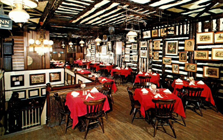
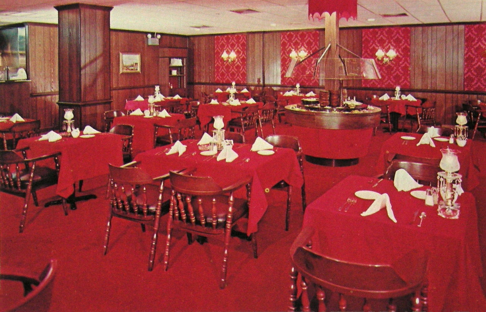
In June of 1928, as construction began, the Chicago Tribune ran a snarky story that managed to insult the design as well as Chicagoans’ taste in general. It said that the building “should make one think he’s in Persia, provided he doesn’t know too much about Persian Architecture,” and that it was aimed at “Chicago’s epicureans – if we have any.” [Above: Raphael’s main dining room in 1929]

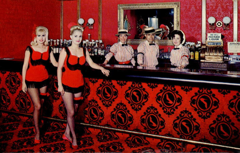
The layout of the building accommodated a small tea garden inside the front door that was outfitted with trees and fountains. Next came a two-story dining room accommodating hundreds, with a ceiling imitating a blue sky with twinkling stars and surrounded on all sides by a balcony that also held tables for guests. Two ends of the building provided people entering from the street access to two interior lunch counters with soda fountains. [Above: one of the lunch counters, but looking strangely like a bar.]

With its minaret, the building reached 60 feet in height and was visible for miles along all three major streets that crossed there. The minaret was used for advertising with neon lighting and a crescent on top. The illustrations used for this building, whether on the restaurant’s dinnerware [shown above] or in advertising, took great liberty in portraying it. [Below: April 1929 advertisement that imagines the building with two domes, four minarets, and palm trees!]

The main dining room featured a band named Raphael’s Persians. Their performances could be heard on the radio at night.

The March 1929 issue of The American Restaurant Magazine hailed Raphael’s for its ability to merchandise meals by “stealing the thunder” of night clubs and offering them stiff competition while putting food “foremost.” When the radio audience listened to the Raphael’s orchestra, the story said, they would feel that the restaurant had “an air of mystery about it” and want to visit “Chicago’s most exclusive restaurant.” But did they?

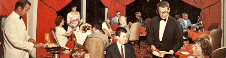
The combination of three types of eating places in one business was an odd one, something that would be more understandable in a hotel than a restaurant. It would seem as though the tea room and the snack bars would keep earlier and shorter hours than the restaurant/nightclub which stayed open until 3 a.m. and that this would cause staffing problems. By June of 1929 Raphael’s had figured out more ways of making money, as is shown on the advertisement below, such as afternoon dancing, an additional cover charge, and higher cover charges on weekends, but it’s likely that it wasn’t enough.

The trade journal also hailed Raphael’s for its modern kitchen facilities that were filled with the latest mixing machines, ranges, refrigerators, warmers, etc., proving “that the kitchen methods of this modern restaurant are a far cry from the methods employed when the members of Persian tribes would prepare feasts for their shahs.”

A reader of The American Restaurant would be left with the idea that Raphael’s was an elegant place catering to a clientele with sophisticated tastes. But that idea was dashed in a story written by a young reporter who spent a night there playing the part of a “shy cigaret girl.” Over the course of the evening male patrons hit on her nine times. She also observed people drinking alcoholic drinks, probably enhanced by their own whisky flasks. The crowd included teenagers. By June of 1929, the restaurant was reduced to featuring a “crystal gazer” on the balcony named Allah Mahalla. So much for elegance!

Despite serious searching I could find no advertising, nor any mention of the Raphael restaurant at all after July, 1929. In 1940 the address was mentioned as the location of a bunco party (a dice game) hosted by a political group. In 1947 the building, then occupied by a beauty supply warehouse, was auctioned for taxes. It sold for a mere $14,027 plus payment of back taxes of $11,259. The second floor was offered for rent in 1948, and it may have been then that the American Legion moved in. [Above: Could the Hippodrome have occupied the building when this advertisement ran in 1938?]

However, according to a recent Chicago Sun Times story by architectural critic Lee Bey, Raphael’s continued in business until WWII, and “later converted into the American Legion South Shore Post 388.” I haven’t been able to find out why he thought Raphael’s stayed in business that long.

Another eating place that might have once occupied the building (in addition to the Hippodrome) was the Kickapooo Inn. Its address was given as 7901 Stony Island in a 1957 obituary notice for its owner.

The building was acquired by The Haven of Rest Missionary Baptist Church in 1966 and used for church services until 1977 when they built a new church. Now the church is seeking a grant to restore the building, hoping it can be reopened in a few years as a community center. [Above: the building as it appeared recently.]

If any reader has information about this building and its uses over time, I’d love to hear from you. It could assist the church in applying for grants.

© Jan Whitaker, 2025

4 Comments

Filed under atmosphere, night clubs, odd buildings, Offbeat places, restaurant decor

Restaurant psychology

My last post about a restaurant designer who applied psychology to his work inspired me to look further into this subject.

I discovered that when the restaurant world was experiencing hard times there was a turn toward psychology, though of course that wasn’t the only inspiration. In the 1920s, when liquor sales became illegal, expensive restaurants were inspired to look harder for ways to please their guests. A proprietor whose famous eating place had to close warned others that “What the restaurant loses in the revenue from wines and liquors it must make up in psychology.” Evidently in his case, this realization came too late.

Canny cafeteria operators, though never dependent upon liquor sales, were already using psychology on their guests in the 1920s. And as early as 1927 a psychology professor appeared at restaurant conventions to give attendees help in figuring out “What do people like and why?”

Psychology often veered into what I would call blatant manipulation, for instance in cafeterias. Cafeterias tried such things as enlarging trays so they looked empty unless the customer loaded up. They also placed desserts on eye-level shelves that were the first thing the hungry customer saw as they entered the cafeteria line.

In later years other manipulative ploys in everyday eating places would include uncomfortable seating and bright colors that shortened customers’ stays, as I have previously written about.

The Depression and WWII put a damper on psychology advising, but it returned in the 1950s. A strange example was a Hollywood therapist who made a practice of visiting a restaurant called The House of Murphy. He went table to table giving customers, many of them actors, his analyses of their psyches. I would not think they appreciated some of his insights, such as when he told Gary Cooper that he was a “withdrawn introvert.” As for dining, his verdict was that “A very large meal is an escape mechanism.” As he saw it, “The customer is gorging himself in order to have a sense of security and power.”

Other restaurant psychologists turned to writing columns for newspapers. Dr. George W. Crane, for instance, focused on sloppy waitresses who failed to meet his standards, that of a “glorified mother.” “And be sure to smile,” he advised them, “for this makes you a psychotherapist who helps the morale, appetite and even the digestion of lonely, moody and fearful souls.” All for 50 cents an hour?

By the 1970s restaurant psychology had taken leaps forward and was a tool of restaurant designers, beginning with interior and exterior design and assistance with restaurant concepts, naming, advertising, and public relations.

In 1977 David Stevens, then considered a leading restaurant designer, had a hand in the design of 100 restaurants, including fast food chains Hobo Jo, Humpty Dumpty, the Mediterranean in Honolulu, and a number of Bobby McGee’s, as well as the Mai Kai in Fort Lauderdale [shown below]. He believed a restaurant had to be in tune with the “emotional trend of the nation.” In 1977 he favored nature themes and booths to “give the public something to lean on” at a time of nationwide insecurity due to a weak economy. Though he declared that the rustic look was “out,” he admitted that heavy beams could sooth tension.

Another slant on booths came from a designing couple who proclaimed that they served as “a womb surrounding and hiding customers who don’t want to be seen, especially if they’re a little overweight.”

Plants were tricky according to some. In 1980, the part owners of Ruby Tuesday’s Emporium noted plants could be used very strategically. “If you’re aiming for college-age patrons,” they advised, “there should be floor plants.” On the other hand, young professionals liked hanging plants which they said, “denote a higher degree of sophistication.”

In 1983, restaurants had not recovered from the recession of the previous year. In Broward County, Florida, with its 2,600 restaurants, there was a high failure rate in the first year of the recession. Some restaurants sought help from an industrial psychologist who trained staffs in empathy with the customer, and taught them to how to handle uncomfortable situations.

The emphasis stayed on servers at the National Restaurant Association’s annual conference the following year. A psychology professor from Denver’s School of Hotel and Restaurant Management was on hand to instruct participants in their “real” business: not selling food and drink, but in fulfilling people’s needs. Servers were to smile, answer questions, and show interest in what the customer was ordering. They were to nod their heads, and say “I see“ and “uh-huh.”

Of course, by this time it was taken for granted that interior design was important. In 1984 some thought that the nation was “longing to return to simpler times.” In design this was frequently interpreted as early-American themes, barn siding, and huge beams.

But in Houston a design team had a very different interpretation. They preferred to give new restaurants a worn, slightly dirty, look. To achieve this they gave walls a few stains and planted handprints around light switch plates. Customers were to feel they didn’t have to be super careful, that spills were perfectly ok. The Atchafalaya River Café gave an aged look to the building formerly occupied by the Monument Inn. They covered part of the roof with battered tin, deliberately left paint splatters on the front window, and used old doors for the front, pasting them with bumper stickers, all in the belief “that tacky, comfortable design makes people happy.”

Why not a country theme? Well, as the designers of the Atchafalaya River Café liked to say: “Pastoral scenes are deadly to a good time in restaurants. Customers feel mother or grandmother is watching every move.”

Bringing another sense into play, noise became part of design in the 1980s. Designer Leonard Horowitz said in 1986 that at the Crab Shack in Miami, where diners smashed crabs with wooden paddles at their tables, “ear-splitting volume is one of the things that makes the Crab Shack so popular with many of its customers.” He thought it was because people “enjoy feeling like part of a party or performance.” He also noted that while noisy spaces felt festive they also encouraged quick turnover, which of course greatly enhanced profits in popular places.

By the late 1990s, and very likely before that, having a professional designer versed in restaurant psychology was common, particularly in the case of restaurant chains. That was especially true in restaurants that aimed to entertain as well as to provide food. The word for this is “eatertainment” in recognition that food is only one reason that people patronize restaurants.

© Jan Whitaker, 2025

8 Comments

Filed under atmosphere, patrons, restaurant decor

Music & food at Café Society

Café Society was the satirical name of a New York jazz club in the late 1930s and 1940s. The name was meant to make fun of people who wanted to be seen as sophisticated rather than merely rich. However, it’s likely that Café Society nevertheless proved to be an attraction to many of those same people.

By the second year there were two locations of Café Society, Downtown and Uptown. The clubs and their owner Barney Josephson have become well known for the number of jazz greats they introduced and nurtured, among them Lena Horne, Billie Holiday, and Teddy Wilson. And also for their full acceptance of Black customers.

Unlike other “café society” club owners such as the Stork Club’s, Josephson refused to accept the racial codes of that time. He was determined not to follow policies that featured Black performers but would not allow them to mingle with the patrons, and excluded Black guests. Even when these policies began to soften, it was common for Black patrons to be seated inconspicuously in the least desirable spots. [Above: 1939 sign at the Downtown club ridiculing prominent society figures]

When he opened the Downtown Greenwich Village club in late December 1938, Barney recruited three musicians who had been part of a Carnegie Hall Christmas Eve program called From Spirituals to Swing. Albert Ammons, Meade Lux Lewis, and Pete Johnson performed at the club a few days later. The club advertised that it featured “boogie-woogie,” which was largely unknown in New York City at the time. [Above: Downtown in 1939; William Gropper mural]

But what about the food? In general, jazz clubs’ culinary output has not been regarded as the finest. Barney claimed that when he started out, most jazz clubs were run by mobsters who didn’t even try to prepare good meals. He tried to do better, but it’s hard to judge how well he succeeded since I’ve found little commentary. Club cuisine wasn’t usually written about.

In a book based on recordings of his memories, published by his fourth wife after his death, Barney commented that in most nightclubs waiters were urged to push drinks not food. For the Uptown Café Society (on East 58th), opened about a year later than Downtown, he made an effort to provide good food by hiring a chef who had managed the Claremont Inn and had been head waiter at Sherry’s. Robert Dana, nightclub editor of the Herald Tribune, was of the opinion that “On its food alone, Café Society ranked with many fine restaurants,” singling out squab chicken casserole and cream of mushroom soup. [Above: Uptown, 1943; Below: Advertisement with the musical lineup on Uptown’s first anniversary, 1940]

By the end of 1947 Uptown was out of business, and Downtown closed in early March of 1949. The problem was that Barney’s brother Leon, an admitted Communist Party member, was part owner of the clubs, having advanced start-up money. In 1947 Leon was called before the House Un-American Activities Committee, refused to testify, and spent a year in prison. Barney was seen as guilty by association, attendance at his clubs plummeted, and he lost all his money. It seemed his career as a jazz club owner was over.

After that he concentrated on the restaurant business. He opened three restaurants, all called The Cookery, with one on Lexington across from Bloomingdale’s, one on 52nd Street in the CBS building, and then in 1955 a third one in Greenwich Village on University Place and 8th Street. The first two did not stay open long, but the Greenwich Village site was successful. [Above: The Cookery on Lexington; wall art by Anton Refregier]

While the two Café Societies had featured jazz with food, his third Cookery was to become a purveyor of food with jazz.

The Village’s Cookery was far from glamorous, generally described as “a hamburger, ham-and-egg type restaurant.” For the first 15 years there was no music. And then one day Barney had a visit from pianist Mary Lou Williams — who had played at Café Society Downtown – looking for work. As he described it:

“. . . this lady, one of the greatest musicians of all times, composer, arranger, not working? It was all this wild, crazy rock. . . . I investigated and found out I didn’t need a cabaret license in my place if I only had three string instruments.” [Above: Mary Lou Williams, at the Cookery in the Village, 1970]

So he told her to go rent a piano and, presto!, he was back in the jazz club business as of 1970. She was a draw. As he put it, “Mary returned to The Cookery each year through 1976 for three-month gigs, always to critical acclaim and crowds.” Other musicians who played there included Teddy Wilson, Marian McPartland, and the elderly singer Alberta Hunter, who had been working as a nurse.

The Cookery stayed in business until 1984.

For those interested in reading more about Barney’s clubs, see the book based on his recorded memoir published by Terry Trilling-Josephson in 2009 (Café Society: The wrong place for the Right people).

© Jan Whitaker, 2025

Leave a comment

Filed under alternative restaurants, night clubs, Offbeat places, patrons, proprietors & careers, restaurant decor

California coffee shops

With the end of World War II, the United States became the undisputed world power as well as the leading economy, producing the largest share of the world’s goods.

Many changes took place in American society as the soldiers returned. Suburbs sprang up with housing for growing families, shopping centers appeared, and many workers enjoyed prosperity. And a new type of eating place came into being, known as the “California coffee shop.” There had been coffee shops before that, but Southern California introduced new features, particularly in terms of design.

Triumph at the war’s end was celebrated with ticker-tape parades, but also in the design of cars and buildings, including the exuberant design of coffee shops in Southern California. The style of restaurant buildings that has also come to be known as “Googie” was modern, but without the severity of International Style. It used a wide range of materials developed in wartime, and forms inspired by the angles of fighter planes, the energy of the atom, and the bursts of bombs.

The inspiration for the striking designs of California coffee shops – known as Coffee Shop Modern – is frequently attributed to the space age, but over time the realization has grown that it was equally inspired by U.S. world ascendancy rooted in warfare. It may seem strange to attribute inspiration for a sprightly and bright type of architecture and interior design to something as ominous and deadly as the bomb, but a number of writers have made this connection.

In the words of Michael Sorkin’s essay “War is Swell” [in World War II and The American Dream, 1995]:
“That the atom so readily became a chipper symbol of American modernity in the immediate aftermath of its use as the greatest instrument of mass death in human history speaks volumes about the relationship of the accomplishments of war to the formal culture of peace. The decor of the fifties is all bursts and orbits, nuclei and energetic spheres. The atom was fully relegated to the class of things, isolated from life.”
[See also Elizabeth Yuko’s “Why Atomic Age Design Still Looks Futuristic 75 Years Later”]

Elements of coffee shop design can be seen in the look of automobiles of the same time. Some of the striking elements of California coffee shop design were echoed in the fins of Cadillacs inspired by the P-38 fighter plane. In Googie Redux, author Alan Hess, who has been largely responsible for recognition and appreciation of the creativity of Coffee Shop Modern, notes that Time Magazine called the 1959 Cadillac design the “ICBM [Intercontinental Ballistic Missile] look,” and also that “The Olds Rocket, the Olds Cutlass, and the Buick LeSabre were all names borrowed from aeronautics.”

The design of coffee shops was nicknamed “Googie” after architect John Lautner’s 1949 unique Los Angeles creation bearing that name. It featured expansive glass window walls, unusual angles and roof lines, prominent signs, and bright colors. [partial view shown above — it extended farther to the right]

The vocabulary of Coffee Shop Modern signals its inventiveness. Terms in a glossary by Alan Hess in his book Googie Redux include: amoeboid, boomerang, cantilevered canopy, diagonals, dingbat, flagcrete, folded plate roof, free form, hyperbolic paraboloid, starburst, steel web lightener, structural truss, and tapering pylon.

California coffee shops, often bearing nicknames of their owners (Norm’s, Biff’s, Ship’s, Hody’s, Sherm’s, etc.), were casual, unpretentious, comfortable, moderately priced, and open 24 hours. Compared to the inexpensive eating places of the Depression, they offered a cheerful example of luxury for the masses, or what has been termed “populuxe” (See Thomas Hines’ book of the same name). Contrary to the usual negative public reaction to modern architecture, the upstart designs of the coffee shops were well accepted.

Counter seats were usually spaced generously and built with cantilevered supports allowing for unobstructed floor cleaning. [see above] Many had walls of decorative stone. A 1955 news story about the newly built Carolina Pines Jr. at LaBrea and Sunset noted its imported Italian mosaic tile columns, Palos Verde stone walls, and custom-designed wall plaques, among other features. It also had a carpeted dining room and an outdoor patio eating area in a garden protected from road noise and dirt with decorative fencing. [see below]

The coffee shops also introduced exhibition cooking. Although Eastern diner-style eateries had long done their cooking in sight of patrons, coffee shops introduced stylish designs and materials to the cooking areas and kept them sparkingly clean.

And, oddly enough, considering that the coffee shops were open all night, many of them had cocktail lounges.

Coffee shops designed along the lines of Southern California’s soon spread across the country. In St. Louis there was the Parkmoor, Cleveland had Manners, and Denny’s, with its beginnings in California, flourished everywhere.

Of course, as was true with neon signs, there were critics, notably Peter Blake in his 1964 book God’s Own Junkyard. He lumped Googie-style designs with neon, billboards, subdivisions, and a general decline in the built environment.

Starting in the mid 1960s but gaining in the 1970s Googie style was rejected, and what has been dubbed the “browning of America” by Philip Langdon had begun. Now chain restaurants of the coffee shop type began featuring earth tones, mansard roofs, exposed wooden beams, hanging plants, and subdued lighting. The coffee shop type of suburban restaurant continued in chains such as Denny’s despite competition by fast food establishments. McDonald’s, which had itself begun with Googie styling, toned down its buildings.

The change was due in part to the Vietnam War, but I can’t help but wonder if Americans hadn’t already become disenchanted with power and wealth based on military might.

© Jan Whitaker, 2024

22 Comments

Filed under chain restaurants, decor, family restaurants, popular restaurants, restaurant decor, restaurants

Anatomy of a restaurateur: Clifford Clinton

Rarely is the word fantastical used to modify the word cafeteria. Nor are restaurant proprietors usually thought of as powerful vice crusaders. [cover, 1940s booklet; below Pacific Seas]

A major exception of the latter was Clifford Clinton, creator of two of Los Angeles’ most memorable cafeterias. Both Clifton’s Pacific Seas and Clifton’s Brookdale were indeed fantastical, exotic, and composed of an odd blend of entertainment and salvation. In appearance they anticipated elements of Disneyland as well as Polynesian restaurant decor.

One of their strangest aspects was that they represented Clinton’s missionary work. After a few years of operating his father’s Puritan restaurant chain in San Francisco – previously owned by moralist Alfred W. Dennett — he came to Los Angeles in 1931 and re-opened a former Boos Brothers cafeteria at 618 S. Olive.

By the following year he was running that “Clifton’s” cafeteria plus another one on W. Third, one on Hollywood Blvd, a hotel probably housing his employees, “A miniature Cafeteria of the Tropics” in Whittier, and a “Penny Caveteria” in a basement on S. Hill street that offered dishes for 1 cent each.

In October 1932, perhaps the worst year of the Depression, a newspaper featured a smiling woman in the Caveteria with her 5¢ meal of soup, veal loaf, macaroni, sliced tomatoes, and buttered bread. According to another story, she was but one of an average of 4,500 customers fed each day (except Sundays, when all Clifton’s closed). Lines typically stretched down the street. For Christmas that year 7,000 guests enjoyed a Christmas turkey dinner priced at 1¢.

In 1939 Clinton remodeled the redwood-forest-themed Clifton’s Brookdale that had opened in 1935 as well as the original place on S. Olive, Clifton’s Pacific Seas, with a dazzling Polynesian look, neon palm trees, and many, many waterfalls. [Brookdale interior shown above; below more waterfalls, Pacific Seas exterior]

Along with meals, the restaurants acted as social centers and spiritual retreats for the thousands of uprooted mid-westerners who had relocated to Los Angeles. And they served as a kind of political base for Clinton’s reform campaigns. His cafeterias and his political activities were entirely consistent with the tenor of Los Angeles culture of the time. As George Creel summarized it in a 1939 Colliers article, the city throbbed with “two thousand religious cults . . ., each claiming daily and direct communication with Jehovah, and an equal number of social, economic and political movements: Epic, Social Credit, Utopia, the Townsend Plan and Thirty Dollars Every Thursday, etc., all guaranteed to promote the immediate salvation of mankind.”

Religiosity permeated the Clifton’s Cafeterias, as it had Dennett’s and would in a number of restaurants later in the century. If guests left the main dining room of Pacific Seas and entered the basement they would find a life-sized figure of Jesus praying in The Garden of Meditation [shown above]. Brookdale featured a Little Chapel set amidst the redwoods.

During World War II, Pacific Seas diners could also post their “feelings and wants” on a bulletin board or consult with a “Mrs. Von” in her bamboo hut for advice on personal problems.

Clifford Clinton’s mission to offer affordable meals continued throughout his career. The policy was that no one would be turned away because of a lack of funds. Although the practice undoubtedly ate into revenue, and was probably taken advantage of by some, Clinton managed to amass enough profits to live in a sprawling mansion on Los Feliz Blvd. and Western Ave in which he hosted convalescing employees [shown above]. (The house sold last year for close to $5M.)

Clifford Clinton was as colorful as his restaurants, despite his appearance as a conventional religious and civic-minded family man. He had spent much of his childhood in China with his missionary parents, an experience that he said made him ultra-sensitive to human hunger. That is unusual but it was just a prelude to his role as one of Los Angeles’ prominent crusaders of the 1930s dedicated to cleaning up the city’s vice and political corruption.

He succeeded in getting Mayor Frank Shaw recalled and replaced by the candidate of his choice, who he promoted on his radio show. In addition, the city’s police chief was indicted and found guilty of plotting the car bombing that severely injured the private detective working for Clinton’s lawyer.

Clinton’s success as a crusader has been partly attributed to his alliances. He worked with Protestant ministers under the banner of an organization he created known as C.I.V.I.C (Citizens’ Independent Vice Investigating Committee). And he also allied with the Communist Party during its popular front phase. As a result of these efforts, gambling, prostitution — and the city’s anti-Communist Red Squad — were eliminated, or at least removed from sight.

Through these years Clinton experienced endless phone threats, a bombing at his home, false reports of food poisoning at his restaurants, and an endless array of dirty tricks such as an invasion of one of his public forums by 300 hungry people who had been given tickets for a (non-existent) free meal of chicken and beer. [above: 1939 advertisement for magazine article; below: Clinton examines bomb damage]

Having turned the cafeterias over to his children in 1946, Clinton and his business partner, Ransom Callicott, focused on world hunger. They found a scientist who developed what would be known as Meals for Millions, a soy-based one-dish meal that could be prepared as soup or, with a little flour or corn meal added, bread.

Clinton died in 1969 but his restaurants, including a number of conventional ones in shopping centers, endured well into the 2000s.

© Jan Whitaker, 2024

11 Comments

Filed under cafeterias, Offbeat places, popular restaurants, proprietors & careers, restaurant decor, restaurants, theme restaurants

Building a myth: Bookbinder’s

As a Philadelphia Inquirer story observed when the legendary Bookbinder’s on Walnut Street closed for the first time, in 2002, its popular appeal had been based not only on seafood and steaks but also on the restaurant’s ability to play on its history.

Eventually, in the 1940s, the myth led to a claim that it was founded in 1865. Not everyone took the claim seriously, but that still leaves the question of why the restaurant invented it. The motivation was somewhat mysterious considering that Bookbinder’s was in fact very long-lived compared to most restaurants in the U.S., which do well to last five years. It’s curious to me that the actual founding date in the 1890s wasn’t good enough, but it may have been that its actual beginnings didn’t seem like much compared to the long patriotic history of Philadelphia.

An 1895 newspaper story reported that Cecilia Bookbinder, wife of Samuel, had bought the building on 125 Walnut Street for $5,000. Since 1884, it had been operated as an oyster and chop house by a man named Attila Beyer. It appears, however, that the devious Beyer may not have actually owned the building when he sold it to Cecilia, having already used it as collateral for a loan on which he was about to default as he left for California.

Perhaps due to monetary claims by Beyer’s creditors, the Bookbinders evidently lost ownership of the building and didn’t regain it until 1906, nevertheless operating the restaurant all the while, possibly at first under the simple name Merchant Restaurant. The restaurant was in Philadelphia’s long-established insurance district where business people flooded the local eating places at noon.

Somewhat before the myth of an 1865 founding was adopted, 1875 was advertised as the restaurant’s start date. For instance that was the date given in a 1940 Life Magazine advertisement for Hines ketchup shown here; it is also indicated by the poster on the wall.

A family rift may partially explain the adoption of an exaggerated founding date. Bookbinder’s on Walnut street adopted the name “Old Original Bookbinder’s” about 1935 or 1936 after Samuel C. Bookbinder, son of the founders, opened a rival Bookbinder’s on South 15th Street [shown above, 1935]. He had been in line to inherit the Walnut Street restaurant but was disinherited upon his conversion from Judaism to Catholicism in order to marry a Catholic woman. The false founding date and the name “Old Original” were likely ways to distance the Walnut Street restaurant from its new competitor. [Note that the 1936 advertisement below had not yet revised the fictitious founding date.]

As a result of the family split, Harriet Bookbinder took over the Old Original, operating it with her husband Harmon Blackburn. He was a successful corporate lawyer, and a collector of Americana, including the Lincoln memorabilia, old theater playbills, and Carrier & Ives prints that adorned the restaurant’s walls.

Obviously the building occupied by Old Original Bookbinder’s itself looked aged, and the memorabilia contributed to a sense of age. Other historical attractions were the fireplaces made of old cobblestones taken from Walnut Street. The fireplaces probably dated back to 1915 or 1916 when the city was removing cobblestones from streets. A 1916 advertisement promised “A Beefsteak Dinner in the ‘Maine Woods’” cooked at that room’s fireplace, with steaks and chops grilled in the fireplace and served with oysters, radishes, celery, and hot biscuits baked on the hearth.

When Harriet died in 1944, her husband ran the restaurant for a year and then donated the business to the Federation of Jewish Charities. Along with the building, the furnishings and equipment, the donation included “all food and liquors on hand, the good will and everything in the till.” John and Charles Taxin bought it, with John running it until its final bankruptcy and closure.

In the 1940s and 1950s Old Original Bookbinder’s was regularly recommended in books featuring the country’s favorite restaurants, such as Duncan Hines Adventures in Good Eating. In 1947 “The Dartnell Directory for America’s Most Popular Restaurants named it the country’s most popular eating place of the 2,300 restaurants it recommended.

In 1965 the restaurant celebrated its 100th anniversary as Bookbinder’s — a mere 30 years prematurely.

By the 1970s, the cobblestone fireplaces remained, but some rooms had been redecorated and modernized. Time was catching up with Bookbinder’s then, as new kinds of restaurants with inventive cuisine such as Le Bec-Fin came on the scene. Citing an estimated 300 new restaurants opening in Philadelphia in the early 1970s, a 1978 issue of trade magazine Restaurant Hospitality observed that traditionally conservative Philadelphia was now “vying with New York and San Francisco as the Eating Capital of the United States.”

Nevertheless, in 1986 Restaurant Hospitality rated Old Bookbinders the nation’s 7th highest-grossing restaurant, with annual sales totaling $10.6M and an average dinner check of $33. It was well-known nationwide and particularly popular with tourists, all the more so since it was near historical points of interest.

But nothing lasts forever. Both Bookbinder’s closed in the first decade of the 21st century.

© Jan Whitaker, 2024

12 Comments

Filed under popular restaurants, proprietors & careers, restaurant advertising, restaurant decor

Image gallery: Redness!

The author of the book A Perfect Red identifies it as “the color of desire” and “the color of blood and fire.” She also notes that the color has often been associated with masculinity because it signifies power, prestige, and “heat and vitality.”

So it makes perfect sense that at one time it was popular as steak house decor. [above, Presto, Chicago, ca. 1970]

But it took a while to catch on. In the early 20th century the color red was strongly rejected by many Americans as inappropriate for clothing. Those who dared to wear red – or other strong, bright colors – were seen as low class and with questionable morals. The judgment was particularly harsh if the wearer was Black or an immigrant.

The use of red in home decor was also severely criticized. An elite Chicago woman’s club firmly rejected a trend toward Oriental-styled dens with red walls, piled-up cushions, and low lighting. One of the club’s members noted in 1903 that during a visit to a house with so-called “cozy corners” full of soft pillows she began to doubt that “the mistress of that home was a moral woman.”

Needless to say, though early women’s tea rooms sometimes adopted playful decorating themes, red was decidedly not a popular color scheme in them.

Despite its association with immorality (or maybe because of it?) red made a strong showing after World War II, especially in the mid-1950s through the early 1970s. It was often used in restaurant decor, especially for places that appealed primarily to men.

Red tended to be employed lavishly. It was variously used for carpets, painted wall and ceiling surfaces, columns, wallpaper, light fixtures, draperies, tablecloths and napkins, glassware, menus, upholstery for chairs and banquettes, and waiters’ uniforms. [above: That Steak Place, VA]

Sometimes an old-time theme was adopted, usually signaled by red-flocked wallpaper meant to conjure a bygone time of jollity that might suggest anything from the “gay ‘90s” to the “roaring ‘20s” to a brothel.

A 1955 book of decorating advice suggested that, in contrast to cool colors and bright lights, restaurants with warm colors and dim lights suggested luxury. The latter decor encouraged patrons to relax and was believed “to increase the size of his check.” Likewise, a bar decorated in red might encourage drink orders.

Of course red is more than warm, it’s hot! It can be difficult to imagine relaxing in some of the eating places that enveloped diners in redness. Such as, in particular, NYC’s Cattle Baron [shown above], which opened in 1967 in the Hotel Edison. If the red decor weren’t appealing enough, the restaurant’s owner seemed willing to revive an association with questionable respectability when he ran an advertisement picturing a nude female model marked with black lines indicating cuts of meat.

Whatever poshness and sense of luxury a red interior suggested, it began to wear off in the 1960s, and even more in the 1970s. In 1961, when a version of the NYC club known as Danny Segal’s Living Room opened in Chicago, a reviewer criticized the “engine red decor” with red light bulbs as “excessive” and amounting to “a satire on night club decor.” Also in the 1960s, an Oregon restaurant reviewer sneered at “that ubiquitous black and red decor which has almost become a stereotype of the snobbier bistros.”

Restaurants began ditching their red decor in the 1970s. The Colony Square Hotel in Atlanta installed a new restaurant called Trellises, causing a reviewer to applaud the disappearance of the “steakhouse/bordello gold and red decor.” The western Straw Hat Pizza chain decided in 1975 that Gay 90-style restaurants with red-flocked wallpaper were out of fashion. The Homestead in Greenwich CT hired NYC designers to come in and rip out their red carpets and red-flocked wallpaper for a country look with hanging plants, wood floors, and brick walls. [above, Harry’s Plaza Cafe, Santa Barbara]

Of course, the U.S. is a big country, full of diverse tastes and fashions, so it’s not a big surprise that there were (and are) some restaurants that kept their red decor.

© Jan Whitaker, 2023

9 Comments

Filed under atmosphere, decor, restaurant decor, restaurant fads

Basic fare: pancakes

After a start in the 1950s, pancake houses made it big in the following decade.

Of course pancakes were not new to eating places. Far from it. They had long been a staple of short order restaurants, known variously as flapjacks, hoecakes, hot cakes, griddle cakes, flannel cakes, batter cakes, butter cakes, and just plain cakes. The mighty Childs chain had built its business by transfixing pedestrians with women flipping pancakes in its windows.

Cheap yet filling, it’s hardly surprising that pancakes grew in popularity during the 1930s Depression. The Childs Corporation reported in 1931 that pancakes with butter and syrup ranked as “the most typical American dish.” Pancakes were once again in the spotlight in the film Imitation of Life (1934) in which a white woman’s Black cook runs Aunt Delilah’s Pancake Shop which makes a hit on the Atlantic City boardwalk. The 1930s was also the decade in which The Pancake House opened in Portland OR – a restaurant which James Beard playfully nominated in the 1950s as one of the 10 best in America.

But what was new in the 1960s, with the spread of economic prosperity through (white) America, was the popularity of the “family restaurant.” Children, who had earlier been a minor element in eating out, became a new factor in restaurant success. Now included in dining plans, they often ascended to the role of lobbyist and de facto decision maker. And, while Mom might frown on high-calorie menus and Dad might wish for steak, the kids loved pancakes.

Pancake restaurants of the 1960s welcomed children with bright primary colors, cartoonish figures on menus and walls, and at least in one case with a rather alarming-looking costumed clown. If a child had not fully satisfied their sweet tooth with pancakes, they could raid the “old-time” candy barrels at Florida’s Kissin’ Cousins Pancake Inns. Meanwhile, an adjoining cocktail lounge beckoned parents with beer and bourbon.

What else was new about pancake restaurants? They were part of the advent of eating places focused on single foods, such as hamburgers or pizza. Like pizza, pancakes held special charm for restaurant owners because their ingredients were cheap and no skilled cooks were needed. Plus, they weren’t just for breakfast — customers were ready to order them all day and through the night. The trade journal American Restaurant mused in 1960, “Who ever dreamed that the lowly pancake would build a fortune . . .?”

Restaurant consultant George Wenzel asserted that pancake houses proved “that any one item, prepared with great care, and basically popular, can lead to fortunes especially if the menu price is reasonably low.” While regular service restaurants had food costs up to 48%, he figured they were only 35% in specialty restaurants such as pancake houses.

Chains built around pancakes spread rapidly. By 1961 the International House of Pancakes had opened 25 units in just three years, and was poised to expand into the Northeast. Uncle John’s Pancake Houses, begun in 1956, were doing business with 60 units in more than 20 states. Each of these chains may have been inspired by Aunt Jemima’s Pancake House that opened in Disneyland in 1955.

Despite the development of dozens and dozens of pancake varieties and their high profit margins, pancake restaurants gradually broadened their menus. The trade magazine Cooking for Profit noted in 1964 that pancake restaurants had found it necessary to put steak on the menu. The growing menus meant that the pancake restaurant boom would soon give way to a more general sort of family restaurant in the 1970s. Like pancake restaurants, full-service family restaurant chains such as Denny’s and Country Kitchen were also expanding.

Eating in restaurants continued to be popular with families in the 1970s. Reporting on a Gallup survey in 1975, Food Service Magazine observed that more working mothers, increased family income, and smaller families suggested “a more profitable family market than ever before.” The survey also found that preferences included table service restaurants that welcomed children, had moderate prices – typically $1.00 to $1.99 per person for breakfast — and a menu with a wide range of selections.

A 1978 New York Times story titled “Family Restaurant Booming” noted that dining out is extremely sensitive to economic conditions, a situation that is likely to be especially true for family dining.

So the current economy should favor patronage at IHOP, the reigning pancake kingdom.

© Jan Whitaker, 2022

4 Comments

Filed under chain restaurants, family restaurants, food, patrons, restaurant decor, roadside restaurants

Image gallery: have a seat!

How often do you notice the chair you are sitting on in a restaurant? I’m a fairly observant person but I couldn’t tell you what kind of chairs my favorite restaurants use. Unless a chair is unusually uncomfortable I doubt I’d pay any attention to it at all.

Restaurant owners, managers, and designers, on the other hand, have thought about chairs a lot. There are numerous considerations that go into selecting them, including price, comfort, durability, style, portability, and how much space they occupy.

And let’s not leave out gender, because many of the chairs used in the 20th century were either intended to appeal to men or women, with the understanding that women will adapt to male preferences, but not necessarily vice versa. A 1912 etiquette column counseled women not to wrap their feet around the front legs of chairs in restaurants, but to keep them close together, facing straight ahead and flat on the floor. The author admitted the reason so many wrapped their feet around chair legs was that the chairs were too high for most women!

It’s hard to say exactly what chairs were used in the 19th century because of the lack of available images as compared to the 20th. In the early 19th century, public eating places were often furnished with benches, while chairs came later. After hunting up as many drawings of chairs as I could – mostly from Victorian trade cards and circulars of the 1880s [e.g., Glover’s Corner, Boston] — I’d say seating in ordinary, non-deluxe restaurants was fairly simple, with slat or spindle backs.

Certain chairs have been dominant in restaurants at various times over the past decades. The most successful beyond a doubt was commonly known as the “Vienna chair.” Used worldwide in the 19th and 20th centuries, it was one of the bentwood chairs developed and produced from Carpathian beech by the Thonet Company of Austria. Its stellar success was because it was graceful, durable, and lightweight. As one of the earliest chairs to be mass produced, it was also inexpensive. [Boos Bros., 1915]

Various versions of the Vienna chair were in use in this country in the 19th century. The C. L. Woodman restaurant of Chicago advertised in 1880 that it had remodeled and added “260 pretty chairs of cane and ebony [that] recall the days of our Viennese rambles.” In 1884 B. Nathan & Co., San Francisco, ran an ad saying “Sole Agents For Thonet Bros. Indestructible Bent-Wood Austrian Furniture and Chairs, for Hotels, Restaurants and Dining-rooms.”

Somewhat reminiscent of the Vienna chair, metal “ice cream parlor chairs” were used in various types of restaurants in the early 20th century.

Though it continued in use until WWII and even beyond, becoming collectible in the 1960s, the prototypical Vienna bentwood chair began to look dated in the 1930s, when streamlined aluminum or chrome chairs upholstered in colorful leatherette came into vogue. Some restaurants tried to update their bentwoods with paint or cloth covers that added color. [Lauer Sister’s, 1936]

But by the 1960s chairs with metal frames and padded vinyl backs and seats lost their 1930s moderne look, retreating into plainness and, for some, stackability. I have to admit what when I see this type of chair in a restaurant I lose faith that I will encounter good food. They are often used in restaurants that cater to banquets.

Tea rooms and other restaurants that pitched their appeal to women often tried to avoid using typical restaurant chairs. A newspaper in Canton OH in 1906 applauded a new luncheon restaurant for women that had “wicker chairs . . . instead of the conventional stiff restaurant chair.” No two of the wicker chairs were alike, the article said, giving the place a desirable “homelike” look. Many other tea rooms and inns used Windsor side and armchairs evoking a sense of Colonial times.

More expensive restaurants, especially those catering to men, were likely to use leather upholstered chairs, as shown in the men-only Locke-Ober restaurant in Boston.

Men evidently favored sturdy arm chairs with a clubby look or, more informally, less pretentious captain’s chairs. As early as 1862, Philadelphia’s Continental Café and Restaurant advertised that the gentlemen’s café was furnished with walnut tables with marble tops and handsome walnut chairs “covered with red morocco.”

More recently a stylish restaurant has demanded a stylish chair, though I’d be hard pressed to say what the typical restaurant chair of the 1980s up to today actually is.

© Jan Whitaker, 2020

8 Comments

Filed under restaurant decor

Dining on a roof

Roof-garden restaurants have had something of a vogue in recent years and may see many more visitors this summer. Their history goes back at least to 1879 when St. Louis restaurant owner Tony Faust created a terrace adorned with boxed shrubs and flowers and lit by gaslights. It was a roof garden of sorts, but on a low roof incapable of giving diners a magnificent view. The terrace remained in operation until at least the mid-1880s, and was commemorated in the ca. 1906 postcard shown here.

In the 1890s, a few places of entertainment in New York City added roof gardens atop tall buildings, primarily as sites for drinking, dancing, and listening to music. The Casino built a garden around 1890, with lanterns, palm trees, and a small stage. Another appeared atop Madison Square Garden [shown here, 1894], then at Koster & Bial’s. These did not serve dinner, but it soon appeared there was a demand for that and it was added to the attractions.

By 1905, New York had dozens of rooftop restaurants during the summer, mostly on hotel roofs. But some restaurants joined in, such as Clyde’s on Broadway and 75th street, famed for its “beefsteak dungeon” which transitioned to the roof in warm weather. Delmonico had a rooftop restaurant in 1920, a few years before it closed for good. Jack Delaney’s ca. 1940 garden appears in a postcard to be rather cramped and lacking a view of the city but it was at least outdoors.

One of the most impressive earlier rooftop restaurants was the one set to open in 1905 on top of New York’s Astor Hotel which was designed to resemble a Tuscan garden. Unlike some others furnished by hotels it was entirely in the open air, with a pergola running down the center that was adorned with moonflowers that only opened after dark.

Other New York hotels that opened roof garden restaurants in the early 1900s included the Hoffman House, The Vendome, the Belle Claire, the Majestic, and the Hotel Bossert in Brooklyn. The Waldorf-Astoria had a roof garden but according to a 1905 account only salads and desserts were served there.

Rooftop restaurants in hotels were not limited to New York. They could be found all over the country – at the Grunewald in New Orleans, the St. Anthony in San Antonio, the Hotel Nortonia in Portland OR, the Bingham in Philadelphia, and the McKenzie Hotel which was intended to “boost Bismarck and North Dakota.” Philadelphia had a number of hotel roof gardens, including an unusual-looking one at the Continental Hotel [shown above].

In researching this topic it was often difficult to figure out exactly what was meant by a rooftop restaurant. It might be entirely in the open-air, as was true of the famous Astor roof, or it might be partially or entirely enclosed, occupying part of a roof or the entire roof in which case it was actually the top floor. The Continental’s garden restaurant appeared to be at least partially under a roof, as did the one at Hotel Breakers in Lynn MA shown here.

Most outdoor rooftops opened at the beginning of June, advertising “cool breezes.” Not surprisingly, rooftop restaurants were in vogue mainly before air conditioning came into use in the 1930s. After World War II, when it became more common, it seems the number of open-air rooftops declined.

© Jan Whitaker, 2020

11 Comments

Filed under Offbeat places, outdoor restaurants, restaurant decor