Tag Archives: Googie

California coffee shops

With the end of World War II, the United States became the undisputed world power as well as the leading economy, producing the largest share of the world’s goods.

Many changes took place in American society as the soldiers returned. Suburbs sprang up with housing for growing families, shopping centers appeared, and many workers enjoyed prosperity. And a new type of eating place came into being, known as the “California coffee shop.” There had been coffee shops before that, but Southern California introduced new features, particularly in terms of design.

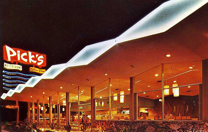
Triumph at the war’s end was celebrated with ticker-tape parades, but also in the design of cars and buildings, including the exuberant design of coffee shops in Southern California. The style of restaurant buildings that has also come to be known as “Googie” was modern, but without the severity of International Style. It used a wide range of materials developed in wartime, and forms inspired by the angles of fighter planes, the energy of the atom, and the bursts of bombs.

The inspiration for the striking designs of California coffee shops – known as Coffee Shop Modern – is frequently attributed to the space age, but over time the realization has grown that it was equally inspired by U.S. world ascendancy rooted in warfare. It may seem strange to attribute inspiration for a sprightly and bright type of architecture and interior design to something as ominous and deadly as the bomb, but a number of writers have made this connection.

In the words of Michael Sorkin’s essay “War is Swell” [in World War II and The American Dream, 1995]:
“That the atom so readily became a chipper symbol of American modernity in the immediate aftermath of its use as the greatest instrument of mass death in human history speaks volumes about the relationship of the accomplishments of war to the formal culture of peace. The decor of the fifties is all bursts and orbits, nuclei and energetic spheres. The atom was fully relegated to the class of things, isolated from life.”
[See also Elizabeth Yuko’s “Why Atomic Age Design Still Looks Futuristic 75 Years Later”]

Elements of coffee shop design can be seen in the look of automobiles of the same time. Some of the striking elements of California coffee shop design were echoed in the fins of Cadillacs inspired by the P-38 fighter plane. In Googie Redux, author Alan Hess, who has been largely responsible for recognition and appreciation of the creativity of Coffee Shop Modern, notes that Time Magazine called the 1959 Cadillac design the “ICBM [Intercontinental Ballistic Missile] look,” and also that “The Olds Rocket, the Olds Cutlass, and the Buick LeSabre were all names borrowed from aeronautics.”

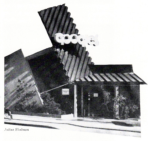
The design of coffee shops was nicknamed “Googie” after architect John Lautner’s 1949 unique Los Angeles creation bearing that name. It featured expansive glass window walls, unusual angles and roof lines, prominent signs, and bright colors. [partial view shown above — it extended farther to the right]

The vocabulary of Coffee Shop Modern signals its inventiveness. Terms in a glossary by Alan Hess in his book Googie Redux include: amoeboid, boomerang, cantilevered canopy, diagonals, dingbat, flagcrete, folded plate roof, free form, hyperbolic paraboloid, starburst, steel web lightener, structural truss, and tapering pylon.

California coffee shops, often bearing nicknames of their owners (Norm’s, Biff’s, Ship’s, Hody’s, Sherm’s, etc.), were casual, unpretentious, comfortable, moderately priced, and open 24 hours. Compared to the inexpensive eating places of the Depression, they offered a cheerful example of luxury for the masses, or what has been termed “populuxe” (See Thomas Hines’ book of the same name). Contrary to the usual negative public reaction to modern architecture, the upstart designs of the coffee shops were well accepted.

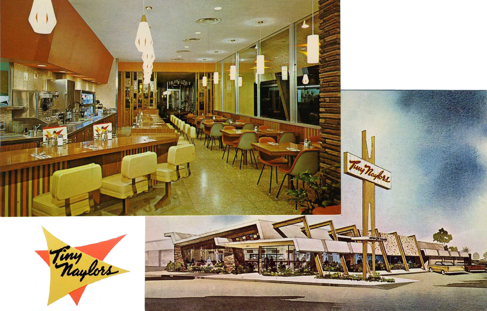
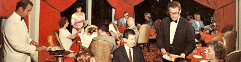
Counter seats were usually spaced generously and built with cantilevered supports allowing for unobstructed floor cleaning. [see above] Many had walls of decorative stone. A 1955 news story about the newly built Carolina Pines Jr. at LaBrea and Sunset noted its imported Italian mosaic tile columns, Palos Verde stone walls, and custom-designed wall plaques, among other features. It also had a carpeted dining room and an outdoor patio eating area in a garden protected from road noise and dirt with decorative fencing. [see below]

The coffee shops also introduced exhibition cooking. Although Eastern diner-style eateries had long done their cooking in sight of patrons, coffee shops introduced stylish designs and materials to the cooking areas and kept them sparkingly clean.

And, oddly enough, considering that the coffee shops were open all night, many of them had cocktail lounges.

Coffee shops designed along the lines of Southern California’s soon spread across the country. In St. Louis there was the Parkmoor, Cleveland had Manners, and Denny’s, with its beginnings in California, flourished everywhere.

Of course, as was true with neon signs, there were critics, notably Peter Blake in his 1964 book God’s Own Junkyard. He lumped Googie-style designs with neon, billboards, subdivisions, and a general decline in the built environment.

Starting in the mid 1960s but gaining in the 1970s Googie style was rejected, and what has been dubbed the “browning of America” by Philip Langdon had begun. Now chain restaurants of the coffee shop type began featuring earth tones, mansard roofs, exposed wooden beams, hanging plants, and subdued lighting. The coffee shop type of suburban restaurant continued in chains such as Denny’s despite competition by fast food establishments. McDonald’s, which had itself begun with Googie styling, toned down its buildings.

The change was due in part to the Vietnam War, but I can’t help but wonder if Americans hadn’t already become disenchanted with power and wealth based on military might.

© Jan Whitaker, 2024

21 Comments

Filed under chain restaurants, decor, family restaurants, popular restaurants, restaurant decor, restaurants

Restaurant design and decoration

In the second half of 19th century restaurant decoration – in restaurants that had any — was mainly the work of painters who created baroque fantasies on walls and ceilings. Rooms reserved for female diners seemed to be more likely to be well decorated. An example was a ladies’ Refreshment Saloon on Broadway in New York in 1853 painted by someone simply referred to as Delamano. It’s likely he was the same Signor Delamano who painted scenery for a minstrel production with tableaux featuring Uncle Tom and Little Eva five years later.

Unfortunately I don’t know what the women’s decor of 1853 looked like. But for men, a standard decorative focal point was a painting over the bar of a reclining nude woman. Presumably men enjoyed these paintings, though one dissenter in 1884 declared barroom artwork a tasteless and degraded “decorative nightmare” aimed at “gamblers and the swell-mob.” To little effect – such paintings survived well into the 20th century, continuing to define spaces as male turf.

Along with friezes and murals, a full-service painting and decorating firm was likely to be able to handle plaster ceiling decorations and room moldings. In the case of the excessively ornate, carved and gilded Tosetti Restaurant opened in Chicago in 1895, decorators were aided by metal grillwork attached to the ceiling which was then covered with elaborate plaster work and lunettes painted to depict historic scenes.

Magnificence had become more attainable in the 1880s with the availability of Lincrusta-Walton, a thin version of linoleum that was embossed and paintable. It was waterproof and altogether superior to papier maché reliefs that had been used earlier. An era of exuberant gorgeousness was about to begin.

Theatrical decor reached a peak in the work of Henry Erkins, who designed the short-lived, Babylonian-styled Café de l’Opera and the opulently ridiculous Murray’s Roman Gardens in New York, shown here in 1908.

Decorative materials such as Lincrusta [shown here] were especially popular in the decades when restaurants were designed as empty boxes, ready for a decorator. As explained in Interiors Book of Restaurants (1960), architects from earlier eras had “designed buildings from the outside in, often giving no more thought to the appearance of the interior than the use of appropriately designed moldings, paneling, stairways, and other architectural details which would relate the style of the interior to that of the exterior.” The rest was left to a decorator who would finish the interior in the period style selected.

Later, particularly around the mid-20th century, the process was reversed, with architects working from the inside out, often in collaboration with an integrated design team that might include lighting and kitchen consultants along with interior designers. The integrated inside-out process was manifested in the California coffee shop of the late 1940s and 1950s.

Of course hiring a professional design team presumes a well-capitalized restaurant. Many restaurants, of course, had no architect, designer, or decorator unless it was the owner or an associate, and this remains the case today. In stark contrast to restaurants designed by prominent designers and decorators such as Raymond Loewy Associates or Dorothy Draper [see top, coffee shop at The Greenbrier], were the everyday 20th-century cafes and lunchrooms that had no decor whatsoever other than advertising calendars and soft drink posters.

For a long time, only luxury restaurants enjoyed the services of professionals, but that had begun to change with the emergence of chain lunchrooms in the late 19th and early 20th centuries. They adopted functional designs meant to make the most of a storefront location from a business standpoint. Rather than beauty or faux-luxury, they built their reputations on cleanliness, efficiency, and brisk, moderately priced food service.

Although there have been some well-known restaurant designers, they tend to remain behind the scenes, largely unknown to the dining public. Certainly the designers of lunchroom and cafeteria chains were not celebrated. It’s likely that some of them were employees of restaurant supply companies, such as Vulcan Equipment and Supply Co. of Birmingham AL, which claimed in the 1950s to be “One of the South’s Finest Restaurant Designers,” specializing in “beautiful and serviceable” restaurants.

After World War II restaurant design came into its own, with firms that specialized in just that, handling not only dining room decor, but kitchen layouts, lighting, furnishings, and even the design of distinctive uniforms, tableware, and menus. In the case of restaurants owned by New York’s Restaurant Associates – such as the Forum of the Twelve Caesars, Leone’s, the Four Seasons [see below], La Fonda del Sol, and others, each restaurant had its own logo appearing on menus, matchbooks, ashtrays, and in advertisements.

Although New York City had many restaurants by top designers, California proved a strong rival in the 1960s when restaurant patronage soared there. A new restaurant type had evolved, the “California coffee shop,” combining elements of drive-ins, coffee shops, cocktail lounges, and dinner houses. They occupied specially designed structures that used novel angles and signage, with modern interiors that were said to reduce labor costs and speed up service. Among the leading designers were IRS, Inc., responsible for designing and developing more than 2,200 California coffee shops by the mid-1960s, and Armet & Davis, hailed by Alan Hess (Googie, Googie Redux) as responsible for making “Coffee Shop Modern . . . a major popular modern style.” Hess identifies a specialized architectural vocabulary applicable to these styles, one that includes terms such as boomerangs, dingbats, folded eaves and plates, and hyperbolic paraboloids. [Biffs, Los Angeles, Dougles Honnold architect]

The Four Seasons, opened in 1959 in NY’s Seagram Building, represented the height of luxury restaurant design, not only because it employed a top flight of designers but also because everything in it was custom designed to the tune of $5.5 million. The decor changed with the seasons, from the interior trees and plants right down to the color of waiter uniforms and matchbooks. The recreated Four Seasons, about to open at a new address, reportedly cost $30 million, which works out to $6.2 million less than the present-day value of the 1959 project [measuringworth.com].

In the 1970s and 1980s, the growing popularity of theme restaurants brought about new kinds of decorating services, as well as a growing industry of collectors who amassed warehouses full of objects of all sorts, ranging from antiques to wagon wheels and dentists’ chairs. One such business, originating in the late 1950s, was Oceanic Arts in suburban Los Angeles which grew to be a major supplier and manufacturer of Tiki decor.

By the later 20th century anyone opening a first-class restaurant faced a host of requirements beyond heightened customer expectations of decor. They ranged from managing utility demands, fire and health regulations, accessibility issues, and, in California, earthquake proofing. By 1990 costs began in the hundreds of thousands, easily escalating into the millions, even when dealing with a location in pre-existing building.

Restaurant design has come a long way from Lincrusta and potted palms.

© Jan Whitaker, 2018

8 Comments

Filed under chain restaurants, elite restaurants, lunch rooms, restaurant decor, uniforms & costumes

The browning of McDonald’s

mcdonald'sold&new781

It is always gratifying to find a piece of ephemera that marks a transition. The postcard above is blank on the back, probably to allow McDonald’s franchises to imprint it with their locations as they completed the changeover from the old building style to the new in the 1970s.

The old-style McDonald’s was based on the original design of California architect Stanley Meston who had once worked for Wayne McAllister, noted designer of modernistic 1930s drive-ins. The design was made for the McDonald brothers who in the 1950s had begun to franchise their California drive-in.

When Ray Kroc obtained a franchise from the brothers and spread McDonald’s outside the West and across the nation, he made modifications to Meston’s design, simplifying the arches and adding a glass-enclosed vestibule to the front as shown on the postcard at the top.

picks299The original Meston design was of an exuberant style known as “Googie” that featured eye-catching elements such as swooping roofs, extensive plate glass, neon, and the use of shiny industrial building materials (but sometimes also lava stone as shown in Pick’s). I recommend the books Googie and Googie Redux by Alan Hess, which I have drawn upon for this post, along with Orange Roofs, Golden Arches by Philip Langdon.

McDonald's1998Collectors'ClubIn the 1960s Kroc’s McDonald’s (he had bought out the McDonald brothers in 1961) began to run up against resistance from local zoning boards that wanted something more restrained than the “franchise schlock” look of the golden arches model. In 1968 the corporation went to work on a new design for a brick-faced building with a dark mansard-style roof and indoor seating. “We have taken off the gaudy materials and eliminated the circusy atmosphere,” said a McDonald’s executive in charge of design. The arches, on their way to become an ever-smaller letter M logo, were relegated to the sign. The first mansardized McDonald’s opened in the Chicago suburb of Matteson in 1969.

The little red, white, and yellow stands began to disappear. In 1972 most – about 75% — had been remodeled or replaced, leaving only about 250. By 1980, fewer than 50 remained, out of a total of 5,082 McDonald’s in the U.S. Preservationists in Oregon and Virginia tried to have old-style McDonald’s placed on historic preservation lists on the grounds they were symbols of America; they were turned down. By 1990 only five remained. A McDonald’s in Downey CA which opened in 1953 has been preserved, and this is probably the only example of the original design remaining other than the corporation’s recreation of Kroc’s first unit in Des Plaines IL.

mcdonald'sAberdeenNJca.1983The cultural climate that brought McDonald’s and other fast food restaurants into contention with critics who sought to keep Googie buildings out of their towns and neighborhoods was in stark contrast to the optimistic futurism exhibited at the 1964-65 New York World’s Fair. Philip Langdon has used the term “the browning of America” for the turn away from buildings that were shiny, colorful, and blatantly commercial to ones that were low-slung, dark, and of natural looking materials. He suggested this shift signified a downcast attitude toward America. “The demand for a less garish roadside strip, when combined with other currents in the culture – a growing awareness of the nation’s faults and a fading away of the once-euphoric attitude toward futuristic technology – fostered a more subdued esthetic,” he wrote.

But another interpretation begs to explain the change as a progressive corrective to the post-WWII abandonment of nature, as evidenced in commercial roadside strips, napalm warfare, chem-lab convenience foods, and the widespread despoliation of the environment.

© Jan Whitaker, 2014

25 Comments

Filed under chain restaurants