With the end of World War II, the United States became the undisputed world power as well as the leading economy, producing the largest share of the world’s goods.
Many changes took place in American society as the soldiers returned. Suburbs sprang up with housing for growing families, shopping centers appeared, and many workers enjoyed prosperity. And a new type of eating place came into being, known as the “California coffee shop.” There had been coffee shops before that, but Southern California introduced new features, particularly in terms of design.
Triumph at the war’s end was celebrated with ticker-tape parades, but also in the design of cars and buildings, including the exuberant design of coffee shops in Southern California. The style of restaurant buildings that has also come to be known as “Googie” was modern, but without the severity of International Style. It used a wide range of materials developed in wartime, and forms inspired by the angles of fighter planes, the energy of the atom, and the bursts of bombs.
The inspiration for the striking designs of California coffee shops – known as Coffee Shop Modern – is frequently attributed to the space age, but over time the realization has grown that it was equally inspired by U.S. world ascendancy rooted in warfare. It may seem strange to attribute inspiration for a sprightly and bright type of architecture and interior design to something as ominous and deadly as the bomb, but a number of writers have made this connection.
In the words of Michael Sorkin’s essay “War is Swell” [in World War II and The American Dream, 1995]:
“That the atom so readily became a chipper symbol of American modernity in the immediate aftermath of its use as the greatest instrument of mass death in human history speaks volumes about the relationship of the accomplishments of war to the formal culture of peace. The decor of the fifties is all bursts and orbits, nuclei and energetic spheres. The atom was fully relegated to the class of things, isolated from life.”
[See also Elizabeth Yuko’s “Why Atomic Age Design Still Looks Futuristic 75 Years Later”]
Elements of coffee shop design can be seen in the look of automobiles of the same time. Some of the striking elements of California coffee shop design were echoed in the fins of Cadillacs inspired by the P-38 fighter plane. In Googie Redux, author Alan Hess, who has been largely responsible for recognition and appreciation of the creativity of Coffee Shop Modern, notes that Time Magazine called the 1959 Cadillac design the “ICBM [Intercontinental Ballistic Missile] look,” and also that “The Olds Rocket, the Olds Cutlass, and the Buick LeSabre were all names borrowed from aeronautics.”
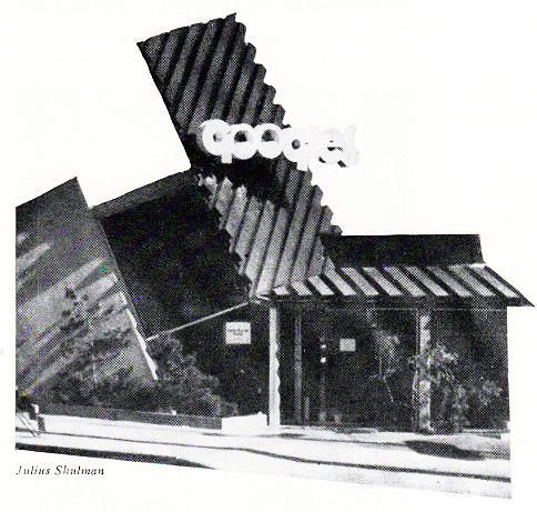
The design of coffee shops was nicknamed “Googie” after architect John Lautner’s 1949 unique Los Angeles creation bearing that name. It featured expansive glass window walls, unusual angles and roof lines, prominent signs, and bright colors. [partial view shown above — it extended farther to the right]
The vocabulary of Coffee Shop Modern signals its inventiveness. Terms in a glossary by Alan Hess in his book Googie Redux include: amoeboid, boomerang, cantilevered canopy, diagonals, dingbat, flagcrete, folded plate roof, free form, hyperbolic paraboloid, starburst, steel web lightener, structural truss, and tapering pylon.
California coffee shops, often bearing nicknames of their owners (Norm’s, Biff’s, Ship’s, Hody’s, Sherm’s, etc.), were casual, unpretentious, comfortable, moderately priced, and open 24 hours. Compared to the inexpensive eating places of the Depression, they offered a cheerful example of luxury for the masses, or what has been termed “populuxe” (See Thomas Hines’ book of the same name). Contrary to the usual negative public reaction to modern architecture, the upstart designs of the coffee shops were well accepted.
Counter seats were usually spaced generously and built with cantilevered supports allowing for unobstructed floor cleaning. [see above] Many had walls of decorative stone. A 1955 news story about the newly built Carolina Pines Jr. at LaBrea and Sunset noted its imported Italian mosaic tile columns, Palos Verde stone walls, and custom-designed wall plaques, among other features. It also had a carpeted dining room and an outdoor patio eating area in a garden protected from road noise and dirt with decorative fencing. [see below]
The coffee shops also introduced exhibition cooking. Although Eastern diner-style eateries had long done their cooking in sight of patrons, coffee shops introduced stylish designs and materials to the cooking areas and kept them sparkingly clean.
And, oddly enough, considering that the coffee shops were open all night, many of them had cocktail lounges.
Coffee shops designed along the lines of Southern California’s soon spread across the country. In St. Louis there was the Parkmoor, Cleveland had Manners, and Denny’s, with its beginnings in California, flourished everywhere.
Of course, as was true with neon signs, there were critics, notably Peter Blake in his 1964 book God’s Own Junkyard. He lumped Googie-style designs with neon, billboards, subdivisions, and a general decline in the built environment.
Starting in the mid 1960s but gaining in the 1970s Googie style was rejected, and what has been dubbed the “browning of America” by Philip Langdon had begun. Now chain restaurants of the coffee shop type began featuring earth tones, mansard roofs, exposed wooden beams, hanging plants, and subdued lighting. The coffee shop type of suburban restaurant continued in chains such as Denny’s despite competition by fast food establishments. McDonald’s, which had itself begun with Googie styling, toned down its buildings.
The change was due in part to the Vietnam War, but I can’t help but wonder if Americans hadn’t already become disenchanted with power and wealth based on military might.
© Jan Whitaker, 2024




 It's great to hear from readers and I take time to answer queries. I can't always find what you are looking for, but I do appreciate getting thank yous no matter what the outcome.
