
Colorful matchbooks advertising restaurants became popular in the 1930s and remained commonplace into the 1950s. Every time customers lit a match they were reminded of the restaurant. As a catalog of the Match Corporation of America put it in referring to matchbooks with 20 matches: “20 Lights, 20 Reader-exposures . . . twice that if inside printing is used.”
Usually matchcover collectors remove matches from their covers, but the exceptions are the feature matchbooks. In that case, the printed matches are as much of an attraction as the covers, as the above examples show.

Many feature matchbooks were a product of the Lion Match Co. in Philadelphia. The company also made contour matchcovers which incorporate die cuts as shown here.

This batch shows the simple type of matchcover. The two taller ones are salesman’s samples — which are considered worthless by serious collectors. However, I value them just as highly as others because I am primarily interested in graphics.

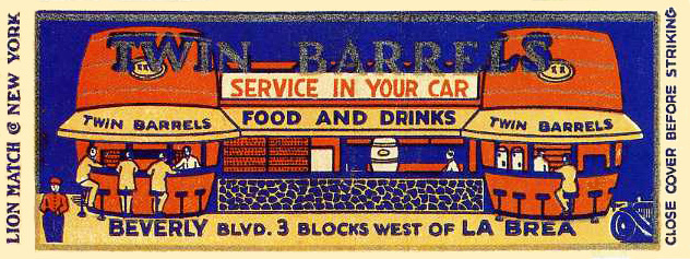

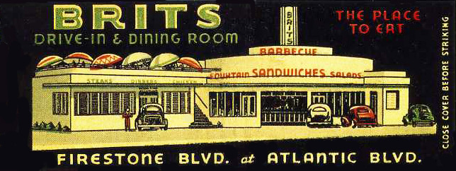
These full-length matchcovers were perfect for horizontal restaurants, particularly for diners and Western roadside places.

Stock matchcovers such as these would have cost restaurant proprietors less since they involved no original artwork on the part of the manufacturer. It’s likely that they were used mainly by cafes and basic eateries. Though I know nothing about The Patio in St. Louis, I somehow doubt that waiters there wore tuxedos.
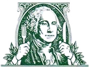
While I was investigating the subject of restaurant matches, I happened upon an amusing incident involving a restaurant’s matchcover design and the Secret Service. In 1977, shortly after the opening of George’s-on-Washington, a Houston TX barbecue place, the Secret Service showed up and confiscated 15,000 matchbooks bearing an image similar to that on the $1 bill. The grounds were that they violated federal counterfeiting laws. However when the owners challenged the seizure in court a U.S. District Judge ruled that the logo did not violate federal law and ordered the matches returned.
In the 1980s numerous American match-producers, which had been doing less and less business with restaurants and in general, failed. One exception was Universal Match that did a big business with Las Vegas hotels and eating places.
Although some restaurants use matchbooks today, designs are usually simple and (sigh) tasteful. Michael Greer, a home decorator who published a 1962 book called Inside Design, would be relieved. He was very particular about small items around the house such as a pink toothbrush in a fancy gold bathroom or an “antagonistically colored soap.” And he laid down the following rule regarding matchbooks: “Restaurant matchbooks are name droppy to leave around if the restaurant is elegant or in another country, demeaning if it is not.” For your own good, do be careful!
If you are interested in viewing more restaurant matchcovers, you might find this site’s 11,278 examples entertaining.
© Jan Whitaker, 2023


 It's great to hear from readers and I take time to answer queries. I can't always find what you are looking for, but I do appreciate getting thank yous no matter what the outcome.