In the second half of 19th century restaurant decoration – in restaurants that had any — was mainly the work of painters who created baroque fantasies on walls and ceilings. Rooms reserved for female diners seemed to be more likely to be well decorated. An example was a ladies’ Refreshment Saloon on Broadway in New York in 1853 painted by someone simply referred to as Delamano. It’s likely he was the same Signor Delamano who painted scenery for a minstrel production with tableaux featuring Uncle Tom and Little Eva five years later.
Unfortunately I don’t know what the women’s decor of 1853 looked like. But for men, a standard decorative focal point was a painting over the bar of a reclining nude woman. Presumably men enjoyed these paintings, though one dissenter in 1884 declared barroom artwork a tasteless and degraded “decorative nightmare” aimed at “gamblers and the swell-mob.” To little effect – such paintings survived well into the 20th century, continuing to define spaces as male turf.
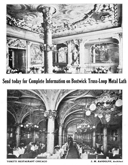
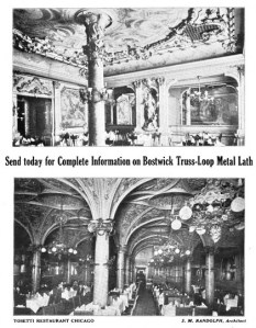 Along with friezes and murals, a full-service painting and decorating firm was likely to be able to handle plaster ceiling decorations and room moldings. In the case of the excessively ornate, carved and gilded Tosetti Restaurant opened in Chicago in 1895, decorators were aided by metal grillwork attached to the ceiling which was then covered with elaborate plaster work and lunettes painted to depict historic scenes.
Magnificence had become more attainable in the 1880s with the availability of Lincrusta-Walton, a thin version of linoleum that was embossed and paintable. It was waterproof and altogether superior to papier maché reliefs that had been used earlier. An era of exuberant gorgeousness was about to begin.
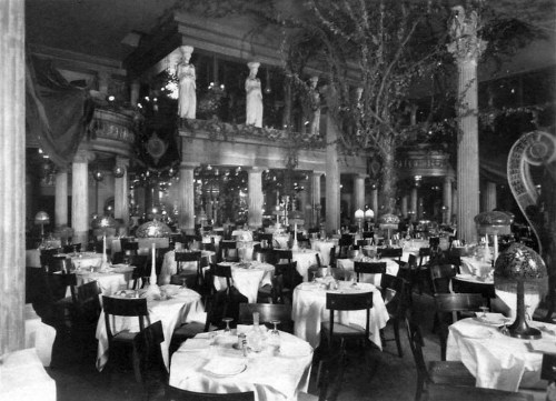
Theatrical decor reached a peak in the work of Henry Erkins, who designed the short-lived, Babylonian-styled Café de l’Opera and the opulently ridiculous Murray’s Roman Gardens in New York, shown here in 1908.
 Decorative materials such as Lincrusta [shown here] were especially popular in the decades when restaurants were designed as empty boxes, ready for a decorator. As explained in Interiors Book of Restaurants (1960), architects from earlier eras had “designed buildings from the outside in, often giving no more thought to the appearance of the interior than the use of appropriately designed moldings, paneling, stairways, and other architectural details which would relate the style of the interior to that of the exterior.” The rest was left to a decorator who would finish the interior in the period style selected.
Later, particularly around the mid-20th century, the process was reversed, with architects working from the inside out, often in collaboration with an integrated design team that might include lighting and kitchen consultants along with interior designers. The integrated inside-out process was manifested in the California coffee shop of the late 1940s and 1950s.
Of course hiring a professional design team presumes a well-capitalized restaurant. Many restaurants, of course, had no architect, designer, or decorator unless it was the owner or an associate, and this remains the case today. In stark contrast to restaurants designed by prominent designers and decorators such as Raymond Loewy Associates or Dorothy Draper [see top, coffee shop at The Greenbrier], were the everyday 20th-century cafes and lunchrooms that had no decor whatsoever other than advertising calendars and soft drink posters.
For a long time, only luxury restaurants enjoyed the services of professionals, but that had begun to change with the emergence of chain lunchrooms in the late 19th and early 20th centuries. They adopted functional designs meant to make the most of a storefront location from a business standpoint. Rather than beauty or faux-luxury, they built their reputations on cleanliness, efficiency, and brisk, moderately priced food service.
Although there have been some well-known restaurant designers, they tend to remain behind the scenes, largely unknown to the dining public. Certainly the designers of lunchroom and cafeteria chains were not celebrated. It’s likely that some of them were employees of restaurant supply companies, such as Vulcan Equipment and Supply Co. of Birmingham AL, which claimed in the 1950s to be “One of the South’s Finest Restaurant Designers,” specializing in “beautiful and serviceable” restaurants.
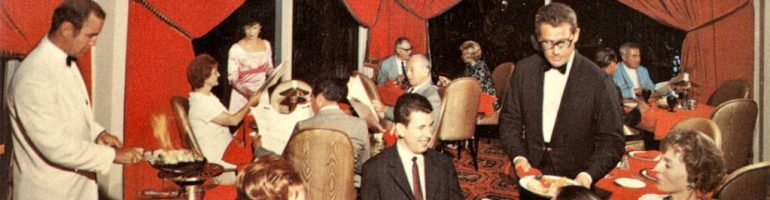
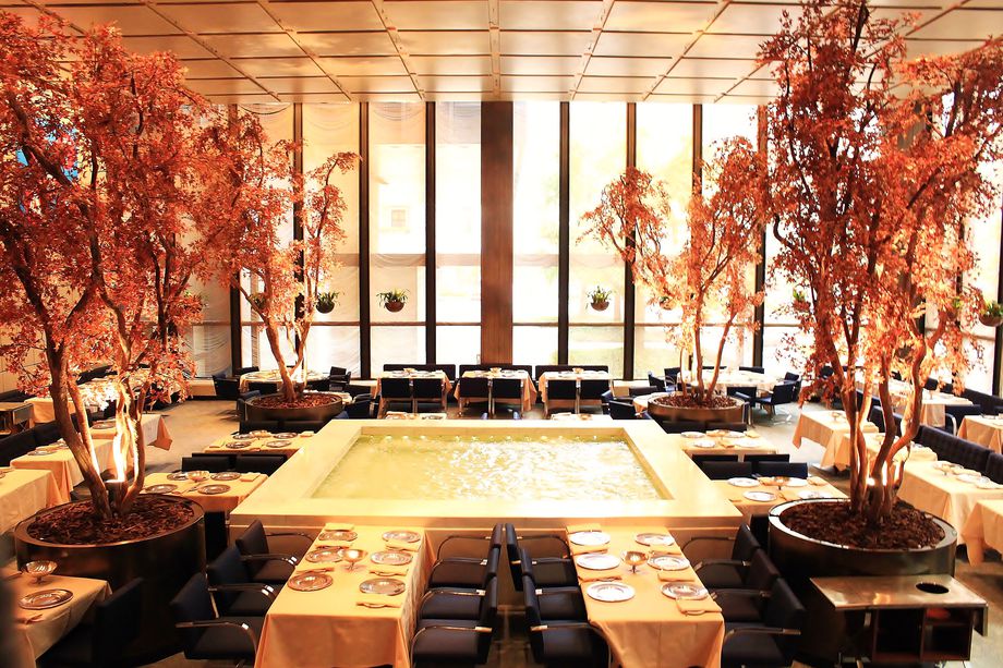
After World War II restaurant design came into its own, with firms that specialized in just that, handling not only dining room decor, but kitchen layouts, lighting, furnishings, and even the design of distinctive uniforms, tableware, and menus. In the case of restaurants owned by New York’s Restaurant Associates – such as the Forum of the Twelve Caesars, Leone’s, the Four Seasons [see below], La Fonda del Sol, and others, each restaurant had its own logo appearing on menus, matchbooks, ashtrays, and in advertisements.
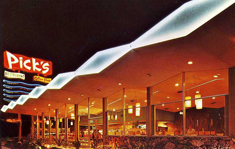
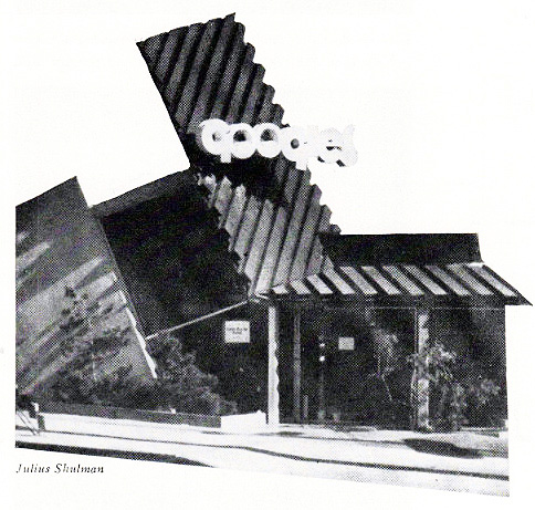
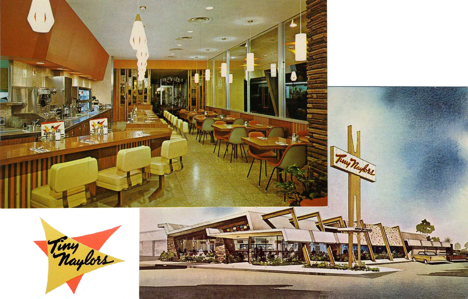
 Although New York City had many restaurants by top designers, California proved a strong rival in the 1960s when restaurant patronage soared there. A new restaurant type had evolved, the “California coffee shop,” combining elements of drive-ins, coffee shops, cocktail lounges, and dinner houses. They occupied specially designed structures that used novel angles and signage, with modern interiors that were said to reduce labor costs and speed up service. Among the leading designers were IRS, Inc., responsible for designing and developing more than 2,200 California coffee shops by the mid-1960s, and Armet & Davis, hailed by Alan Hess (Googie, Googie Redux) as responsible for making “Coffee Shop Modern . . . a major popular modern style.” Hess identifies a specialized architectural vocabulary applicable to these styles, one that includes terms such as boomerangs, dingbats, folded eaves and plates, and hyperbolic paraboloids. [Biffs, Los Angeles, Dougles Honnold architect]

The Four Seasons, opened in 1959 in NY’s Seagram Building, represented the height of luxury restaurant design, not only because it employed a top flight of designers but also because everything in it was custom designed to the tune of $5.5 million. The decor changed with the seasons, from the interior trees and plants right down to the color of waiter uniforms and matchbooks. The recreated Four Seasons, about to open at a new address, reportedly cost $30 million, which works out to $6.2 million less than the present-day value of the 1959 project [measuringworth.com].
In the 1970s and 1980s, the growing popularity of theme restaurants brought about new kinds of decorating services, as well as a growing industry of collectors who amassed warehouses full of objects of all sorts, ranging from antiques to wagon wheels and dentists’ chairs. One such business, originating in the late 1950s, was Oceanic Arts in suburban Los Angeles which grew to be a major supplier and manufacturer of Tiki decor.
By the later 20th century anyone opening a first-class restaurant faced a host of requirements beyond heightened customer expectations of decor. They ranged from managing utility demands, fire and health regulations, accessibility issues, and, in California, earthquake proofing. By 1990 costs began in the hundreds of thousands, easily escalating into the millions, even when dealing with a location in pre-existing building.
Restaurant design has come a long way from Lincrusta and potted palms.
© Jan Whitaker, 2018


 It's great to hear from readers and I take time to answer queries. I can't always find what you are looking for, but I do appreciate getting thank yous no matter what the outcome.