Category Archives: decor

Famous in its day: Well of the Sea

A short time ago I had a chance to visit the fascinating second floor of the Fishs Eddy store in New York. It is piled high with not-for-sale dishware of all kinds, collected by the store’s owner Julie Gaines. The collection includes restaurant ware from the golden past when this country still produced such things. (Tours of the collection, hosted by Julie, are given periodically and booked by the New York Adventure Club.)

The Fishs Eddy collection also includes records from china producers that show pattern designs. A page from Shenango China in Newcastle PA — closed in the 1970s — depicted the design for a plate made for use at the Well of the Sea restaurant in the former Hotel Sherman in Chicago. (A ca. 1950 painting of the restaurant by Cal Dunn is shown at the top of this page. Below is a plate using the above Shenango design.)

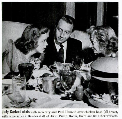
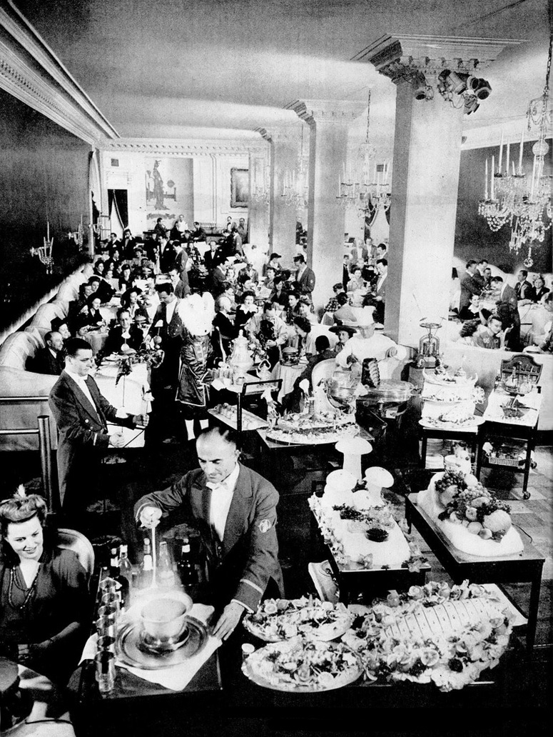
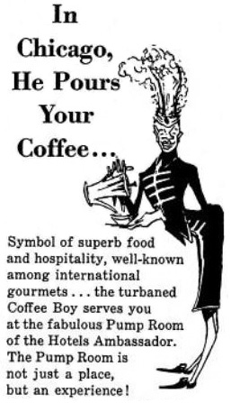
The restaurant opened late in 1948 in the hotel’s basement, which no doubt suggested an underwater theme to the hotel’s owner, the colorful and theatrical Ernie Byfield. He had also originated the over-the-top glamour restaurant, the Pump Room in the Ambassador Hotel.

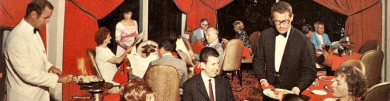
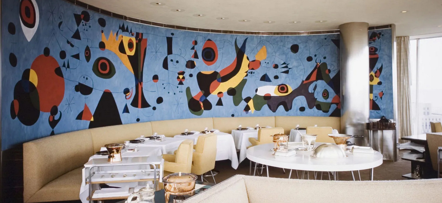
A number of abstract murals of underwater scenes by Richard Koppe, Chicago painter and student of the German Bauhaus, decorated the walls of the restaurant. One of them was used for the menu’s cover shown below. The room was further enhanced by darkness and other-worldly ultraviolet lighting.

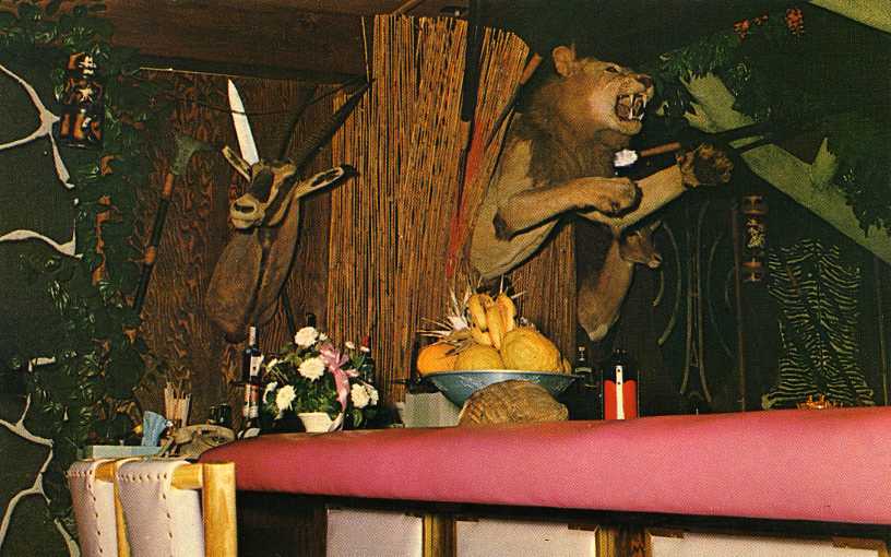
In addition to the murals, Koppe also contributed wire fish and light sculptures somewhat visible in the black and white advertisement of unknown date. The color menu depicted one of the murals.

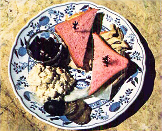
Needless to say, the restaurant specialized in fish, with frequent shipments coming in by air. It was especially known for what was called Black Clam Chowder made with Madeira wine, clams, and many herbs and spices. A portion of a menu is shown above.

Another unusual feature of the Well of the Sea was the attached art gallery in which the work of Koppe and other Chicago artists was displayed. The exhibit of Richard Koppe’s work took place in December, 1949, one year after the restaurant’s opening.

In 1968 the Sherman’s general manager explained that the ultraviolet light used in Well of the Sea was glamorous when it illuminated jewelry and white shirts but not when it lighted false teeth. But the customers liked it anyway despite the room being so dark that waiters had to assist them with flashlights in order to read menus. In 1968 a glow-in-the-dark menu was introduced to make reading easier.

Exactly when the dishware inspired by Koppe’s murals and designed by Shenango Potteries’ Paul Cook came into use in the restaurant is not known with certainty. According to Margaret Carney, whose International Museum of Dinnerware Design in Kingston NY features many pieces of dinnerware from the Well of the Sea, the design shown on the Shenango file page above was probably not used until 1954. What preceded it is unknown.

The Well of the Sea was popular from the start and stayed in business until 1972, a year before the Sherman itself closed.

© Jan Whitaker, 2024

5 Comments

Filed under atmosphere, decor, menus, Offbeat places

Continental cuisine comes to Orange County

In the mid 1950s Geril and Gosta Muller arrived on the west coast. They were born in Denmark and had graduated from a Hotel and Restaurant School in Copenhagen in 1943. Following that Geril had served royalty at a Royal Gun Club. [Gosta (left of then-president Nixon) and Geril, 1971, at Chez Cary]

After a few years in Reno NV, they would swiftly work their way to the top of the emerging luxury restaurant pyramid in Southern California, managing and eventually owning award-winning restaurants there.

In Reno, the brothers worked at a motel restaurant called The Bundox (meaning boondocks). After a few years Geril went on to San Francisco to work as manager of the Pink Chateau restaurant in the Continental Motel. It may be significant that the Pink Chateau featured steak cooked on a “flaming dagger,” because flaming food would be a featured attraction at their next engagement in Orange CA. There the brothers firmly established their reputations for creating and running fine restaurants. [above: River House Motel, home of The Bundox]

In 1965 the Mullers helped establish Chez Cary, named for owner Cary Sinclair. The Chez, as it became known, set a model for an exquisitely posh and precious style of “continental” restaurant-ing not found much outside San Francisco and Los Angeles at that time. Orange’s residents may have been well off but they were not used to dressing up for dinner. A suit and tie was a requirement at Chez Cary where princely male waiters threatened to outdress their wealthy customers. [1967 cartoon of Geril wearing tuxedo]

The brothers decorated the restaurant lavishly with red velvet upholstered swivel chairs, crystal chandeliers, silver candlesticks, fine china, and old world decorative objects. Geril rounded up a talented kitchen and dining room staff. And, of course, there was quite a lot of tableside theatrics, with salads tossed and dressed, sauces poured, and meats and desserts flamed.

There was a ladies’ menu – i.e., one with no prices — since madame couldn’t possibly be the one paying the bill. And there were ladies’ footstools under the tables. Why the footstools? I don’t know, but they seemed to impress reviewers.

In 1966 the restaurant reviewer from the Long Beach newspaper observed that the bill for a dinner with his wife came to $18 plus tip. But, he wrote, it was the sort of restaurant where guests were not supposed to care what the total came to. He gave it his highest rating: AAAA. While the brothers were at Chez Cary, acting as managers and maitre d’s, the restaurant won four Holiday Magazine Awards, an accomplishment generally attributed to the Mullers.

The Mullers remained at Chez Cary until 1973 when they opened their own restaurant, Ambrosia, in a Newport Beach location formerly occupied by a restaurant called Karam’s [shown above]. Their ability to win awards continued at Ambrosia [below: cartoon of Geril with a Holiday award, 1975].

Ambrosia strongly resembled Chez Cary in luxurious decor and smooth operation. According to one report the restaurant “served so many flaming dishes that at one point it had to get special permits from the town’s fire department.”

Evidently patrons found Ambrosia very comfortable. Five-hour-long meals were not unheard of. By the 1980s the typical tab for two had risen to $150. [Above, Ambrosia in Newport Beach]

But, alas, ten years after opening Ambrosia the building’s owner threatened to double the rent. The brothers hatched a plan to relocate Ambrosia to an elaborate and expensive new restaurant complex they built in Costa Mesa called Le Premier. But Ambrosia didn’t succeed in its new location, closing a mere two years after opening in 1983. Geril bitterly observed that Costa Mesa was not a good location for a first-class restaurant, saying there weren’t “enough well-traveled people in Costa Mesa” and “Anything exclusive will not work there.”

Despite declaring bankruptcy, the Mullers did not give up the struggle to revive Ambrosia. Another restaurateur had adopted the name Ambrosia and the type style the brothers had used. They sued him, hoping to get back the name. Then they bought the restaurant in Newport Beach that had taken over their former location there – 30th Street Bistro — planning to open a new Ambrosia once they won the suit. Sadly for them, they did not succeed.

© Jan Whitaker, 2024

10 Comments

Filed under decor, elite restaurants, proprietors & careers, restaurant prices

California coffee shops

With the end of World War II, the United States became the undisputed world power as well as the leading economy, producing the largest share of the world’s goods.

Many changes took place in American society as the soldiers returned. Suburbs sprang up with housing for growing families, shopping centers appeared, and many workers enjoyed prosperity. And a new type of eating place came into being, known as the “California coffee shop.” There had been coffee shops before that, but Southern California introduced new features, particularly in terms of design.

Triumph at the war’s end was celebrated with ticker-tape parades, but also in the design of cars and buildings, including the exuberant design of coffee shops in Southern California. The style of restaurant buildings that has also come to be known as “Googie” was modern, but without the severity of International Style. It used a wide range of materials developed in wartime, and forms inspired by the angles of fighter planes, the energy of the atom, and the bursts of bombs.

The inspiration for the striking designs of California coffee shops – known as Coffee Shop Modern – is frequently attributed to the space age, but over time the realization has grown that it was equally inspired by U.S. world ascendancy rooted in warfare. It may seem strange to attribute inspiration for a sprightly and bright type of architecture and interior design to something as ominous and deadly as the bomb, but a number of writers have made this connection.

In the words of Michael Sorkin’s essay “War is Swell” [in World War II and The American Dream, 1995]:
“That the atom so readily became a chipper symbol of American modernity in the immediate aftermath of its use as the greatest instrument of mass death in human history speaks volumes about the relationship of the accomplishments of war to the formal culture of peace. The decor of the fifties is all bursts and orbits, nuclei and energetic spheres. The atom was fully relegated to the class of things, isolated from life.”
[See also Elizabeth Yuko’s “Why Atomic Age Design Still Looks Futuristic 75 Years Later”]

Elements of coffee shop design can be seen in the look of automobiles of the same time. Some of the striking elements of California coffee shop design were echoed in the fins of Cadillacs inspired by the P-38 fighter plane. In Googie Redux, author Alan Hess, who has been largely responsible for recognition and appreciation of the creativity of Coffee Shop Modern, notes that Time Magazine called the 1959 Cadillac design the “ICBM [Intercontinental Ballistic Missile] look,” and also that “The Olds Rocket, the Olds Cutlass, and the Buick LeSabre were all names borrowed from aeronautics.”

The design of coffee shops was nicknamed “Googie” after architect John Lautner’s 1949 unique Los Angeles creation bearing that name. It featured expansive glass window walls, unusual angles and roof lines, prominent signs, and bright colors. [partial view shown above — it extended farther to the right]

The vocabulary of Coffee Shop Modern signals its inventiveness. Terms in a glossary by Alan Hess in his book Googie Redux include: amoeboid, boomerang, cantilevered canopy, diagonals, dingbat, flagcrete, folded plate roof, free form, hyperbolic paraboloid, starburst, steel web lightener, structural truss, and tapering pylon.

California coffee shops, often bearing nicknames of their owners (Norm’s, Biff’s, Ship’s, Hody’s, Sherm’s, etc.), were casual, unpretentious, comfortable, moderately priced, and open 24 hours. Compared to the inexpensive eating places of the Depression, they offered a cheerful example of luxury for the masses, or what has been termed “populuxe” (See Thomas Hines’ book of the same name). Contrary to the usual negative public reaction to modern architecture, the upstart designs of the coffee shops were well accepted.

Counter seats were usually spaced generously and built with cantilevered supports allowing for unobstructed floor cleaning. [see above] Many had walls of decorative stone. A 1955 news story about the newly built Carolina Pines Jr. at LaBrea and Sunset noted its imported Italian mosaic tile columns, Palos Verde stone walls, and custom-designed wall plaques, among other features. It also had a carpeted dining room and an outdoor patio eating area in a garden protected from road noise and dirt with decorative fencing. [see below]

The coffee shops also introduced exhibition cooking. Although Eastern diner-style eateries had long done their cooking in sight of patrons, coffee shops introduced stylish designs and materials to the cooking areas and kept them sparkingly clean.

And, oddly enough, considering that the coffee shops were open all night, many of them had cocktail lounges.

Coffee shops designed along the lines of Southern California’s soon spread across the country. In St. Louis there was the Parkmoor, Cleveland had Manners, and Denny’s, with its beginnings in California, flourished everywhere.

Of course, as was true with neon signs, there were critics, notably Peter Blake in his 1964 book God’s Own Junkyard. He lumped Googie-style designs with neon, billboards, subdivisions, and a general decline in the built environment.

Starting in the mid 1960s but gaining in the 1970s Googie style was rejected, and what has been dubbed the “browning of America” by Philip Langdon had begun. Now chain restaurants of the coffee shop type began featuring earth tones, mansard roofs, exposed wooden beams, hanging plants, and subdued lighting. The coffee shop type of suburban restaurant continued in chains such as Denny’s despite competition by fast food establishments. McDonald’s, which had itself begun with Googie styling, toned down its buildings.

The change was due in part to the Vietnam War, but I can’t help but wonder if Americans hadn’t already become disenchanted with power and wealth based on military might.

© Jan Whitaker, 2024

22 Comments

Filed under chain restaurants, decor, family restaurants, popular restaurants, restaurant decor, restaurants

Psychedelic restaurants

The short-lived psychedelic “theme” did not become popular in restaurants to the same degree that it did in the music world. But when you think about it, that’s not too surprising. [Trident menu, ca.1969]

As decor, a psychedelic interior made generous use of strobe lights and brightly colored paint. The decor was most likely to turn up in a teen club or a nightclub, such as Mother’s in San Francisco in 1969. Just reading a one-sentence description of Mother’s interior “with walls that modulate, colors that pulsate to music, hallucinatory lights . . .” is enough to make me queasy. Scarcely an environment for dining!

Interiors were meant to mimic the effects of LSD without the aid of drugs. This makes sense for music clubs, but it’s hard to see what it might lend to a café’s ambience.

Nevertheless there were a scattering of restaurants and cafes throughout the country in the late 1960s and early 1970s that were referred to in the press as being psychedelic in some sense. It was not always clear what that meant other than having psychedelic decor with bright colors or swirls.

The psychedelic Uptown Café in Madison WI, for instance, was decorated with fist-sized rocks “handpainted psychedelically [with] pop swirls.” But surely it took more than that to categorize the café as psychedelic. What that might have been is unknown.

Like the “Uptown Café,” some so-called psychedelic eating places had names that weren’t at all suggestive of grooviness, such as Dino’s in Tampa FL, the Great Society in Minneapolis, and the Feed Store in Chicago. In 1969 the Feed Store was firebombed, with police assuming that the perpetrator was someone in the neighborhood who disliked hippies and their psychedelic decor.

Although the natural food movement emerged at the same time as the interest in exploring consciousness via drugs, it would seem that not all psychedelic restaurants embraced it. Haight-Ashbury’s main gathering spot for the area’s hippies was The Drogstore, so named to avoid the obligation to fill prescriptions. Tabletops there may have featured “psychedelic linoleum” but the menu was centered on ordinary hamburgers, minestrone, and soft drinks.

Other eating places shown on a Haight-Ashbury tourist map of the late 1960s could have been just about anywhere judging from their commonplace designations, such as Mexican Restaurant, Pizza Joint, and Grinder Joint.

Outside of San Francisco, the 1969 Temptations’ hit pop song Psychedelic Shack inspired several places to adopt that name, one in Belle Glades FL and another in Salt Lake City. Like so many psychedelically inspired eating places and clubs, they were aimed at young people.

A bit later, after the Haight-Ashbury scene had dispersed, mainstream commerce discovered psychedelics – and it was odd. Burger King’s “Love” postcards and Mattel’s Barbie embraced a watered-down version evidently acceptable to the majority of Americans in a way that hippies were not. The “vibe” was detached from all meaning other than swirling color and made its appearance slightly after the movement had lost its center in San Francisco. Yet it was undoubtedly an attempt to appeal to teens. Burger King gave away its postcards for patrons to send on Valentines Day, 1972.

The best known psychedelic restaurant was Sausalito’s Trident, owned for a number of years by the Kingston Trio. It had a swirling ceiling and wild-looking menus. The early menu shown above listed natural foods but later ones featured many conventional items such as steak, plus alcoholic beverages said to be generally rejected by hippies. By 1970 it had become a favorite of tourists, and reportedly entertained “the hip and many society names trying to be hip.”

The Trident’s early menus were filled with cosmic advice in tiny type, dispensing such pseudo wisdom as “One must rise by that which one falls,” and “You can’t know what is in if you’re never off.” However, the messages at the menu’s bottom brought the patron back to earth with a thud, advising, “Sorry we do not accept checks,” and “When necessary, table service minimum of $3 per person.” [Click to see later Trident menus]

Nonetheless, another message from the Trident menu contains a wish for 2024: “May all our offerings please you. Peace within you.”

© Jan Whitaker, 2024

16 Comments

Filed under alternative restaurants, atmosphere, decor, Offbeat places

Image gallery: Redness!

The author of the book A Perfect Red identifies it as “the color of desire” and “the color of blood and fire.” She also notes that the color has often been associated with masculinity because it signifies power, prestige, and “heat and vitality.”

So it makes perfect sense that at one time it was popular as steak house decor. [above, Presto, Chicago, ca. 1970]

But it took a while to catch on. In the early 20th century the color red was strongly rejected by many Americans as inappropriate for clothing. Those who dared to wear red – or other strong, bright colors – were seen as low class and with questionable morals. The judgment was particularly harsh if the wearer was Black or an immigrant.

The use of red in home decor was also severely criticized. An elite Chicago woman’s club firmly rejected a trend toward Oriental-styled dens with red walls, piled-up cushions, and low lighting. One of the club’s members noted in 1903 that during a visit to a house with so-called “cozy corners” full of soft pillows she began to doubt that “the mistress of that home was a moral woman.”

Needless to say, though early women’s tea rooms sometimes adopted playful decorating themes, red was decidedly not a popular color scheme in them.

Despite its association with immorality (or maybe because of it?) red made a strong showing after World War II, especially in the mid-1950s through the early 1970s. It was often used in restaurant decor, especially for places that appealed primarily to men.

Red tended to be employed lavishly. It was variously used for carpets, painted wall and ceiling surfaces, columns, wallpaper, light fixtures, draperies, tablecloths and napkins, glassware, menus, upholstery for chairs and banquettes, and waiters’ uniforms. [above: That Steak Place, VA]

Sometimes an old-time theme was adopted, usually signaled by red-flocked wallpaper meant to conjure a bygone time of jollity that might suggest anything from the “gay ‘90s” to the “roaring ‘20s” to a brothel.

A 1955 book of decorating advice suggested that, in contrast to cool colors and bright lights, restaurants with warm colors and dim lights suggested luxury. The latter decor encouraged patrons to relax and was believed “to increase the size of his check.” Likewise, a bar decorated in red might encourage drink orders.

Of course red is more than warm, it’s hot! It can be difficult to imagine relaxing in some of the eating places that enveloped diners in redness. Such as, in particular, NYC’s Cattle Baron [shown above], which opened in 1967 in the Hotel Edison. If the red decor weren’t appealing enough, the restaurant’s owner seemed willing to revive an association with questionable respectability when he ran an advertisement picturing a nude female model marked with black lines indicating cuts of meat.

Whatever poshness and sense of luxury a red interior suggested, it began to wear off in the 1960s, and even more in the 1970s. In 1961, when a version of the NYC club known as Danny Segal’s Living Room opened in Chicago, a reviewer criticized the “engine red decor” with red light bulbs as “excessive” and amounting to “a satire on night club decor.” Also in the 1960s, an Oregon restaurant reviewer sneered at “that ubiquitous black and red decor which has almost become a stereotype of the snobbier bistros.”

Restaurants began ditching their red decor in the 1970s. The Colony Square Hotel in Atlanta installed a new restaurant called Trellises, causing a reviewer to applaud the disappearance of the “steakhouse/bordello gold and red decor.” The western Straw Hat Pizza chain decided in 1975 that Gay 90-style restaurants with red-flocked wallpaper were out of fashion. The Homestead in Greenwich CT hired NYC designers to come in and rip out their red carpets and red-flocked wallpaper for a country look with hanging plants, wood floors, and brick walls. [above, Harry’s Plaza Cafe, Santa Barbara]

Of course, the U.S. is a big country, full of diverse tastes and fashions, so it’s not a big surprise that there were (and are) some restaurants that kept their red decor.

© Jan Whitaker, 2023

9 Comments

Filed under atmosphere, decor, restaurant decor, restaurant fads

Caves, caverns, and grottos

I would have said that restaurants made to resemble caves represented a proprietor’s desperate attempt to rescue a windowless, underground space. Except . . . many restaurants of the early 20th century, when these sorts of restaurants became popular, had few or no windows yet they were not rigged up to resemble caves.

But it seems that the American public was discovering a fascination with caves and cave men in the early decades of the 20th century. In 1915 the Peter Pan, in the college town of Eugene OR, did seem to appeal to wannabe cave men, and possibly cave women too.

Perhaps the cave restaurants were spiritually related to beefsteak dungeons of a similar era where men sat on crates and ate steaks with their claws, er, hands.

I suspect another reason that cave-themed restaurants and clubs appeared in the teens was as a way to attract patrons during a time when drinking was becoming less popular. Prohibition of alcohol was not yet national law but many localities had banned it.

Or, if I wanted to get psychoanalytical about it, I might think that locating these night-clubby spots underground revealed a degree of shame in a culture once ruled by Puritanism.

Close to the turn of the century two hotels already had cave-like grottos built underground. In 1900 architect W. E. Loyer of Philadelphia designed a grotto for the Hotel Rudolph in Atlantic City. Five years later his grotto for a Boston hotel, the Revere House, opened. Like the Rudolph, it featured an all-women orchestra. According to Revere House advertising, light bulbs in the grotto sparkled “like jewels in an Aladin [sic] cave” where dining was “both weird and entrancing.” Even in August, cool breezes were said to “sweep across the room” where its “jagged sides” resembled “what might be found in some large underground cavern.”

Other hotels with caves and grottos for dining and entertainment in the teens and 1920s included the Ambassador in Atlantic City with its underground Neptune and Dolphin Grills, the latter filled with marble, cut glass, sea-green furniture, fish nets, life belts, shells, and more.

The Grunewald in New Orleans [shown here], the Mt. Washington Hotel in Bretton Woods NH, and the Redwoods Hotel in Grants Pass OR carried on the cave tradition.

New York City was a little short on cave/grotto restaurants but it did at least have one. According to The Grotto’s advertising it was a “romantic cave.”

Of course there were also eating stations in genuine caves designated as National Parks. I am hesitant to refer to some of their facilities as restaurants – particularly that of Carlsbad Caverns with its accommodations for 1,000 lunchers at a time, pictured here ca. 1962.

The whole idea of a cave-themed restaurant seems strange enough to me that I might have imagined they went out of fashion long ago. But of course they did not, and undoubtedly can be found today. In 1928 columnist O. O. McIntyre declared that Los Angeles was the foremost city for “stunt cafes and trick eating places . . . built in every fantastical and baroque shape imaginable.” However, since then cave-like eateries, though always sparse, showed up in a variety of cities and towns.

In the early 1930s, for instance, Binghamton NY had a restaurant called The Barn, which encompassed a Shell Room and a Chinese Grotto. The Grotto, whose special effects were the creation of its originator, David Stewart, offered the only Chinese food in Binghamton — accompanied by organ playing. I was surprised to discover that the restaurant’s cooking was applauded by a number of 1940s guidebooks.

The 1960s and 1970s saw restaurants such as The Cave in Cleveland which declared itself “a cave to end all caves.” An article revealed that its conversion from a pool hall involved the application of 16 tons of gray plaster accompanied by a poured Polyrock floor speckled with gold. The total effect, said the account, was “somewhat eerie and fascinating.”

In Fort Lauderdale FL, The Caves restaurant was designed to encourage diners to “journey to prehistoric days via the stone-age decor and hearty feasting.” But, they were assured, they would be made comfortable with “luxurious pillows” and “soft lighting,” two things seriously lacking in nature’s version.

© Jan Whitaker, 2023

7 Comments

Filed under alternative restaurants, atmosphere, decor, Offbeat places, theme restaurants

Glamming in Booth One

Before non-stop coast-to-coast air travel became common, actors and performers relied on the railroad to cover long distances. Usually this involved changing trains in Chicago. Arriving there, weary celebrities were more than happy to be scooped up and whooshed off for lunch or dinner at the Pump Room.

Top celebrities were escorted to Booth One, a cushy white leather nest where their job was to field calls from gossip columnists and smile as the flashbulbs went off. Their lunch may have been on the house, but they earned it. [It’s likely Judy Garland is talking with a columnist in the above Life magazine photo, 1943] Of course both the stars and the restaurant got publicity out of the deal.

The Pump Room stood out as a notable publicity mill in part because it was in the middle of the country. On the coasts there were plenty of such venues – the Stork Club and El Morocco in New York, and Chasen’s and Romanoff’s in Los Angeles to name but a few.

But the Pump Room had a vibe all its own. [Life magazine photo showing a very crowded room, 1943]

In addition to being swanky — with dark blue walls, white leather upholstery and crystal chandeliers — and well connected to the gossip pipeline, the Pump Room drew attention for its culinary burlesque shows featuring costumed staff, flames, and choreography. Waiters – all white men – wore scarlet jackets and black satin knee pants, while the “coffee boys” – all young black men – wore emerald green or white uniforms with giant ostrich plumes seeming to spring from their foreheads. [see grotesque caricature shown below, 1957] There were also “curry boys” dressed in gold. Food was served from wagons except for that skewered on flaming swords.

The coffee servers took it upon themselves to compete in the art of coffee pouring. Competition involved seeing how far they could hold the pot and still manage to pour the coffee neatly into the cups. Management did not approve and stopped the contest, but not before the winner set a record of 5 feet. He said customers asked him to do it. Not unbelievable since it was, after all, in keeping with the spirit of the place. According to one observer, customers watching servers with flaming swords make their entrance secretly hoped “the adroit waiter will slip and ignite one of the highly combustible hats being worn this season.” This never happened.

In 1943, Life magazine visited the Pump Room, photographing a number of spectacular scenes, some of which were undoubtedly contrived for the sake of the story. The crowning photo was certainly that of the procession of waiters holding flaming swords. A flaming-sword dinner cost $3.50 at the time of the story, going up to $4.50 or $5.00 by 1949 according to the menu shown below.

The Pump Room emblemized the sardonic humor of its creator, Ernie Byfield, who also owned its home, the Ambassador East Hotel. Its 1938 creation may have been a desperation attempt to survive during the Depression, but Byfield had long been in the habit of befriending show business stars back when he headed the Sherman Hotel. In the Sherman’s night clubby College Inn, he had entertained actors, musicians, and others on “theatrical nights.” Through the years Byfield made friends with an extensive roster of Hollywood stars that included James Cagney, Bette Davis, and William Powell in the 1930s and Douglas Fairbanks, Mary Pickford and a long list of others in earlier times.

Ernie Byfield’s death in 1950 seemed to mark the beginning of a long decline. The Ambassador East and the two other hotels Byfield owned changed hands repeatedly while the Pump Room sagged. A few months after Byfield died, columnist Lucius Beebe noted in a Holiday magazine story that Ernie had always said, “I don’t want grim gourmets around my place. I want laughing eaters.” Beebe’s story made it clear that the Pump Room was meant to be amusing, even moderately ridiculous. Without its creator at the helm, it became difficult to set the tone while maintaining quality.

In 1962 a reviewer for the Michelin Guide visited the Pump Room and, according to a devastating Life magazine account, had a miserable dinner described as deviled turkey breast accompanied by “canned peas and what looked exactly like potato chips.” Equally horrid, Life reported, was the incompetent waiter who recommended a red wine that “not only foamed but tasted as though it were composed of a second-grade detergent.” Learning of the story, an Ambassador Hotel executive dug through that day’s food checks and found, according to a rapidly produced account in a Chicago newspaper, that the reviewer and his Life magazine companion (the story’s author) had each consumed a cocktail and then shared two bottles of wine. He also insisted that the turkey steak on the menu was never served with anything but grilled sweet potatoes and wild rice.

But the damage was done and the restaurant’s reputation continued to crumble. Not much after the Michelin bomb dropped, Irv “Kup” Kupcinet, its number one gossip columnist, who had created a version of the Pump Room in his own dining room, admitted that it wasn’t what it used to be. Cross-country airplane flights were becoming commonplace, eliminating Chicago stopovers and reducing the flow of celebrities into town. Even though the room was remodeled in the mid-sixties by new managers, it was unable to recapture the past glory.

Although loyal Chicagoans continued to support it, the Pump Room closed in 1976, after some years of low ratings and, it was said, grease-spotted menus and chipped glassware. Everything was auctioned, included Booth One. Then came a new owner, Rich Melman, of the Lettuce Entertain You restaurant group which included Jonathan Livingston Seafood, Lawrence of Oregano, and others. He remodeled it in glamorous fashion and ran it for 22 years. After that it had various owners, including Melman once more who ran it as Booth One.

© Jan Whitaker, 2023

3 Comments

Filed under atmosphere, decor, elite restaurants, Offbeat places, uniforms & costumes, waiters/waitresses/servers

Digesting the Madonna Inn

The Madonna Inn complex in San Luis Obispo CA, including a fantasyland motel, wedding venue, shops, and restaurants, represents the genius and determination of a rugged male individual – assisted by his wife — conquering all obstacles to build a dream.

Alex Madonna had been planning his project from 1953 if not earlier. The motel opened in the full sense of the word in early 1959, but it was not until a couple of years later that the complex was furnished with eating facilities.

Although all along it has had plenty of overnighters, honeymooners, lunch and dinner patrons, banqueters, and gawkers who love it, the place has also had detractors. Among their assessments: “a fantasy run amok,” “the epitome of lousy taste,” and “a crazy, outrageous Hansel-and-Gretel complex.”

Madonna Inn lore credits its unorthodox design to Alex and Phyllis Madonna’s untutored creativity. Alex, according to legend, speedily dismissed the architects he initially consulted. Yet, up until the end of 1958 Madonna worked with plans developed by Beverly Hills architect Louis Gould, a former Hollywood film set designer. And as late as 1966 an advertisement for an apartment complex Gould designed credited him with other “outstanding landmarks . . . including the famed Madonna Inn.” To the extent that the Inn’s exterior achieved any coherence, it may be due to his early influence.

Yet there was a point where no professionals guided the design, as revealed especially in the striking – to me jarring – use of large stones and boulders. The two most celebrated rooms – a men’s public bathroom with a urinal flushed by a waterfall and the Caveman Room [shown above] – prominently feature these materials.

Throughout the interior, the combination of stones and boulders with bright primary colors, artificial flowers and vines, gilded cupids, figured textiles, and plush carpeting is disturbing. The Inn’s eating places exemplify the common observation that many American restaurants are more about decor than food. This was especially true of the primary dining room, the Gold Rush Room [shown below]. Its jangling decor, superficially suggesting luxury but not allowing the eye to rest, is out of keeping with fine dining where food is the star.

A Los Angeles Times reviewer said he lost his appetite in the Gold Rush Room after viewing the giant tree with “fat, glossy, grinning cherubs, spray-painted gold and swimming in Pepto-Bismol.” Alex Madonna responded with a letter defending the room’s centerpiece. The 25-foot tall tree, he pointed out, had been “hand-crafted” on the spot out of “electrical conduit and copper remnants left over from building projects.” The pink, he wrote, was inspired by a visit to Hawaii where it was used lavishly in hotels and restaurants. At one point, even the Inn’s bread and sugar were pink.

The images of the Madonna Inn shown here are difficult to date, but most are probably from the 1960s and 1970s. Everything was subject to change and frequently overhauled. As a 1973 story in the Los Angeles Times observed, Alex Madonna perpetually thought up new ideas, one being an indoor lake featuring a floating cocktail bar that patrons would reach by canoe. The room would have been furnished with a snowflake machine and a three-story fireplace that burned entire trees. That dream did not materialize, nor did the plan to build another motel complex atop the San Luis Mountain behind the Inn that he bought from the city of San Luis Obispo in1972.

The Inn’s basement Wine Bar below the Gold Rush Room featured boulders incongruously festooned with vines and blooming flowers, a beamed ceiling, and chairs fashioned from barrels. If the wine list was anything like the coffee shop’s, it too would have specialized in Lancers and Paul Masson selections such as Rosé and Sparkling Burgundy, along with Port and Sherry aperitifs.

Lunch and supper specials on a ca. 1960s coffee shop menu were also uninspired. They included low-calorie choices such as Ground Beef Patty with Cottage Cheese, and entrees like Top Sirloin Steak with Cottage Cheese and Peaches. “Chilled” Tomato Juice as an appetizer.

The 1960s and 1970s were not distinguished decades gastronomically, and in that sense the Inn was typical. Patrons might be thrilled with the oversized pastries available in the coffee shop, but otherwise the fare did not receive many comments. A few observed that it was nothing special and overpriced. Recent photos taken by guests are not flattering, though it’s only fair to admit that they may reflect Covid-era staffing issues.

The Inn was hailed in the 1970s by fans of vernacular roadside architecture, such as John Margolies, as well as some influential writers and scholars. Not only did Margolies declare the Inn’s meals “delicious,” he considered the complex “a labor of love” designed to make people happy” and “a place where things that don’t go together go together.”

Hmm. I’d say that in the Gold Rush Room’s Christmas scene, among others, things could never go together.

© Jan Whitaker, 2022

13 Comments

Filed under decor, food, odd buildings, Offbeat places, popular restaurants, proprietors & careers

What were they thinking?

I have often been struck by how many postcards fail to present restaurants at their best. Most of those I’ve chosen for this post are from popular restaurants, some of which stayed in business for a very long time and were well loved.

But the whole idea behind postcards was to extend the appeal of a restaurant beyond its regular patrons, to those who perhaps never even heard of it. What would strangers think about the places associated with these self-presentations?

Why show an exterior like this?

I don’t know what explains the sad appearance of the Olympia Oyster House. It was a popular spot that had been around for decades, but the front of the building in 1971, with its high-school-gym style and blanked out window, does not seem attractive even to the people in the photo. It seems they can’t quite bring themselves to enter.

Apparently the Hilltop Restaurant, shown here in 1960, was listed for sale for an extended period of time. Years and years — all the while doing business. Nothing like a patch of weeds to set off a place.

The names!

Please, no more Squat-N-Gobbles! Such a strange name for a white-tablecloth restaurant advertising “Dinner by Candlelight.”

And yet, having no name at all doesn’t work well either.

Identity crisis

As names go, Mammy’s Kitchen is offensive, and, in the case of this 1970s Myrtle Beach restaurant, does not seem to have anything to do with either the food or the strange atomic symbol hovering overhead. Its cuisine is likewise heterogeneous, covering the usual steaks and chicken, but also offering “Italian Kitchen and KOSHER SANDWICHES.” New management took over in the mid-1980s but the objectionable name from an earlier age was still in use as late as 2019.

The Wolf’s Den in Knox, Pennsylvania, opened in 1972 in a very old barn that had been decorated with plows, saddles, old rifles and such. The section called the Hay Mow is shown on this card. Something about the dusty appearance of dried out straw and the chains and hooks does not convey an enjoyable dining experience. According to a 1977 review, the restaurant was expensive and served “standard American fare” such as escargot and French onion soup. I’m confused.

Do these look delicious?

German pancakes have been a favorite at Pandl’s Inn in Whitefish Bay, Wisconsin, for decades. The trouble is they don’t photograph at all well. It is also a mystery to me why anyone would accompany a large pancake with a basket of bread and rolls.

A similar problem afflicts the specialty ice cream pie at Tripp’s Restaurant in Bar Harbor, Maine.

The postcard was almost certainly created to celebrate the opening of the Sirloin Room at Dallas’ Town and Country Restaurant in 1951. Of course steaks are brown, plus this one seems to be resting in a pool of its own juices. I can see that some touch of color was needed, but maybe this parsley is a bit much.

Threatening interiors

Probably when you’re actually in King Arthur’s Court, a room at the Tower Steak House in Mountainside, New Jersey, the deadly implements wielded by the suits of armor recede into the distance and the blood red carpeting is barely noticeable. But in this shot they loom disturbingly.

No, the lion is not actually holding a gun, but she is showing her teeth in a menacing way. Likewise those antelope horns look sharp at the Kenya Club in Palm Beach, Florida.

This light fixture? sculpture? installation? might just be the ugliest I’ve ever seen. Let’s hope that it was well connected to the ceiling of the William Tell Restaurant in Chicago. Then there are the inset wall displays, and . . .

© Jan Whitaker, 2022

13 Comments

Filed under decor, food, odd buildings

Restaurant murals

It’s likely that most Americans are familiar with restaurant murals. They have appeared in a range of restaurants, from sandwich shops to expensive dining resorts. They reveal how much restaurants are related to the arts, not only as producers of fine food but as patrons of the visual arts.

Admittedly, many of them are artistically tame. As someone quipped in 1976, “Talk about murals and most people think of Greek ruins or Venetian canal scenes in Italian restaurants.” I could add scenes of Switzerland, Paris, or of any city or town. And then there are generic mountains, seascapes, and rolling plains. In most cases, restaurant murals have served as upbeat but unobtrusive decorative backgrounds, filling blank walls, often in windowless rooms.

Nevertheless, some murals portraying local scenes have managed to rise above the norm. That was certainly true of one commissioned by a McDonald’s at the request of a local Hawaiian artist, Martin Charlot [portion shown here], in the mid 1980s. It featured lively portraits of over 100 area residents in poses that illustrated proverbs (but in ways that are far from obvious). Despite its popularity with customers at the Kane’ohe shopping center McDonald’s, it was removed in a 2010 remodel.

Occasionally a mural will illustrate controversy. In 1991, after disputes with the Pasadena CA’s bureaucracy over a neon sign at the Rite Spot café, artist Kenton Nelson created a portrait of the city that included scenes of city workers shoveling money into a truck and a doughnut-eating policeman ignoring a mugging. In Northampton MA, owners of the Green Street Café anticipated its coming 2012 closure with a 30-ft long last-supper-themed mural by children’s book author and illustrator Jeff Mack [shown above]. It vanished when the landlord — with whom the restaurant had been wrangling for years – demolished the building.

Mack’s mural has a humorous tone, a quality shared by others such as those at Chicago’s Normandy House, by Edgar Miller; The Waverly Inn, by Edward Sorel; The Waldorf-Astoria, by Tony Sarg; The Carlyle Hotel, by Ludwig Bemelmans; and those by artistic patrons of the early-20th century Coppa’s in San Francisco.

In the late 1930s a dozen or more artists were hired and given freedom to create satirical murals at NYC’s left-leaning Café Society, including Anton Refregier, Ad Reinhardt, and William Gropper. The mural shown above on a graytone postcard was by Alice Stander for the original Greenwich Village location. It depicts a customer in a typical nightclub besieged by a photographer, cigarette “girl,” and others trying to make a sale. Café Society’s mural artists were paid relatively small amounts supplemented by equal payment in free meals.

Quite a number of well-known artists have created restaurant murals over the course of the 20th century, among them Howard Chandler Christy (The Café des Artistes, NYC), Guy Pène du Bois (The Jumble Shop, NYC), Edgar Miller (Normandy House, Chicago), and Maxfield Parrish (Hotel Knickerbocker, moved to Hotel Regis, NYC).

Beginning in the late 19th century, hotels were the sort of businesses especially likely to hire muralists. Before World War I, the murals were usually meant to convey a sense of luxury in the style of baroque European palaces. Nudes and near-nude nymphs and goddesses from myth, with titles such as “The Daughters of Hesperia,”and “The Sirens Beguile Odysseus,” were almost taken for granted in New York’s grand pre-war hotels.

By 1948 a very different sense of luxury was evident in the Terrace Plaza Hotel in Cincinnati, designed by the architecture firm of Skidmore, Owings, and Merrill. In the lobby was an Alexander Calder mobile, while one dining room had a mural of Cincinnati buildings by Saul Steinberg and another had a surrealist mural by Joan Miró which is now in the Cincinnati Art Museum.

Perhaps because they were often windowless, restaurant and hotel bars were the most likely locations for murals. Not only was this true of Maxfield Parrish’s Old King Cole mural [above], but also of the fourteen murals by Greenfield MA’s Thurston Munson. He was commissioned in the 1940s to adorn the walls of a basement barroom at Hartford CT’s popular Adajian’s Restaurant. [sample below] As was so often the case with barroom murals, some of the paintings included female nudes.

It seems as though murals with nudes evaded the censors in the 19th century, but the country’s uneasy relation to alcohol after Prohibition often brought official crackdowns when they appeared in bars and restaurants. In the 1970s a Hackensack NJ restaurant was threatened with cancellation of its liquor license unless it covered up a nude in a mural illustrating classical Greek mythology. I doubt this was an isolated case.

I can’t say whether there was a golden age of restaurant murals, or just how many restaurants have them now or have had them in the past. But it is worth taking notice when a restaurant hires an artist to create original art for the enjoyment of its guests.

© Jan Whitaker, 2021

9 Comments

Filed under decor