Restaurants have long tempted the public with displays of food, but in the 20th century it became possible to replace actual food with images of desirable dishes on colored postcards and illustrated menus.
Color photochrome postcards became standard after WWII, yet it wasn’t until the 1970s and 1980s that menus illustrated with full-color photographic images of food came into common usage.
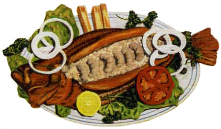
 In the 1930s and early 1940s, before photochrome postcards came into widespread production, linen-finish postcards were the norm. Their cartoonish coloring often lacked realism. For example, the grayish shrimp topping stuffed flounder at Manuel’s in Galveston TX look distressingly like worms.
Even as quality photography and printing became more available in the 1950s, restaurants weren’t always successful in portraying food attractively. Professional food stylists had yet to arrive on the scene to solve problems such as poor plating, monochromatic food combinations, and runny gravies.
 Regarding poor plating, a large portion is all very fine but should an order of meat or fried fish be bigger than the plate?
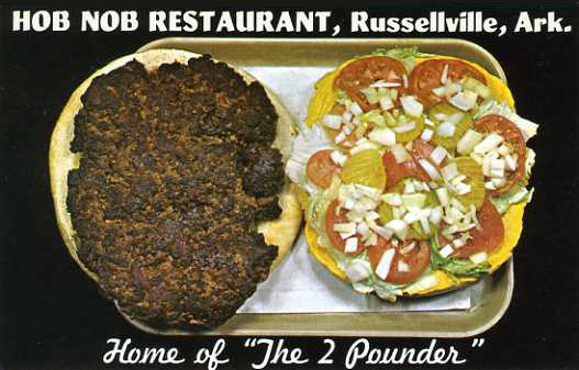
 Gargantuan food itself can be questionable, not only to consume but also to look at. How attractive are french fries almost as big as baked potatoes? Is a two-pound burger eight times better looking than a quarter pounder?

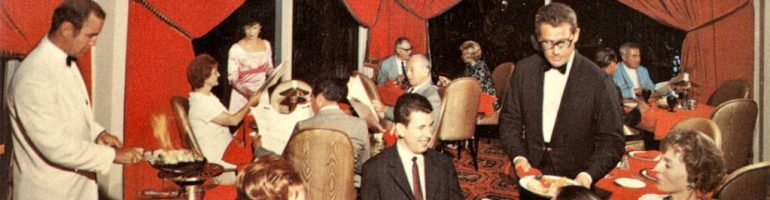
On menus, photos of food play multiple roles, providing information about “exotic” dishes, invoking desire, and steering choices. In the case of restaurants whose dishes – or drinks in the case of Polynesian theme restaurants — might be unfamiliar to some patrons, pictures serve as visual description.
 As far back as the 1930s, some restaurants used illustrated menus but with images that appeared to be hand drawn and colored and almost comical compared to the realistic photographs that dominated chain restaurant menus by the 1980s. Full-color, laminated menus are most often found in 24-hour coffee-shop restaurants and present all the meals and dishes that are available; breakfast, lunch, and dinner often have no clear demarcation.
Laminated menus cost more to produce than others yet are relatively long-lasting because they can be wiped off — though, as often noted, rarely are. Their lifespan is about 3 to 6 months, after which prices and dishes need updating.
Unlike Indian, Chinese, or Mexican restaurants (especially in the years when they were new to many diners), dishes found on illustrated menus of chain restaurants – such as bacon and eggs, pancakes, or burgers — are not the least bit unfamiliar. Quite the opposite.
Which seems to raise the question of why such ordinary food needs to be illustrated at all.
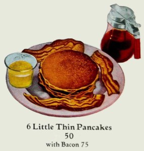
Not too surprisingly the main role of photos is to encourage customers to order the restaurant’s more profitable dishes. It’s always possible to order a single pancake or fried egg, but it is certain that what will be pictured is instead a stack of three pancakes or two eggs with sausage or bacon.
Featured dishes are positioned to follow the paths typically taken by customers’ eyes. Prized locations include the menu’s center and top right. Another tactic, one that turns the whole menu into an eye-catching circus, is to place featured dishes inside brightly colored boxes.
 As for dishes that don’t get top billing, a Denny’s advertising director observed that a hopelessly slow seller like a grilled cheese sandwich would be line-listed, no photograph. On a 1970 Tops Big Boy menu [shown here], beef and shrimp achieved center feature status but ham and fish dinners failed to make the cut, languishing in a line-list.
 I am still left wondering why many dishes on illustrated menus look so unattractive, especially considering that the menus are often produced after extensive research and consultation with experts. On a three-panel 1985 Friendly’s menu a “100% Sirloin Steak Burger” looms over the center column at a scale larger than other features such as a Clamboat Platter and a Seafood Salad Plate, yet it utterly fails to project charisma.
Contrary to wished-for results, many diners view laminated, illustrated menus as a signal that a restaurant’s offerings are going to be bland and uninteresting. An Orlando FL restaurant reviewer complained in 1988 that many restaurants there used laminated menus: “It seems that no matter what type of restaurant I go to, or how much is charged for the average meal, the menu is plastic coated. It reminds me of the people who buy really nice furniture and then cover it in plastic.”
Illustrated menus have become so strongly associated with mediocre food that it is a huge mistake for an establishment aiming for the fine-dining category to use such a menu, even temporarily. But, believe it or not, such a restaurant existed in Phoenix AZ in 1983, with expensive entrees pictured in shiny plastic while the wine list was calligraphied and covered in velvet.
© Jan Whitaker, 2018


 It's great to hear from readers and I take time to answer queries. I can't always find what you are looking for, but I do appreciate getting thank yous no matter what the outcome.