Category Archives: atmosphere

A grandiose failure?

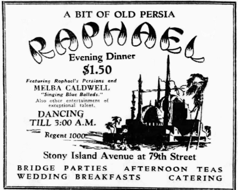
It’s difficult to assign a definite cause to the short life of Raphael’s, a Chicago restaurant that opened in October 1928 and seemed to have closed by the following July. It would make perfect sense if it had failed after the Wall Street crash at the end of October 1929, but it seems to have closed while the boom was still in progress. [Above: Detail of a platter from Raphael’s shown below, with a fanciful depiction of the building.]

Then again, Prohibition was in effect and that almost undoubtedly contributed to failure. But whatever the cause, Raphael’s on Chicago’s south side didn’t even make it to its first birthday as far as I can tell.

Judging from its exotic design, the restaurant clearly had grand aspirations. Its financial backing totaling $300,000 amounted to a small fortune at that time, equal to nearly $5,700,000 today. At least two thirds of the capital came from a major Chicago investment banker. The remaining $100,000 presumably was furnished by the restaurant’s nominal owner, Edwin Raphael.

In June of 1928, as construction began, the Chicago Tribune ran a snarky story that managed to insult the design as well as Chicagoans’ taste in general. It said that the building “should make one think he’s in Persia, provided he doesn’t know too much about Persian Architecture,” and that it was aimed at “Chicago’s epicureans – if we have any.” [Above: Raphael’s main dining room in 1929]

The layout of the building accommodated a small tea garden inside the front door that was outfitted with trees and fountains. Next came a two-story dining room accommodating hundreds, with a ceiling imitating a blue sky with twinkling stars and surrounded on all sides by a balcony that also held tables for guests. Two ends of the building provided people entering from the street access to two interior lunch counters with soda fountains. [Above: one of the lunch counters, but looking strangely like a bar.]

With its minaret, the building reached 60 feet in height and was visible for miles along all three major streets that crossed there. The minaret was used for advertising with neon lighting and a crescent on top. The illustrations used for this building, whether on the restaurant’s dinnerware [shown above] or in advertising, took great liberty in portraying it. [Below: April 1929 advertisement that imagines the building with two domes, four minarets, and palm trees!]

The main dining room featured a band named Raphael’s Persians. Their performances could be heard on the radio at night.

The March 1929 issue of The American Restaurant Magazine hailed Raphael’s for its ability to merchandise meals by “stealing the thunder” of night clubs and offering them stiff competition while putting food “foremost.” When the radio audience listened to the Raphael’s orchestra, the story said, they would feel that the restaurant had “an air of mystery about it” and want to visit “Chicago’s most exclusive restaurant.” But did they?

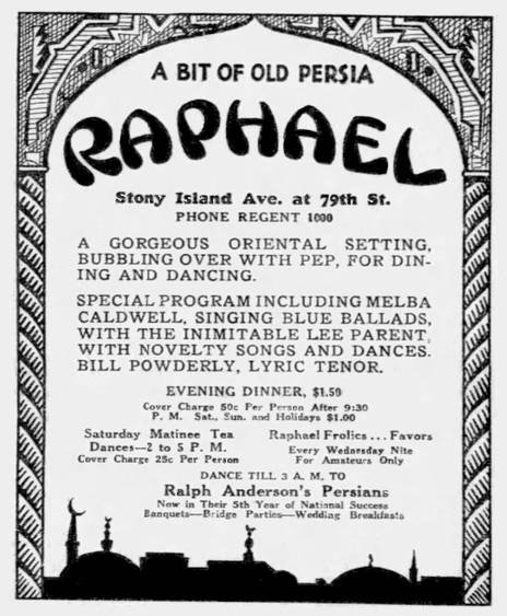
The combination of three types of eating places in one business was an odd one, something that would be more understandable in a hotel than a restaurant. It would seem as though the tea room and the snack bars would keep earlier and shorter hours than the restaurant/nightclub which stayed open until 3 a.m. and that this would cause staffing problems. By June of 1929 Raphael’s had figured out more ways of making money, as is shown on the advertisement below, such as afternoon dancing, an additional cover charge, and higher cover charges on weekends, but it’s likely that it wasn’t enough.

The trade journal also hailed Raphael’s for its modern kitchen facilities that were filled with the latest mixing machines, ranges, refrigerators, warmers, etc., proving “that the kitchen methods of this modern restaurant are a far cry from the methods employed when the members of Persian tribes would prepare feasts for their shahs.”

A reader of The American Restaurant would be left with the idea that Raphael’s was an elegant place catering to a clientele with sophisticated tastes. But that idea was dashed in a story written by a young reporter who spent a night there playing the part of a “shy cigaret girl.” Over the course of the evening male patrons hit on her nine times. She also observed people drinking alcoholic drinks, probably enhanced by their own whisky flasks. The crowd included teenagers. By June of 1929, the restaurant was reduced to featuring a “crystal gazer” on the balcony named Allah Mahalla. So much for elegance!

Despite serious searching I could find no advertising, nor any mention of the Raphael restaurant at all after July, 1929. In 1940 the address was mentioned as the location of a bunco party (a dice game) hosted by a political group. In 1947 the building, then occupied by a beauty supply warehouse, was auctioned for taxes. It sold for a mere $14,027 plus payment of back taxes of $11,259. The second floor was offered for rent in 1948, and it may have been then that the American Legion moved in. [Above: Could the Hippodrome have occupied the building when this advertisement ran in 1938?]

However, according to a recent Chicago Sun Times story by architectural critic Lee Bey, Raphael’s continued in business until WWII, and “later converted into the American Legion South Shore Post 388.” I haven’t been able to find out why he thought Raphael’s stayed in business that long.

Another eating place that might have once occupied the building (in addition to the Hippodrome) was the Kickapooo Inn. Its address was given as 7901 Stony Island in a 1957 obituary notice for its owner.

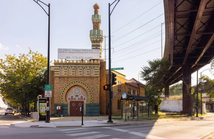
The building was acquired by The Haven of Rest Missionary Baptist Church in 1966 and used for church services until 1977 when they built a new church. Now the church is seeking a grant to restore the building, hoping it can be reopened in a few years as a community center. [Above: the building as it appeared recently.]

If any reader has information about this building and its uses over time, I’d love to hear from you. It could assist the church in applying for grants.

© Jan Whitaker, 2025

2 Comments

Filed under atmosphere, night clubs, odd buildings, Offbeat places, restaurant decor

Restaurant psychology

My last post about a restaurant designer who applied psychology to his work inspired me to look further into this subject.

I discovered that when the restaurant world was experiencing hard times there was a turn toward psychology, though of course that wasn’t the only inspiration. In the 1920s, when liquor sales became illegal, expensive restaurants were inspired to look harder for ways to please their guests. A proprietor whose famous eating place had to close warned others that “What the restaurant loses in the revenue from wines and liquors it must make up in psychology.” Evidently in his case, this realization came too late.

Canny cafeteria operators, though never dependent upon liquor sales, were already using psychology on their guests in the 1920s. And as early as 1927 a psychology professor appeared at restaurant conventions to give attendees help in figuring out “What do people like and why?”

Psychology often veered into what I would call blatant manipulation, for instance in cafeterias. Cafeterias tried such things as enlarging trays so they looked empty unless the customer loaded up. They also placed desserts on eye-level shelves that were the first thing the hungry customer saw as they entered the cafeteria line.

In later years other manipulative ploys in everyday eating places would include uncomfortable seating and bright colors that shortened customers’ stays, as I have previously written about.

The Depression and WWII put a damper on psychology advising, but it returned in the 1950s. A strange example was a Hollywood therapist who made a practice of visiting a restaurant called The House of Murphy. He went table to table giving customers, many of them actors, his analyses of their psyches. I would not think they appreciated some of his insights, such as when he told Gary Cooper that he was a “withdrawn introvert.” As for dining, his verdict was that “A very large meal is an escape mechanism.” As he saw it, “The customer is gorging himself in order to have a sense of security and power.”

Other restaurant psychologists turned to writing columns for newspapers. Dr. George W. Crane, for instance, focused on sloppy waitresses who failed to meet his standards, that of a “glorified mother.” “And be sure to smile,” he advised them, “for this makes you a psychotherapist who helps the morale, appetite and even the digestion of lonely, moody and fearful souls.” All for 50 cents an hour?

By the 1970s restaurant psychology had taken leaps forward and was a tool of restaurant designers, beginning with interior and exterior design and assistance with restaurant concepts, naming, advertising, and public relations.

In 1977 David Stevens, then considered a leading restaurant designer, had a hand in the design of 100 restaurants, including fast food chains Hobo Jo, Humpty Dumpty, the Mediterranean in Honolulu, and a number of Bobby McGee’s, as well as the Mai Kai in Fort Lauderdale [shown below]. He believed a restaurant had to be in tune with the “emotional trend of the nation.” In 1977 he favored nature themes and booths to “give the public something to lean on” at a time of nationwide insecurity due to a weak economy. Though he declared that the rustic look was “out,” he admitted that heavy beams could sooth tension.

Another slant on booths came from a designing couple who proclaimed that they served as “a womb surrounding and hiding customers who don’t want to be seen, especially if they’re a little overweight.”

Plants were tricky according to some. In 1980, the part owners of Ruby Tuesday’s Emporium noted plants could be used very strategically. “If you’re aiming for college-age patrons,” they advised, “there should be floor plants.” On the other hand, young professionals liked hanging plants which they said, “denote a higher degree of sophistication.”

In 1983, restaurants had not recovered from the recession of the previous year. In Broward County, Florida, with its 2,600 restaurants, there was a high failure rate in the first year of the recession. Some restaurants sought help from an industrial psychologist who trained staffs in empathy with the customer, and taught them to how to handle uncomfortable situations.

The emphasis stayed on servers at the National Restaurant Association’s annual conference the following year. A psychology professor from Denver’s School of Hotel and Restaurant Management was on hand to instruct participants in their “real” business: not selling food and drink, but in fulfilling people’s needs. Servers were to smile, answer questions, and show interest in what the customer was ordering. They were to nod their heads, and say “I see“ and “uh-huh.”

Of course, by this time it was taken for granted that interior design was important. In 1984 some thought that the nation was “longing to return to simpler times.” In design this was frequently interpreted as early-American themes, barn siding, and huge beams.

But in Houston a design team had a very different interpretation. They preferred to give new restaurants a worn, slightly dirty, look. To achieve this they gave walls a few stains and planted handprints around light switch plates. Customers were to feel they didn’t have to be super careful, that spills were perfectly ok. The Atchafalaya River Café gave an aged look to the building formerly occupied by the Monument Inn. They covered part of the roof with battered tin, deliberately left paint splatters on the front window, and used old doors for the front, pasting them with bumper stickers, all in the belief “that tacky, comfortable design makes people happy.”

Why not a country theme? Well, as the designers of the Atchafalaya River Café liked to say: “Pastoral scenes are deadly to a good time in restaurants. Customers feel mother or grandmother is watching every move.”

Bringing another sense into play, noise became part of design in the 1980s. Designer Leonard Horowitz said in 1986 that at the Crab Shack in Miami, where diners smashed crabs with wooden paddles at their tables, “ear-splitting volume is one of the things that makes the Crab Shack so popular with many of its customers.” He thought it was because people “enjoy feeling like part of a party or performance.” He also noted that while noisy spaces felt festive they also encouraged quick turnover, which of course greatly enhanced profits in popular places.

By the late 1990s, and very likely before that, having a professional designer versed in restaurant psychology was common, particularly in the case of restaurant chains. That was especially true in restaurants that aimed to entertain as well as to provide food. The word for this is “eatertainment” in recognition that food is only one reason that people patronize restaurants.

© Jan Whitaker, 2025

8 Comments

Filed under atmosphere, patrons, restaurant decor

Fear of restaurants?

In a talk he gave at the National Restaurant Association convention in 1965, restaurant designer Richard Kramer observed that “Eating and drinking are anxiety-evoking situations that reduce man’s independence and make him regress to a child-like dependency.” Going into a restaurant made him feel “angry because he is hungry and also dependent on someone else to feed him.”

I find it so interesting how he linked anxiety and anger, not to mention restaurants and anger.

He applied this mostly to men. By contrast, I would think most women then would have felt grateful and relaxed when going to a restaurant because someone else would be doing the cooking and clean up.

Kramer, who said he had studied psychology and psychotherapy, had a very successful career as a restaurant designer and founder of Integrated Design Associates in Los Angeles in the 1960s. The company continued in business long after he retired in the 1980s. IDA won 6 of 19 awards given by a national magazine in 1964, two of them for the restaurant El Gaucho in Beverly Hills’ Wilshire House [shown above].

In addition to El Gaucho, IDA’s clients included Hyatt Hotels, a couple of Playboy Clubs, the Balboa Bay Club, Chez Voltaire in the Beverly Hills Rodeo Hotel, the Little Corporal in Chicago, Quivira Inn in San Diego, Dobbs Houses at the Dallas/Fort Worth Airport, eating facilities in the Air Resort Hotel in Fresno and the Friendship International Airport in Baltimore, The Lodge of the Four Seasons in Missouri’s Ozarks, and a number of western Sirloin Pits.

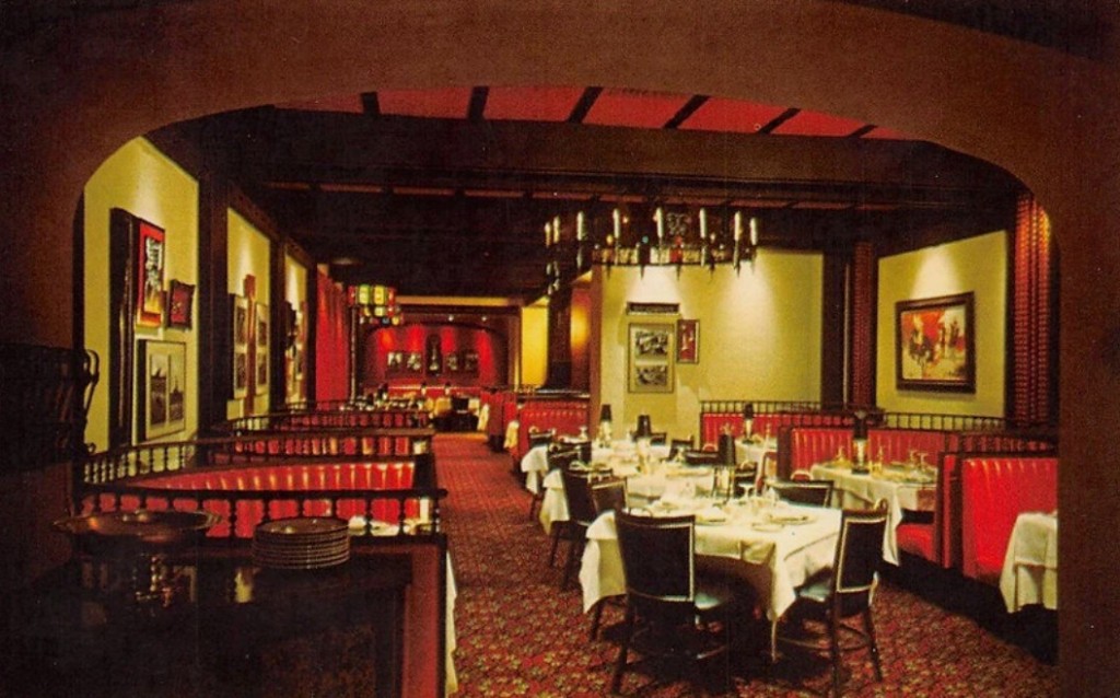
After reading Kramer’s approach to design I could only wonder what his interiors looked like. Although I could find very few images of restaurants he designed, I noticed that he seemed to like to use the color red, a color that has been linked strongly to mid-century restaurants especially attractive to male diners. I was surprised when I saw the red interiors, mainly because I don’t see redness as soothing. But perhaps the role of red in restaurant decor was to suggest luxury more than to soothe an anxious, angry diner. [above: Chez Voltaire]

His observations were that people eating in restaurants “want to be taken care of in a basic psychological sense.” They choose restaurants that make them “feel secure.” But he was also aware that a restaurant had to present a sense of luxury if guests were to “enhance their status and bolster their egos.” He wrote that “The designers’ task was to find a balance between extravagant formality and boring familiarity.” Otherwise their interiors might fail to “activate a buying mood.” Another hazard was that the diner might decide that a restaurant served bad food, according to Kramer, who declared, “To any angry, anxious person, the best food can have no taste except bad.”

Who knew that the stakes in restaurant design were so high?

© Jan Whitaker, 2025
9 Comments

Filed under atmosphere

Famous in its day: Well of the Sea

A short time ago I had a chance to visit the fascinating second floor of the Fishs Eddy store in New York. It is piled high with not-for-sale dishware of all kinds, collected by the store’s owner Julie Gaines. The collection includes restaurant ware from the golden past when this country still produced such things. (Tours of the collection, hosted by Julie, are given periodically and booked by the New York Adventure Club.)

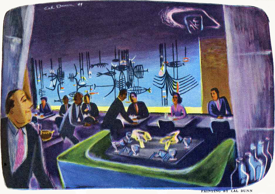
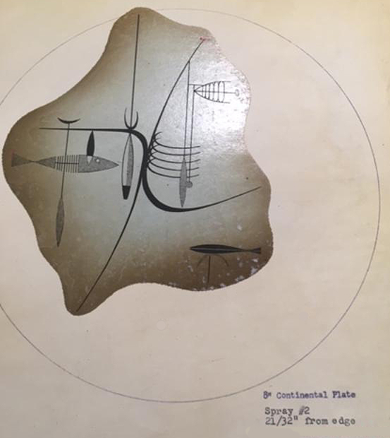
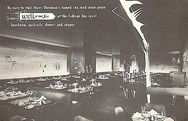
The Fishs Eddy collection also includes records from china producers that show pattern designs. A page from Shenango China in Newcastle PA — closed in the 1970s — depicted the design for a plate made for use at the Well of the Sea restaurant in the former Hotel Sherman in Chicago. (A ca. 1950 painting of the restaurant by Cal Dunn is shown at the top of this page. Below is a plate using the above Shenango design.)

The restaurant opened late in 1948 in the hotel’s basement, which no doubt suggested an underwater theme to the hotel’s owner, the colorful and theatrical Ernie Byfield. He had also originated the over-the-top glamour restaurant, the Pump Room in the Ambassador Hotel.

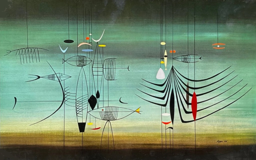
A number of abstract murals of underwater scenes by Richard Koppe, Chicago painter and student of the German Bauhaus, decorated the walls of the restaurant. One of them was used for the menu’s cover shown below. The room was further enhanced by darkness and other-worldly ultraviolet lighting.

In addition to the murals, Koppe also contributed wire fish and light sculptures somewhat visible in the black and white advertisement of unknown date. The color menu depicted one of the murals.

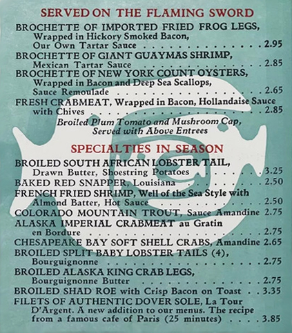
Needless to say, the restaurant specialized in fish, with frequent shipments coming in by air. It was especially known for what was called Black Clam Chowder made with Madeira wine, clams, and many herbs and spices. A portion of a menu is shown above.

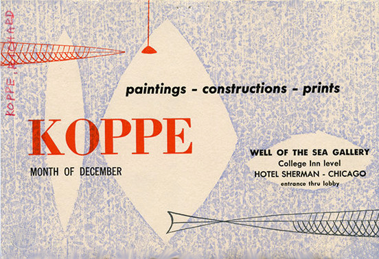
Another unusual feature of the Well of the Sea was the attached art gallery in which the work of Koppe and other Chicago artists was displayed. The exhibit of Richard Koppe’s work took place in December, 1949, one year after the restaurant’s opening.

In 1968 the Sherman’s general manager explained that the ultraviolet light used in Well of the Sea was glamorous when it illuminated jewelry and white shirts but not when it lighted false teeth. But the customers liked it anyway despite the room being so dark that waiters had to assist them with flashlights in order to read menus. In 1968 a glow-in-the-dark menu was introduced to make reading easier.

Exactly when the dishware inspired by Koppe’s murals and designed by Shenango Potteries’ Paul Cook came into use in the restaurant is not known with certainty. According to Margaret Carney, whose International Museum of Dinnerware Design in Kingston NY features many pieces of dinnerware from the Well of the Sea, the design shown on the Shenango file page above was probably not used until 1954. What preceded it is unknown.

The Well of the Sea was popular from the start and stayed in business until 1972, a year before the Sherman itself closed.

© Jan Whitaker, 2024

5 Comments
Filed under atmosphere, decor, menus, Offbeat places

Behind the scenes at Gonfarone’s

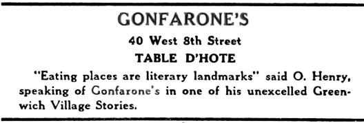
There is nothing as interesting (to me) as a memoir about a restaurant from an insider who reveals its workings not usually known to customers. Papa’s Table d’Hôte by Maria Sermolino is such a memoir, published in 1952, decades after her father’s ownership of the New York City restaurant, Gonfarone’s.

Maria’s career as an editor and writer was extensive. After graduating from the Columbia School of Journalism and spending a couple of years writing about post-WWI conditions in France, she interviewed Italian Fascist leader Benito Mussolini. Later she worked for Time, was the editor of The Delineator and for 11 years an associate editor for Life magazine. She attributed her lifelong unmarried status to overhearing conversations about women among waiters and from male guests invited by her father to join him at his table. [above, Maria at age 25, in 1920, the year she interviewed Mussolini]

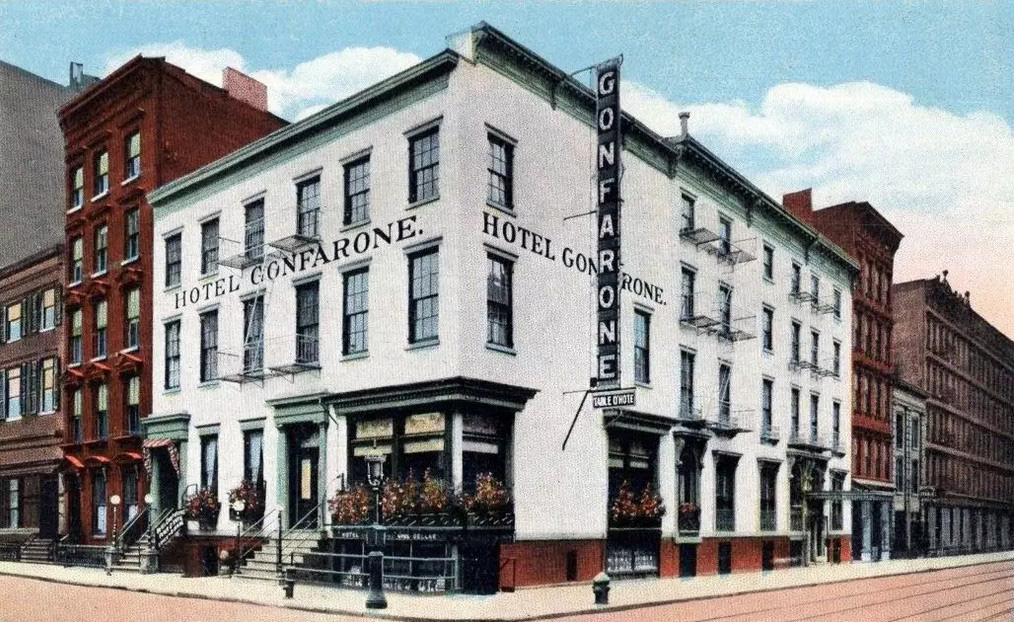
Gonfarone’s began in business around the turn of the last century as an Italian pension-type eating place, transitioning into a bohemian resort for Greenwich Villagers. It was run initially by Caterina Gonfarone who operated it in a basement on the corner of Eighth and McDougall streets. She soon partnered with Maria Sermolino’s father, Anacleto, who saw to it that the dining room was moved upstairs. Then, as neighboring residences were acquired by the partners, the popular Latin Quarter table d’hôte expanded to eventually accommodate 500 diners at a time. Sermolino soon acquired the restaurant from Madama Gonfarone, but kept her name.

After the Sermolino family moved into the complex of buildings (which also included a small hotel), Maria spent much of her childhood in the restaurant. Chapter 6 of her book is entitled “The Barroom Was My Playground.” She assisted her mother, the restaurant’s cashier, by spotting waiters who failed to pay her mother for drinks they ordered for customers at the bar. (They would have been reimbursed later, but without paying first they were able to keep the customers’ payments for themselves.)

But that is not the only way in which the staff tried to make extra money on the side. Dishwashers sold food scraps and fat to a company that made soap, with higher prices paid for barrels with more fat. On occasion Madama Gonfarone would catch a dishwasher pouring a large tin of unused lard into a barrel for a higher payoff. It was also common for the staff to smuggle out bottles of wine, chickens, lobsters, and other choice food items when they left at night. Her father refused to institute routine searches because he thought it would be bad for morale.

Because the restaurant was connected to a hotel, the bartender also acted as the room clerk. He took advantage of his position by renting rooms to prostitutes, even on occasion — when she was away — renting Madama’s room for more than double his usual charge.

Not all the restaurant’s customers were treated equally. Waiters would see to it that their favored regulars got larger portions, choicer cuts of meat, and less melted ice in their drinks. A standard menu, 50 cents on weeknights and 10 cents more on Saturdays and Sundays, featured Antipasto, Minestrone, Spaghetti, Salmon with Caper Sauce, a Sweetbread, Broiled Chicken or Roast Beef, Vegetables, Potatoes, Green Salad, Biscuit Tortoni or Spumoni, Fresh Fruit, Assorted Cheeses, and a Demi-tasse. In all likelihood the portions would have usually been on the small size.

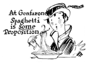
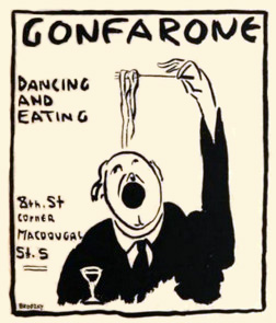
“By the simple act of ordering spaghetti an American was plunged into a foreign experience,” observes Sermolino. [above, 1916 advertisement from The Greenwich Village Quill; below, 1919 Quill]

All meals came with a glass of California claret, which the restaurant bought 40 or 50 barrels at a time, reducing their cost to ten cents a gallon. Apart from that free glass, which impressed many American patrons who were unfamiliar with wine and considered it exotic, the bar was a money maker. Maria called it “a gold mine.” A Manhattan cocktail — with cherry — cost 3 cents but sold for 15 cents, she explained.

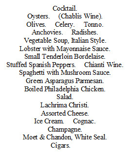
Banquet menus were grander and supplied more alcoholic beverages, as is shown in a 1904 menu above for a dinner given to honor a supporter of Democrats in the Tammany-controlled area occupied by the restaurant.

The restaurant’s best years were before World War I, when it was not unusual to serve four to five thousand dinners on an average weekday and double that on a good Saturday or Sunday, with waiting patrons spilling down the hall and into Macdougal Street. When food ran low the cooks would water the soup and waiters would offer patrons omelets.

With the onset of Prohibition, Maria’s father decided to get out of the business and concentrate on his other interest, real estate. Under new ownership, Gonfarone’s remained open for another 10 years, until 1930. The buildings were razed in 1937.

© Jan Whitaker, 2024

8 Comments

Filed under atmosphere, ethnic restaurants, menus, popular restaurants, proprietors & careers, restaurant customs, restaurant prices, waiters/waitresses/servers

Psychedelic restaurants

The short-lived psychedelic “theme” did not become popular in restaurants to the same degree that it did in the music world. But when you think about it, that’s not too surprising. [Trident menu, ca.1969]

As decor, a psychedelic interior made generous use of strobe lights and brightly colored paint. The decor was most likely to turn up in a teen club or a nightclub, such as Mother’s in San Francisco in 1969. Just reading a one-sentence description of Mother’s interior “with walls that modulate, colors that pulsate to music, hallucinatory lights . . .” is enough to make me queasy. Scarcely an environment for dining!

Interiors were meant to mimic the effects of LSD without the aid of drugs. This makes sense for music clubs, but it’s hard to see what it might lend to a café’s ambience.

Nevertheless there were a scattering of restaurants and cafes throughout the country in the late 1960s and early 1970s that were referred to in the press as being psychedelic in some sense. It was not always clear what that meant other than having psychedelic decor with bright colors or swirls.

The psychedelic Uptown Café in Madison WI, for instance, was decorated with fist-sized rocks “handpainted psychedelically [with] pop swirls.” But surely it took more than that to categorize the café as psychedelic. What that might have been is unknown.

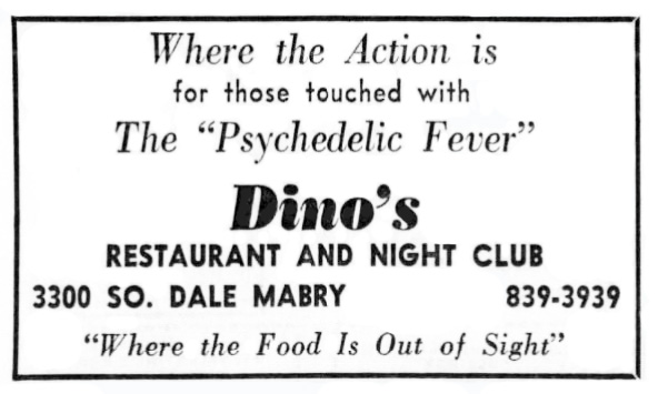
Like the “Uptown Café,” some so-called psychedelic eating places had names that weren’t at all suggestive of grooviness, such as Dino’s in Tampa FL, the Great Society in Minneapolis, and the Feed Store in Chicago. In 1969 the Feed Store was firebombed, with police assuming that the perpetrator was someone in the neighborhood who disliked hippies and their psychedelic decor.

Although the natural food movement emerged at the same time as the interest in exploring consciousness via drugs, it would seem that not all psychedelic restaurants embraced it. Haight-Ashbury’s main gathering spot for the area’s hippies was The Drogstore, so named to avoid the obligation to fill prescriptions. Tabletops there may have featured “psychedelic linoleum” but the menu was centered on ordinary hamburgers, minestrone, and soft drinks.

Other eating places shown on a Haight-Ashbury tourist map of the late 1960s could have been just about anywhere judging from their commonplace designations, such as Mexican Restaurant, Pizza Joint, and Grinder Joint.

Outside of San Francisco, the 1969 Temptations’ hit pop song Psychedelic Shack inspired several places to adopt that name, one in Belle Glades FL and another in Salt Lake City. Like so many psychedelically inspired eating places and clubs, they were aimed at young people.

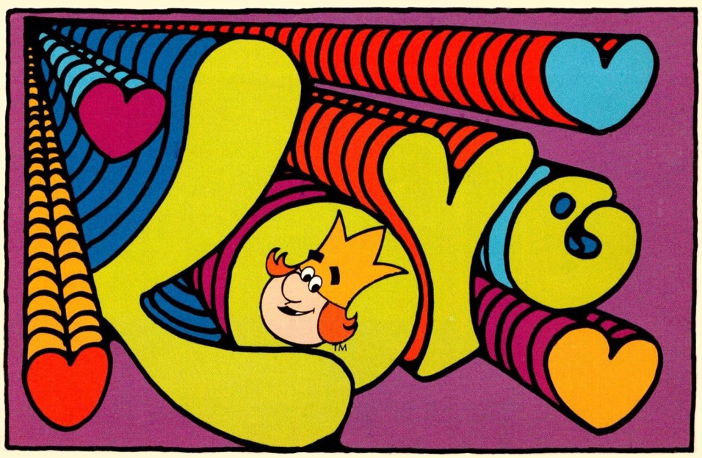
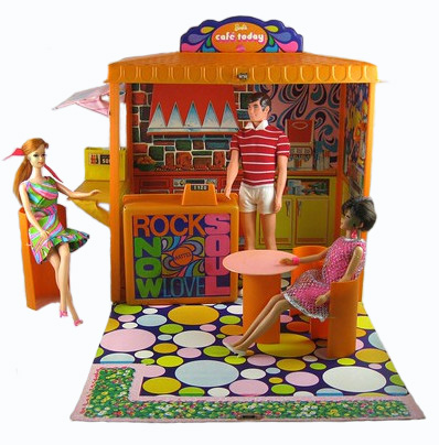
A bit later, after the Haight-Ashbury scene had dispersed, mainstream commerce discovered psychedelics – and it was odd. Burger King’s “Love” postcards and Mattel’s Barbie embraced a watered-down version evidently acceptable to the majority of Americans in a way that hippies were not. The “vibe” was detached from all meaning other than swirling color and made its appearance slightly after the movement had lost its center in San Francisco. Yet it was undoubtedly an attempt to appeal to teens. Burger King gave away its postcards for patrons to send on Valentines Day, 1972.

The best known psychedelic restaurant was Sausalito’s Trident, owned for a number of years by the Kingston Trio. It had a swirling ceiling and wild-looking menus. The early menu shown above listed natural foods but later ones featured many conventional items such as steak, plus alcoholic beverages said to be generally rejected by hippies. By 1970 it had become a favorite of tourists, and reportedly entertained “the hip and many society names trying to be hip.”

The Trident’s early menus were filled with cosmic advice in tiny type, dispensing such pseudo wisdom as “One must rise by that which one falls,” and “You can’t know what is in if you’re never off.” However, the messages at the menu’s bottom brought the patron back to earth with a thud, advising, “Sorry we do not accept checks,” and “When necessary, table service minimum of $3 per person.” [Click to see later Trident menus]

Nonetheless, another message from the Trident menu contains a wish for 2024: “May all our offerings please you. Peace within you.”

© Jan Whitaker, 2024

16 Comments

Filed under alternative restaurants, atmosphere, decor, Offbeat places

Image gallery: Redness!

The author of the book A Perfect Red identifies it as “the color of desire” and “the color of blood and fire.” She also notes that the color has often been associated with masculinity because it signifies power, prestige, and “heat and vitality.”

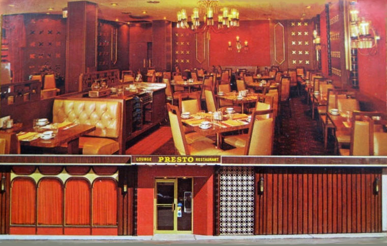
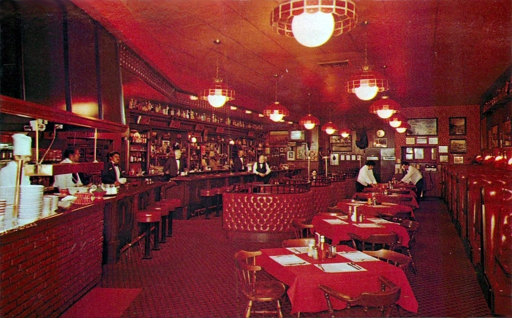
So it makes perfect sense that at one time it was popular as steak house decor. [above, Presto, Chicago, ca. 1970]

But it took a while to catch on. In the early 20th century the color red was strongly rejected by many Americans as inappropriate for clothing. Those who dared to wear red – or other strong, bright colors – were seen as low class and with questionable morals. The judgment was particularly harsh if the wearer was Black or an immigrant.

The use of red in home decor was also severely criticized. An elite Chicago woman’s club firmly rejected a trend toward Oriental-styled dens with red walls, piled-up cushions, and low lighting. One of the club’s members noted in 1903 that during a visit to a house with so-called “cozy corners” full of soft pillows she began to doubt that “the mistress of that home was a moral woman.”

Needless to say, though early women’s tea rooms sometimes adopted playful decorating themes, red was decidedly not a popular color scheme in them.

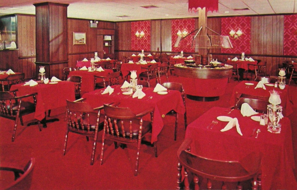
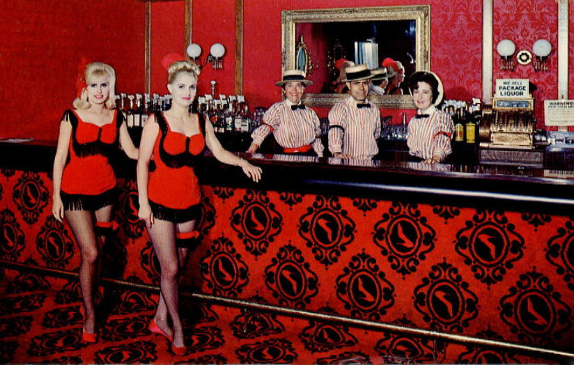
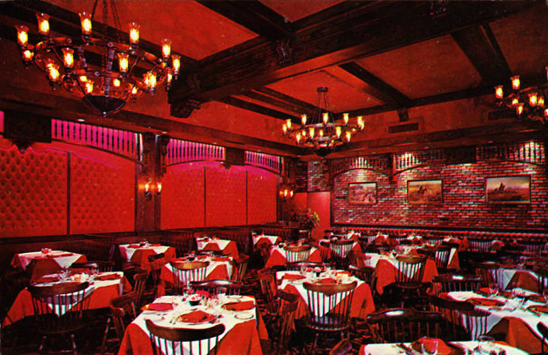
Despite its association with immorality (or maybe because of it?) red made a strong showing after World War II, especially in the mid-1950s through the early 1970s. It was often used in restaurant decor, especially for places that appealed primarily to men.

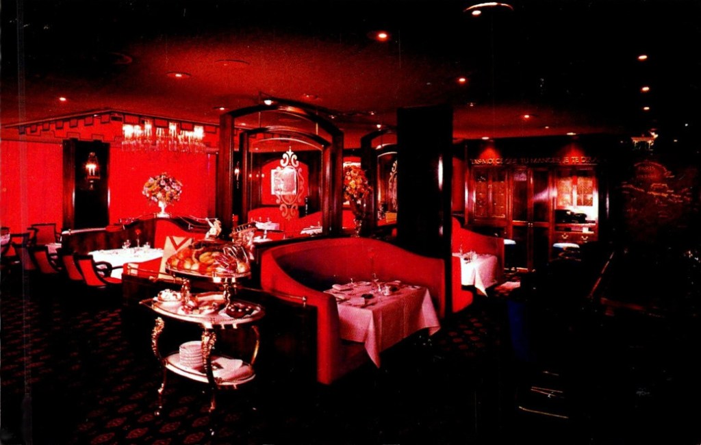
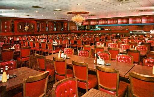
Red tended to be employed lavishly. It was variously used for carpets, painted wall and ceiling surfaces, columns, wallpaper, light fixtures, draperies, tablecloths and napkins, glassware, menus, upholstery for chairs and banquettes, and waiters’ uniforms. [above: That Steak Place, VA]

Sometimes an old-time theme was adopted, usually signaled by red-flocked wallpaper meant to conjure a bygone time of jollity that might suggest anything from the “gay ‘90s” to the “roaring ‘20s” to a brothel.

A 1955 book of decorating advice suggested that, in contrast to cool colors and bright lights, restaurants with warm colors and dim lights suggested luxury. The latter decor encouraged patrons to relax and was believed “to increase the size of his check.” Likewise, a bar decorated in red might encourage drink orders.

Of course red is more than warm, it’s hot! It can be difficult to imagine relaxing in some of the eating places that enveloped diners in redness. Such as, in particular, NYC’s Cattle Baron [shown above], which opened in 1967 in the Hotel Edison. If the red decor weren’t appealing enough, the restaurant’s owner seemed willing to revive an association with questionable respectability when he ran an advertisement picturing a nude female model marked with black lines indicating cuts of meat.

Whatever poshness and sense of luxury a red interior suggested, it began to wear off in the 1960s, and even more in the 1970s. In 1961, when a version of the NYC club known as Danny Segal’s Living Room opened in Chicago, a reviewer criticized the “engine red decor” with red light bulbs as “excessive” and amounting to “a satire on night club decor.” Also in the 1960s, an Oregon restaurant reviewer sneered at “that ubiquitous black and red decor which has almost become a stereotype of the snobbier bistros.”

Restaurants began ditching their red decor in the 1970s. The Colony Square Hotel in Atlanta installed a new restaurant called Trellises, causing a reviewer to applaud the disappearance of the “steakhouse/bordello gold and red decor.” The western Straw Hat Pizza chain decided in 1975 that Gay 90-style restaurants with red-flocked wallpaper were out of fashion. The Homestead in Greenwich CT hired NYC designers to come in and rip out their red carpets and red-flocked wallpaper for a country look with hanging plants, wood floors, and brick walls. [above, Harry’s Plaza Cafe, Santa Barbara]

Of course, the U.S. is a big country, full of diverse tastes and fashions, so it’s not a big surprise that there were (and are) some restaurants that kept their red decor.

© Jan Whitaker, 2023

9 Comments

Filed under atmosphere, decor, restaurant decor, restaurant fads

Caves, caverns, and grottos

I would have said that restaurants made to resemble caves represented a proprietor’s desperate attempt to rescue a windowless, underground space. Except . . . many restaurants of the early 20th century, when these sorts of restaurants became popular, had few or no windows yet they were not rigged up to resemble caves.

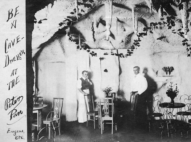
But it seems that the American public was discovering a fascination with caves and cave men in the early decades of the 20th century. In 1915 the Peter Pan, in the college town of Eugene OR, did seem to appeal to wannabe cave men, and possibly cave women too.

Perhaps the cave restaurants were spiritually related to beefsteak dungeons of a similar era where men sat on crates and ate steaks with their claws, er, hands.

I suspect another reason that cave-themed restaurants and clubs appeared in the teens was as a way to attract patrons during a time when drinking was becoming less popular. Prohibition of alcohol was not yet national law but many localities had banned it.

Or, if I wanted to get psychoanalytical about it, I might think that locating these night-clubby spots underground revealed a degree of shame in a culture once ruled by Puritanism.

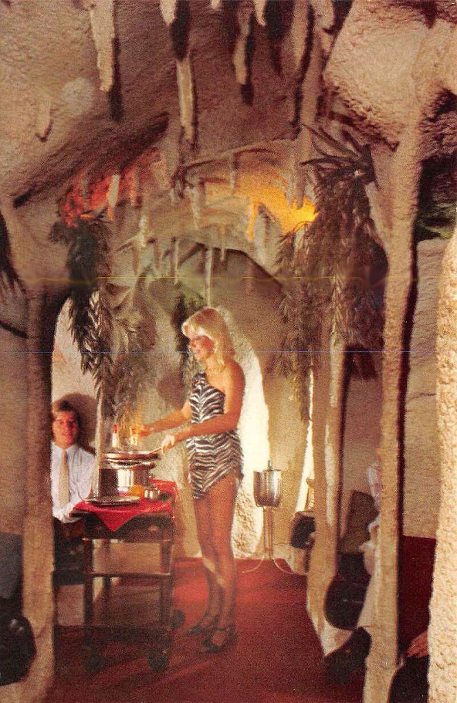
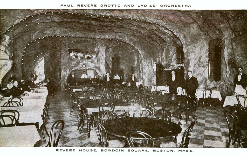
Close to the turn of the century two hotels already had cave-like grottos built underground. In 1900 architect W. E. Loyer of Philadelphia designed a grotto for the Hotel Rudolph in Atlantic City. Five years later his grotto for a Boston hotel, the Revere House, opened. Like the Rudolph, it featured an all-women orchestra. According to Revere House advertising, light bulbs in the grotto sparkled “like jewels in an Aladin [sic] cave” where dining was “both weird and entrancing.” Even in August, cool breezes were said to “sweep across the room” where its “jagged sides” resembled “what might be found in some large underground cavern.”

Other hotels with caves and grottos for dining and entertainment in the teens and 1920s included the Ambassador in Atlantic City with its underground Neptune and Dolphin Grills, the latter filled with marble, cut glass, sea-green furniture, fish nets, life belts, shells, and more.

The Grunewald in New Orleans [shown here], the Mt. Washington Hotel in Bretton Woods NH, and the Redwoods Hotel in Grants Pass OR carried on the cave tradition.

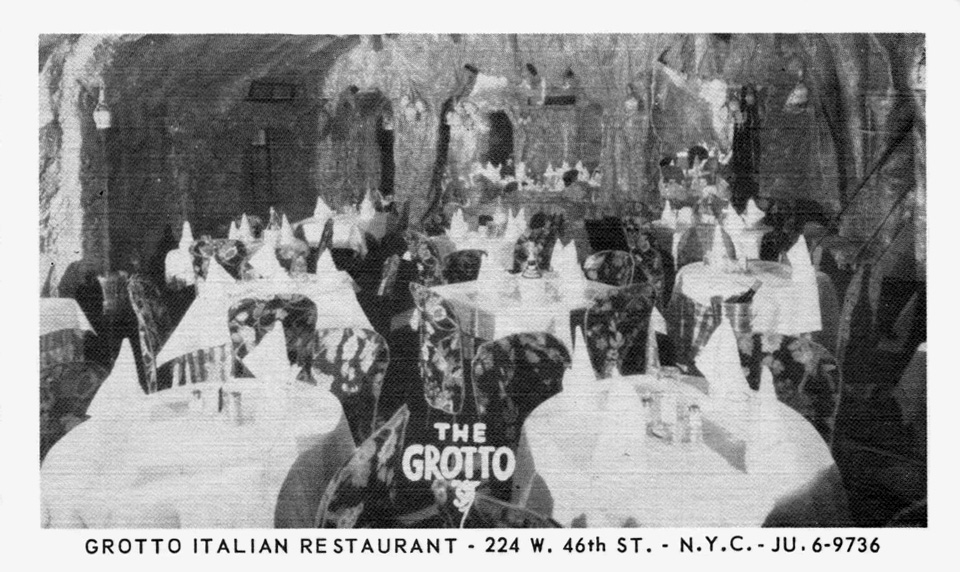
New York City was a little short on cave/grotto restaurants but it did at least have one. According to The Grotto’s advertising it was a “romantic cave.”

Of course there were also eating stations in genuine caves designated as National Parks. I am hesitant to refer to some of their facilities as restaurants – particularly that of Carlsbad Caverns with its accommodations for 1,000 lunchers at a time, pictured here ca. 1962.

The whole idea of a cave-themed restaurant seems strange enough to me that I might have imagined they went out of fashion long ago. But of course they did not, and undoubtedly can be found today. In 1928 columnist O. O. McIntyre declared that Los Angeles was the foremost city for “stunt cafes and trick eating places . . . built in every fantastical and baroque shape imaginable.” However, since then cave-like eateries, though always sparse, showed up in a variety of cities and towns.

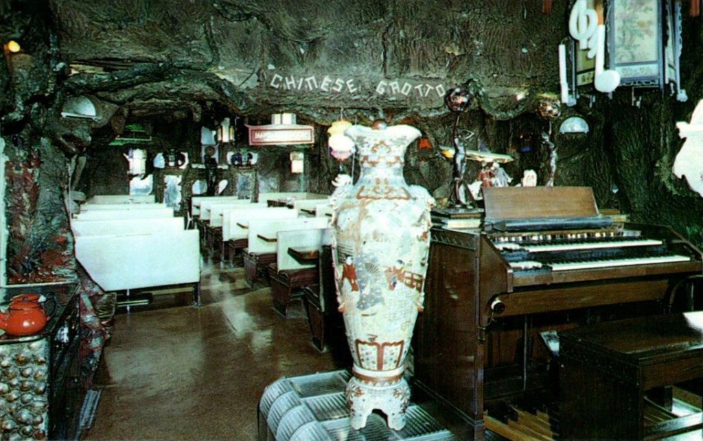
In the early 1930s, for instance, Binghamton NY had a restaurant called The Barn, which encompassed a Shell Room and a Chinese Grotto. The Grotto, whose special effects were the creation of its originator, David Stewart, offered the only Chinese food in Binghamton — accompanied by organ playing. I was surprised to discover that the restaurant’s cooking was applauded by a number of 1940s guidebooks.

The 1960s and 1970s saw restaurants such as The Cave in Cleveland which declared itself “a cave to end all caves.” An article revealed that its conversion from a pool hall involved the application of 16 tons of gray plaster accompanied by a poured Polyrock floor speckled with gold. The total effect, said the account, was “somewhat eerie and fascinating.”

In Fort Lauderdale FL, The Caves restaurant was designed to encourage diners to “journey to prehistoric days via the stone-age decor and hearty feasting.” But, they were assured, they would be made comfortable with “luxurious pillows” and “soft lighting,” two things seriously lacking in nature’s version.

© Jan Whitaker, 2023

7 Comments

Filed under alternative restaurants, atmosphere, decor, Offbeat places, theme restaurants

Glamming in Booth One

Before non-stop coast-to-coast air travel became common, actors and performers relied on the railroad to cover long distances. Usually this involved changing trains in Chicago. Arriving there, weary celebrities were more than happy to be scooped up and whooshed off for lunch or dinner at the Pump Room.

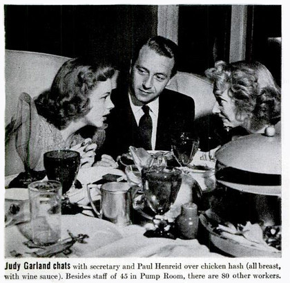
Top celebrities were escorted to Booth One, a cushy white leather nest where their job was to field calls from gossip columnists and smile as the flashbulbs went off. Their lunch may have been on the house, but they earned it. [It’s likely Judy Garland is talking with a columnist in the above Life magazine photo, 1943] Of course both the stars and the restaurant got publicity out of the deal.

The Pump Room stood out as a notable publicity mill in part because it was in the middle of the country. On the coasts there were plenty of such venues – the Stork Club and El Morocco in New York, and Chasen’s and Romanoff’s in Los Angeles to name but a few.

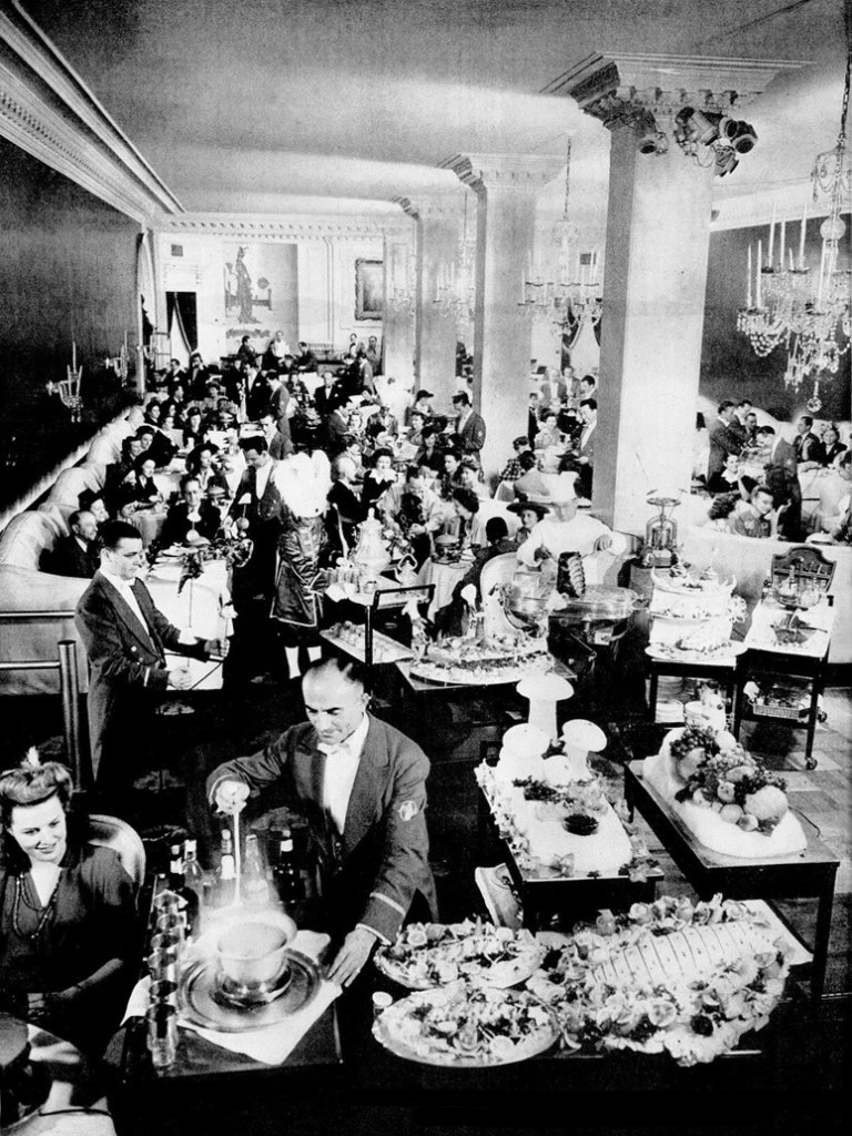
But the Pump Room had a vibe all its own. [Life magazine photo showing a very crowded room, 1943]

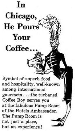
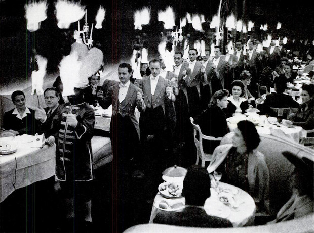
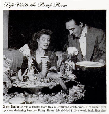
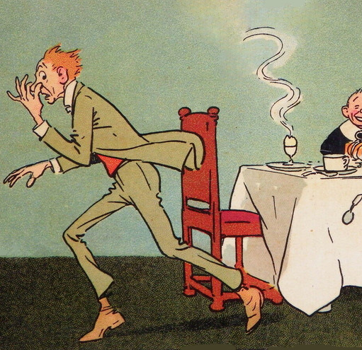
In addition to being swanky — with dark blue walls, white leather upholstery and crystal chandeliers — and well connected to the gossip pipeline, the Pump Room drew attention for its culinary burlesque shows featuring costumed staff, flames, and choreography. Waiters – all white men – wore scarlet jackets and black satin knee pants, while the “coffee boys” – all young black men – wore emerald green or white uniforms with giant ostrich plumes seeming to spring from their foreheads. [see grotesque caricature shown below, 1957] There were also “curry boys” dressed in gold. Food was served from wagons except for that skewered on flaming swords.

The coffee servers took it upon themselves to compete in the art of coffee pouring. Competition involved seeing how far they could hold the pot and still manage to pour the coffee neatly into the cups. Management did not approve and stopped the contest, but not before the winner set a record of 5 feet. He said customers asked him to do it. Not unbelievable since it was, after all, in keeping with the spirit of the place. According to one observer, customers watching servers with flaming swords make their entrance secretly hoped “the adroit waiter will slip and ignite one of the highly combustible hats being worn this season.” This never happened.

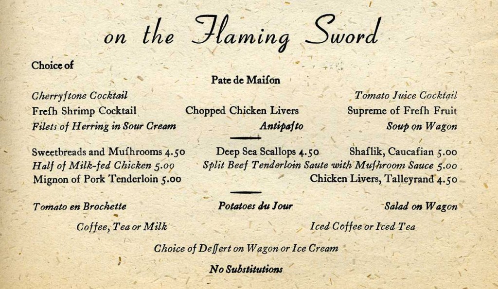
In 1943, Life magazine visited the Pump Room, photographing a number of spectacular scenes, some of which were undoubtedly contrived for the sake of the story. The crowning photo was certainly that of the procession of waiters holding flaming swords. A flaming-sword dinner cost $3.50 at the time of the story, going up to $4.50 or $5.00 by 1949 according to the menu shown below.

The Pump Room emblemized the sardonic humor of its creator, Ernie Byfield, who also owned its home, the Ambassador East Hotel. Its 1938 creation may have been a desperation attempt to survive during the Depression, but Byfield had long been in the habit of befriending show business stars back when he headed the Sherman Hotel. In the Sherman’s night clubby College Inn, he had entertained actors, musicians, and others on “theatrical nights.” Through the years Byfield made friends with an extensive roster of Hollywood stars that included James Cagney, Bette Davis, and William Powell in the 1930s and Douglas Fairbanks, Mary Pickford and a long list of others in earlier times.

Ernie Byfield’s death in 1950 seemed to mark the beginning of a long decline. The Ambassador East and the two other hotels Byfield owned changed hands repeatedly while the Pump Room sagged. A few months after Byfield died, columnist Lucius Beebe noted in a Holiday magazine story that Ernie had always said, “I don’t want grim gourmets around my place. I want laughing eaters.” Beebe’s story made it clear that the Pump Room was meant to be amusing, even moderately ridiculous. Without its creator at the helm, it became difficult to set the tone while maintaining quality.

In 1962 a reviewer for the Michelin Guide visited the Pump Room and, according to a devastating Life magazine account, had a miserable dinner described as deviled turkey breast accompanied by “canned peas and what looked exactly like potato chips.” Equally horrid, Life reported, was the incompetent waiter who recommended a red wine that “not only foamed but tasted as though it were composed of a second-grade detergent.” Learning of the story, an Ambassador Hotel executive dug through that day’s food checks and found, according to a rapidly produced account in a Chicago newspaper, that the reviewer and his Life magazine companion (the story’s author) had each consumed a cocktail and then shared two bottles of wine. He also insisted that the turkey steak on the menu was never served with anything but grilled sweet potatoes and wild rice.

But the damage was done and the restaurant’s reputation continued to crumble. Not much after the Michelin bomb dropped, Irv “Kup” Kupcinet, its number one gossip columnist, who had created a version of the Pump Room in his own dining room, admitted that it wasn’t what it used to be. Cross-country airplane flights were becoming commonplace, eliminating Chicago stopovers and reducing the flow of celebrities into town. Even though the room was remodeled in the mid-sixties by new managers, it was unable to recapture the past glory.

Although loyal Chicagoans continued to support it, the Pump Room closed in 1976, after some years of low ratings and, it was said, grease-spotted menus and chipped glassware. Everything was auctioned, included Booth One. Then came a new owner, Rich Melman, of the Lettuce Entertain You restaurant group which included Jonathan Livingston Seafood, Lawrence of Oregano, and others. He remodeled it in glamorous fashion and ran it for 22 years. After that it had various owners, including Melman once more who ran it as Booth One.

© Jan Whitaker, 2023

3 Comments

Filed under atmosphere, decor, elite restaurants, Offbeat places, uniforms & costumes, waiters/waitresses/servers

Odors and aromas

It is said that the sense of smell became less important when proto-humans began to walk upright. Yet it has played a significant role in restaurant history, for better and for worse.

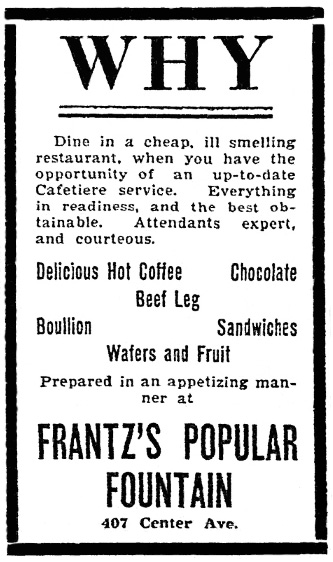
While not limited to the 19th century, complaints about bad odors in eating places abounded then. In that century, unwanted smells might come from the building itself, accumulated cooking odors, or the humans in the rooms. Worst of all were the cheap eating places located in damp and windowless basements where all three perils came into play.

A self-styled researcher in 1849 cancelled a plan to visit common eating houses in New York City, writing, “We once undertook to count these establishments in the lower part of the City, but got surfeited on the smell of fried grease before we got half through the first street, and were obliged to go home in a cab.”

Even Taylor’s, Broadway’s mid-19th-century hot spot where fashionable ladies went to consume fricandeaus and meringues, failed the smell test. It had a deluxe interior with 18-ft-high ceilings, gold leaf, fountains, and mirrors, leading journalist Fannie Fern to exclaim, “What a display of gilding and girls.” And yet, upon its close in 1866, a critic put things straight, admitting “there was always the restaurant odor, the mingled essence of many past dinners, and precisely the same from month to month and year to year.”

If Taylor’s wasn’t free of bad odors, what restaurant was? Well, according to a British visitor, the answer was just about none! In 1868 the author, after visiting New York, gave 99.9% of the city’s eating places a no-star rating when it came to smelliness. “The restaurants, with the exception of Delmonico’s on Fifth Avenue, generally speaking, are dingy and warm, and have a sickly smell about them,” he wrote. Not much later the Prince of Wales traveled to the U.S. and quickly grew sick of the sight and smell of one of the country’s most beloved foods: oysters. “During his sojourn he was always endeavoring to escape from the smell of them,” according to one chronicler. Obviously, one person’s bad odor might be another’s delicious aroma.

Old-fashioned chophouses, revered as hyper-masculine shrines to meat-eating, also came in for criticism. One critic denounced New York’s Old Tom’s, a venerable dining spot, as “the humbug of the century.” He characterized its atmosphere as “fat and greasy,” adding, “You breathe it, smell it, taste it.”

On the whole, though, it was unusual for men to criticize the smell of meat cooking. It was so enticing that the owner of an 1890s NYC ballroom arranged to pipe in the kitchen’s odor of steaks being grilled at the end of the night’s entertainment, ensuring a crowd for his dining room a floor below.

The restaurant foods usually singled out as unacceptably smelly tended toward fried, greasy things, as well as garlic, onions, cabbage, and, in certain cases — when they perfumed residential neighborhoods — hamburgers and hot dogs. Los Angeles regarded tamale wagons as “odor factories” and Scarsdale fought to remove a “smelly” stand operated by Castel Hitaltakides, aka ‘Hot Dog Joe.’

But it wasn’t until after the first world war that real improvements were made with ventilation and kitchen design. Wood surfaces were replaced with harder materials such as “Monel metal,” forerunner to stainless steel. And the use of vents and exhaust systems grew commonplace except in the poorest eating places. Air conditioning in the 1930s also made a big difference. However, improvements in air quality were always in order. A 1946 customer survey revealed that restaurant patrons’ biggest complaint after noise and clatter was still bad odors. They almost certainly would have included cigars and cigarettes, which would draw even more complaints as the movement to ban smoking in restaurants grew.

What could restaurants do to control odors? There were range hoods as far back as the 1880s, though I don’t know enough about them to judge their effectiveness. Another method employed by restaurateurs who could afford it was to locate their kitchen on the top floor of a building, with the dining room a floor below so the kitchen’s greasy hot air and odors would float inoffensively skyward.

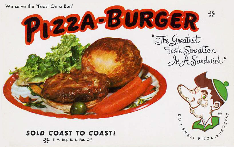
But then attitudes to food smells began to shift. An overlooked feature of the food “revolution” taking place in the late 1970s and 1980s was that cooking aromas – which, apart from beef, had rarely been regarded as a positive attraction in restaurants – became a plus, particularly when they emanated from the kitchens and platters of ethnic restaurants. Fast food smells, such as the pizza-burger’s, were also redeemed as pleasant.

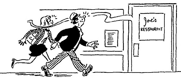
At Joe’s, yes, but not so much in luxury restaurants.

Remember that smelling was long associated with lowly creatures. And for decades the standard had been that proper middle class homes should be entirely free of cooking smells, even if this required a series of doors between kitchen and dining room as well as frequent daily airings of the kitchen. In the 1920s a genteel residential hotel in Cleveland went so far as to design suites in its new building with no kitchenettes “so that one family will not inconvenience other occupants with cooking odors.”

It seems this standard was adopted by luxury restaurants as well. I have been unable to find any reviews of elite restaurants that mentioned odors or aromas. Evidently the only time customers’ noses were allowed to come into use was in sniffing wine offered by the sommelier.

What would Julia (Child) have thought about this? In a 1972 interview, she was asked how, when traveling, she identified a good restaurant. Her answer: “If you poke your nose in, the smell will tell you something. A good restaurant smells good – of fresh food and butter and fresh olive oil.”

© Jan Whitaker, 2022

6 Comments

Filed under atmosphere, elite restaurants, food, patrons, restaurant issues