Tag Archives: restaurant china

Famous in its day: Well of the Sea

A short time ago I had a chance to visit the fascinating second floor of the Fishs Eddy store in New York. It is piled high with not-for-sale dishware of all kinds, collected by the store’s owner Julie Gaines. The collection includes restaurant ware from the golden past when this country still produced such things. (Tours of the collection, hosted by Julie, are given periodically and booked by the New York Adventure Club.)

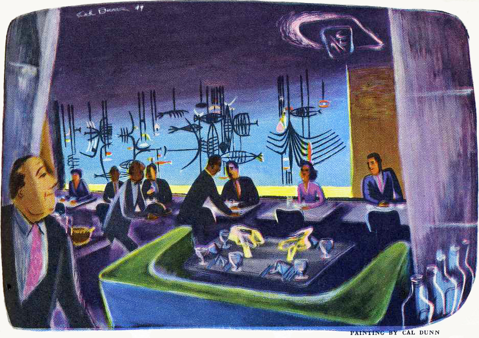
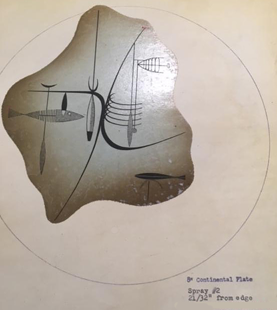
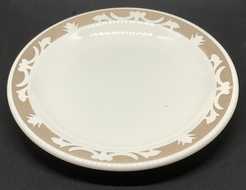
The Fishs Eddy collection also includes records from china producers that show pattern designs. A page from Shenango China in Newcastle PA — closed in the 1970s — depicted the design for a plate made for use at the Well of the Sea restaurant in the former Hotel Sherman in Chicago. (A ca. 1950 painting of the restaurant by Cal Dunn is shown at the top of this page. Below is a plate using the above Shenango design.)

The restaurant opened late in 1948 in the hotel’s basement, which no doubt suggested an underwater theme to the hotel’s owner, the colorful and theatrical Ernie Byfield. He had also originated the over-the-top glamour restaurant, the Pump Room in the Ambassador Hotel.

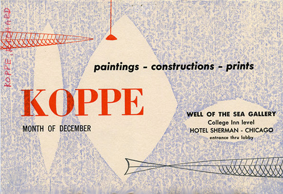
A number of abstract murals of underwater scenes by Richard Koppe, Chicago painter and student of the German Bauhaus, decorated the walls of the restaurant. One of them was used for the menu’s cover shown below. The room was further enhanced by darkness and other-worldly ultraviolet lighting.

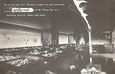
In addition to the murals, Koppe also contributed wire fish and light sculptures somewhat visible in the black and white advertisement of unknown date. The color menu depicted one of the murals.

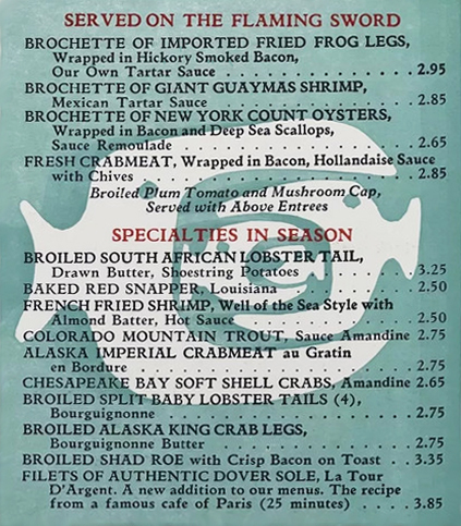
Needless to say, the restaurant specialized in fish, with frequent shipments coming in by air. It was especially known for what was called Black Clam Chowder made with Madeira wine, clams, and many herbs and spices. A portion of a menu is shown above.

Another unusual feature of the Well of the Sea was the attached art gallery in which the work of Koppe and other Chicago artists was displayed. The exhibit of Richard Koppe’s work took place in December, 1949, one year after the restaurant’s opening.

In 1968 the Sherman’s general manager explained that the ultraviolet light used in Well of the Sea was glamorous when it illuminated jewelry and white shirts but not when it lighted false teeth. But the customers liked it anyway despite the room being so dark that waiters had to assist them with flashlights in order to read menus. In 1968 a glow-in-the-dark menu was introduced to make reading easier.

Exactly when the dishware inspired by Koppe’s murals and designed by Shenango Potteries’ Paul Cook came into use in the restaurant is not known with certainty. According to Margaret Carney, whose International Museum of Dinnerware Design in Kingston NY features many pieces of dinnerware from the Well of the Sea, the design shown on the Shenango file page above was probably not used until 1954. What preceded it is unknown.

The Well of the Sea was popular from the start and stayed in business until 1972, a year before the Sherman itself closed.

© Jan Whitaker, 2024

5 Comments

Filed under atmosphere, decor, menus, Offbeat places

Restaurant ware

Fine table settings were not to be taken for granted in pre-Civil War American eating places. In 1843 an English visitor was delighted to find a Charleston hotel with “clean table cloths and silver forks.” He recommended the Jones Hotel, run by a Black proprietor named Jehu Jones, the son of a freed slave. Thick dishes, often chipped, and crude forks were more typical of many hotels then.

According to Junius Henri Browne’s The Great Metropolis, in 1869 there were many restaurants in New York City but only in the most expensive, such as Delmonico’s, did the diner find “silver, and porcelain, and crystal, and fine linen.” Common basement eateries, on the other hand, had “broken earthen-ware, soiled table-cloths, and coarse dishes.”

Coarse dishes had become the definitive sign of a cheap restaurant. But in the later 19th century, when early fast-food chains began to form, they attempted to break the equation that thick dishes and bowls indicated filth by being insistent about cleanliness. They stuck with thick dishes that didn’t break or chip simply because they were more practical.

The Baltimore Dairy Lunch

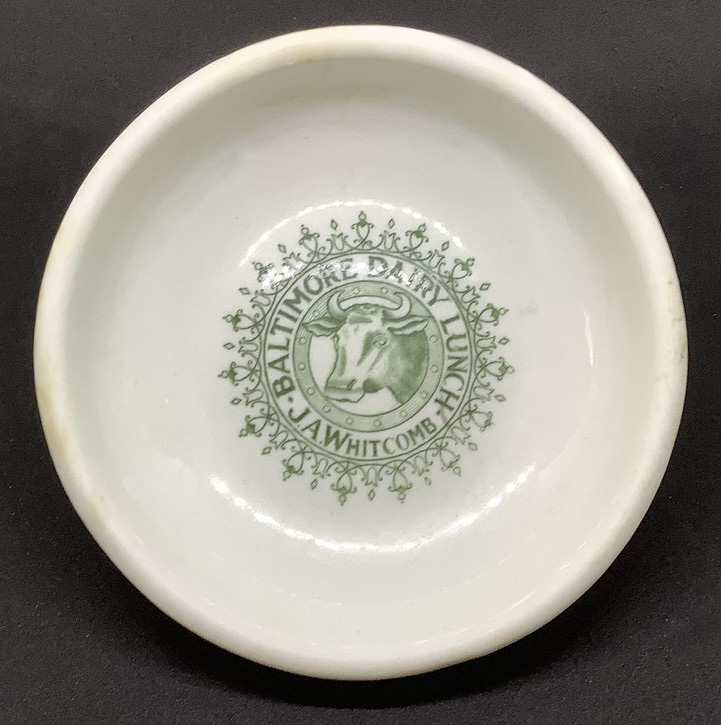
Founded in the late 1880s, Baltimore Dairy Lunch was an early challenger to the old assumptions about thick chinaware. The first unit was opened in Baltimore by a postal clerk. By 1920 there were about 140 locations in large cities through much of the Northeastern U.S. Menus were simple and prices were low. Customers went to a counter to get their food, and consumed it quickly, either while standing at a high counter-type table or sitting in a one-arm chair similar to a school desk. This thick, shallow bowl – possibly used for milk toast – expresses the spartan simplicity of Baltimore Lunches. Despite some yellowing along the edges, it has held up well over the decades.

Ontra Cafeteria

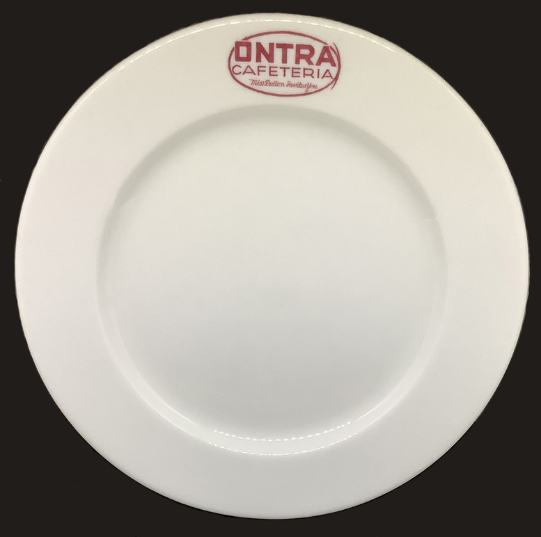
The Ontra (pronounced “on tray”) was a cafeteria begun as a working women’s lunch club, one of four operated by Mary Dutton in Chicago in the 1910s. Like the Baltimore Dairy Lunches they were meant to be affordable and appealed to those who did not want to spend much for a noonday meal. Undoubtedly, like most women cafeteria owners who had studied home economics, Mary Dutton put a high stock on practicality and thrift. This Ontra plate, date unknown, is sturdy but not as thick as dairy lunch dishware.

Steak n Shake and Demos Café

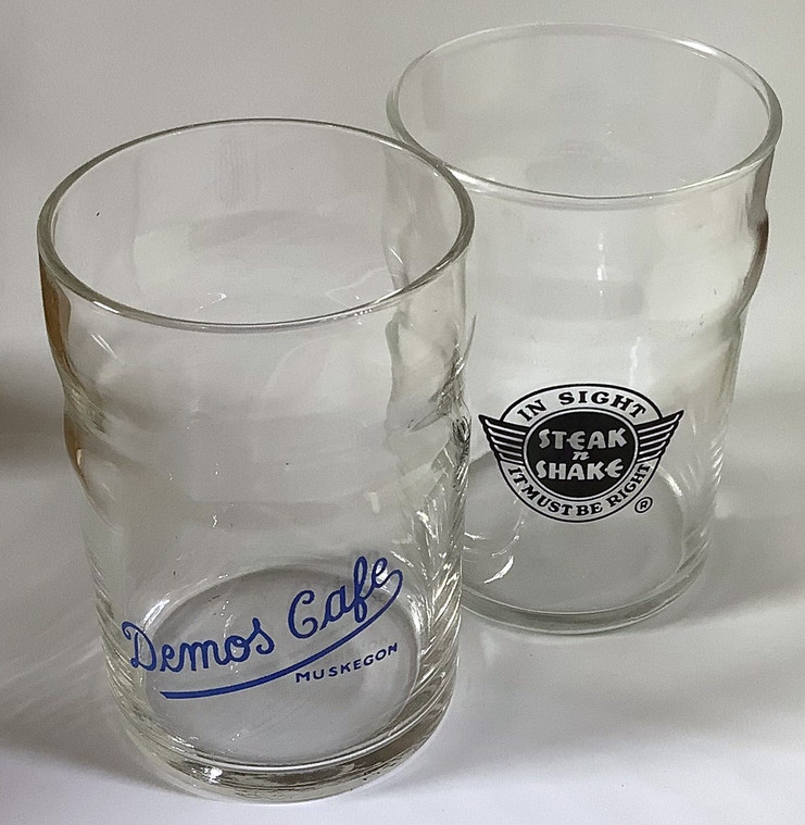
These sturdy glasses are typical of mid-century restaurant glassware with their non-chip rims and their dents and bulges that make them slip proof as well. It’s likely they were produced by Libbey, a major advertiser of glassware in mid-century restaurant trade journals. An advertisement assured restaurant buyers that “Libbey Safedge glassware offers you a wide selection of patterns in all sizes, for beverage and bar service. And because of its durability, you are assured of economy in operation . . . with every glass backed by the famous Libbey guarantee: ‘A new glass if the rim of a Libbey ‘Safedge’ glass ever chips.’”

Woolworth’s lunch counter

The Woolworth plate came from my local dime store when it was closing for good in 1990. Its pattern is one of the endless variations on a theme of this sort, one that could appear in any of a number of colors. Again, a sturdy plate for customers who never gave it a second look.

The Craftsman restaurant

Cheap dishes, glasses, and flatware simply wouldn’t do for upscale restaurants. The better-off classes demanded finer table settings. This had always been true for the wealthy, but in the early 20th century, the middle-class also raised its expectations.

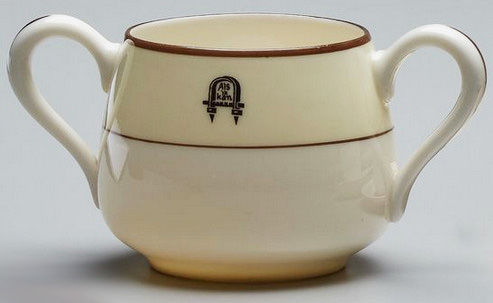
Good taste expressed in restrained design suggestive of nature was the motto of The Craftsman in New York City from 1913 to 1916. Lunch and dinnerware was Onondaga white china with a light brown pinecone design forming a border. For afternoon tea, Lenox furnished an off-white china featuring the Stickley “Als Ik Kan” symbol and motto that promised integrity of method and materials.

Alice Foote MacDougall coffee shops

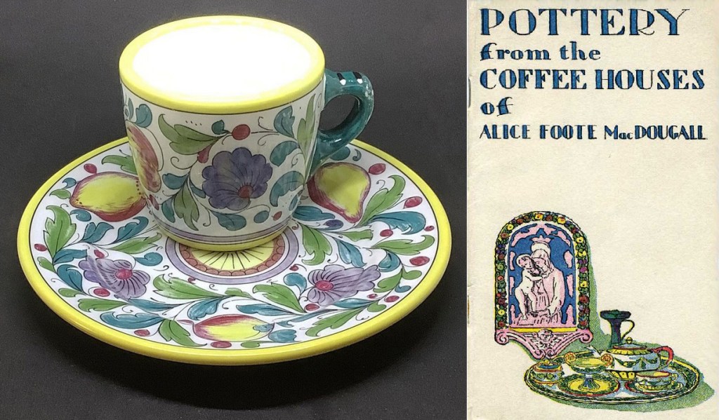
Women’s tea shops tended to stress individuality. This meant rejecting standardized restaurant ware, instead establishing a unique identity with decor and tableware. Alice Foote MacDougall — who called her tea shops coffee shops to attract men — complained loudly about thick cups and dishes. In her 1929 book, The Secret of Successful Restaurants, she described how, formerly, she had to eat in restaurants “where china, white, thick, and hideous was used.” In them, food was served “naked on a bold, pitiless plate half an inch thick and consumptive in its whiteness . . .” By contrast, she said, the plates in her restaurants were colorful with shades of yellow, blue, turquoise, and lilac.

Shown above is the Graziella pattern used in her Italian-themed coffee shops. Like all the imported china in her restaurants it was also for sale ($2.50 for a dinner plate or a cup and saucer).

The Four Seasons

In 1966 a well-known restaurant consultant explained how people with good incomes preferred to dine when they went out. They liked fine restaurants, appreciated good food, and ate out often. “They expect the restaurant decor to be as nice as the decor in their own homes!,” he explained, adding, “They like fine china.”

Given that The Four Seasons was a power-lunch site, I’m sure there were some guests who paid absolutely no attention to the fine design of the hundred items designed by Garth and Ada Huxtable, nor did they notice that unlike the glasses used in dime stores and lunch counters, their wine glass had no reinforced edges. Others guests no doubt were pleased with the elegant simplicity of the designs.

When the restaurant closed and the furnishings and serving pieces were auctioned in 2018, bidders paid goodly sums for items such as the bread servers (as much as $6,250) and cream and sugar sets (more than $2,000) shown above. I do find it humorous that the cream and sugar set included so plebeian an object as a container for packets of sugar substitutes.

Today, collectors of restaurant ware value a wide range of china, including the thick kind often bearing the logo of a once-popular eating place.

© Jan Whitaker, 2022

18 Comments

Filed under chain restaurants, elite restaurants, lunch rooms, restaurant customs, tea shops

Lobster stew at the White Rabbit

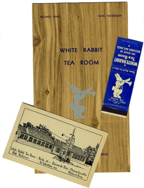
On the menu shown here a bowl of lobster stew cost 70 cents and came with crackers, pickles, and chips. Oyster stew was 50 cents, while fried clams with french fries, cole slaw, and coffee cost 60 cents.

The menu is undated but is probably from the 1940s. Fried lobster was one of the White Rabbit’s most popular dishes, according to Duncan Hines’ 1947 guide book, Adventures in Good Eating. With a fruit cup, tomato, pineapple, french fries, rolls, dessert, and tea or coffee, it came to $1.35. And, of course, they threw in pickles and chips.

In addition to lobster fried, sautéed, or stewed, it was also available as a salad.

Admiring patrons quoted in the 1948 edition of Gourmet’s Guide to Good Eating explained that the reason the Rabbit was always mobbed with people on their way to and from Cape Cod was due to its high standards, excellent food, and, specifically, “plates of hot buttered rolls.”

On Saturday nights the White Rabbit offered a traditional Massachusetts dinner of baked beans for 50 cents. Other interesting dishes on the menu include a vegetable salad sandwich (35¢), a sardine and horseradish sandwich (25¢), and a side order of tomato and cucumbers (15¢).

The tea room got its start in 1931, in West Chatham on the Cape, about 37 miles from the Buzzards Bay location which became its long-term home. Prior to its beginning, owner Nate Nickerson was a taxi driver in Brockton MA, where co-owner Mildred Ring may have worked as a waitress.

Nickerson’s two sons were waiters at the restaurant which was open only from April through November.

In 1966, the final year in which I found advertisements for it, the White Rabbit had evidently abandoned the tea room theme. It then featured liquor and steaks. Nickerson had died in 1950 and it’s likely that it was under different management.

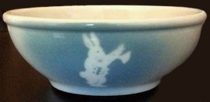
A few years ago I received a nice surprise when a stranger sent me this bowl by Syracuse china used in the tea room.

© Jan Whitaker, 2019

13 Comments

Filed under food, menus, popular restaurants, roadside restaurants, tea shops