Category Archives: restaurant decor

The dining room light and dark

lightingcongresshotel

Diners are not usually aware of lighting in restaurants but it plays an important role in making them comfortable – or not – and in conveying a sense of what kind of space they are in.

Although psychologists say that humans, like other animals, prefer to eat in a dim, safe space like a cave, darkness has not always been prized. The specific meaning of lightness and darkness in restaurants is encoded in history and has varied through the decades.

Here is the simplified version: In the 19th century darkness in an eating place usually signaled that it was disreputable, that it entertained the sort of guests who would not be welcome in polite society. But this equation changed in the 20th century as it became easier and cheaper to provide light. Places with bright lights, first thought attractive, became viewed by many as garish and cheap. Darkness, or at least a degree of dimness, now became associated with fashionability and “atmosphere.”

Through much of the 19th century darkness was associated with poverty and vice. The average oyster cellar was a below-ground dive possessing the three Ds: darkness, dampness, and dirt. A visitor to one of these places in New York in 1845 described rickety chairs and walls blackened with smoke. Overall, he wrote, it was “so dark and damp that the bivalves might have fancied themselves in their native mud.” By contrast a first-class oyster house was set apart from the rest by its bright gaslights, damask draperies, marble topped tables, crystal decanters, large mirrors, and paintings of scantily clad women.

The notion that dark equals dirty has not vanished even today. Unless a restaurant is in the luxury or upscale class, darkness is suspicious. Starting in the teens, inexpensive chain restaurants specializing in fast food were always bright, not only to prove to customers that they were clean but also because bright lights kept customers from lingering.

A few restaurants installed electric lighting in the 1880s, though it was unreliable. On Feb. 27, 1885, Edmund Hill proudly recorded in his diary that his Trenton NJ restaurant, “Had the electric light running for the first time.”

lightingPickensSC

Many more restaurants had electricity by the early 20th century though it had not yet achieved universal status. Some regions of the country still lacked electrification. Even in areas that were lucky enough to have electricity, a single naked bulb dangling from a wire might provide the only illumination in lowly rural cafes. Brightness continued to be equated with good times, especially if a restaurant hired musicians and catered to a late night crowd.

But as inexpensive “quick lunch” urban restaurants installed electric lighting, the glamour of brightness began to fade. Discerning customers at the forefront of taste trends rejected bright, noisy places, viewing them as vulgar. They preferred quiet intimacy in dining, with low lights, or shaded candles.

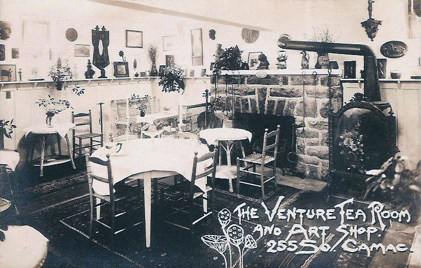
A widespread belief held that it was women who especially preferred dim lighting since it was more flattering. True or not, tea rooms, quintessential women’s haunts, often used candles. On the other hand, restaurants that advertised bright lighting, such as the 1960s chain Abner’s Beef House (“lighted brightly to let you see what you’re eating – like hunks of steak in a long fun bun”) pitched to male customers.

lightingfritzel's1950
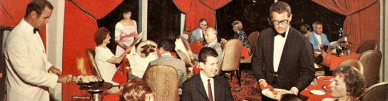
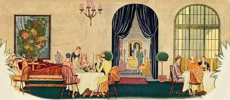
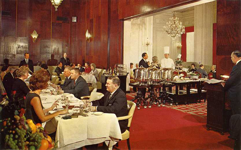
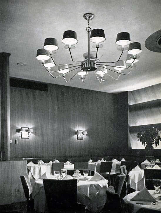
By the 1920s lighting had become an art. The best lighted restaurants were carefully designed using various types of illumination. Emphasis shifted from fancy light fixtures such as chandeliers to the quality of light that fixtures gave. The goal espoused by modern lighting experts and designers became to have adequately bright, but not glaring general illumination, with soft, warm lighting focused on the table. Around 1950 Fritzel’s in Chicago was designed using sophisticated lighting which combined ceiling and wall fixtures with recessed lighting from an architectural feature. [pictured]

Designers hated fluorescent lighting. As a lighting designer wrote in 1950: “Aesthetically, the worst development probably in the whole history of lighting is the fluorescent tube, which emits its eerie cold glare in unknown thousands of public rooms all over America.” Many small town cafes, however, continued to use fluorescent lighting since it was more economical. Equally common in 20th-century lunch rooms were plain white globes descending from chains.

lightingX-Cel

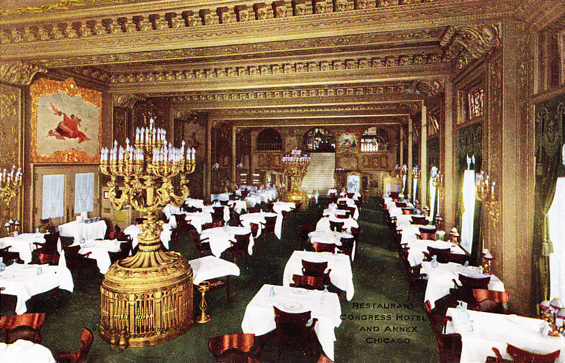
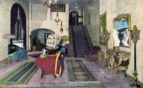
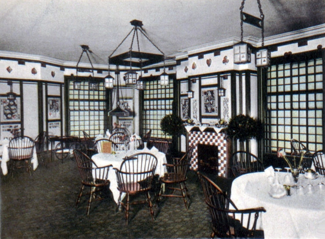
Although lighting experts say it’s all about the light, that has not stopped restaurants from using eye-catching novelty fixtures. Nothing stands out like the “light trees” used in luxurious dining rooms such as one in the Congress Hotel ca. 1915 [pictured above]. Wagonwheels also come to mind as one of the most overused examples, but there have been many others, such as Japanese lanterns, glass footballs, and battered brass buckets.

© Jan Whitaker, 2015

6 Comments

Filed under atmosphere, restaurant decor, technology

“Atmosphere”

atmosphereschaber1941I put the word in quotation marks to acknowledge that what atmosphere in restaurants means is as elusive as air itself — which the word also refers to. It was often used to describe eating places in the 19th century, but not in a flattering way. A typical usage is that from 1868 where someone remarked that in a certain restaurant “the atmosphere is heavy with cooking vapors.”

The term atmosphere (or ambience, which came into use in the 1970s) became used in a more general way to describe the character of a restaurant – that intangible spirit of a place. The broader meaning could encompass an air that was sophisticated or homey, rowdy or relaxing, masculine or feminine, formal or casual, etc. I discovered a 1950s restaurant that claimed to have “Christian atmosphere” with home cooking by a Mrs. and “No Beer, Liquor or Smoking.”

In the 1890s the more general meaning almost always referred to the kinds of people associated with a restaurant, both owners and patrons. For example sawdust on the floor, pictures of athletes on the wall and the presence of prostitutes signaled a thoroughly masculine atmosphere while the presence of artists and writers in French, German, or Italian table d’hotes shouted “bohemian!”. A jolly host could also impart atmosphere, which might be altogether missing if he weren’t on hand, or if his most colorful patrons failed to show.

AtmosphereRomanyMarieSummer1921It didn’t take long before restaurant owners realized they could appeal to new patrons by bragging about their “atmosphere,” especially if it was bohemian. A San Francisco restaurant announced that it attracted “artists, writers, musicians, poets, painters, singers, draftsmen, balladists, literati and newspaper writers.” In 1903 NYC’s Elite Rathskeller Restaurant ran an advertisement claiming to have “Refined Bohemian atmosphere,” which sounds like a contradiction in terms since bohemians were supposed to be carefree souls who violated everyday norms of propriety.

The next step for restaurateurs was to merchandise atmosphere by generating it themselves. Since it seemed that so many people wanted to gawk at bohemians, why wait for them to show up if you could entice them with free dinners? Allegedly some restaurants did just that.

atmosphereVentureTeaRoomPhila

After World War I, following the reign of bohemian restaurants, came a new type of atmospheric eating place, the tea room of the 1920s. The tea room’s special atmosphere was  quaint and homey with artistic touches. In 1922 the Journal of Home Economics pronounced that “The very name of Tea Room has grown to mean a place with ‘atmosphere’ and with furnishings that are unique.” Ranging from the fashionable to the playful, tea rooms proved that women – their primary patrons – were in love with atmosphere.

atmosphere1918FlintMIBucking the trend toward atmospheric decor were a handful of holdouts. Anything like a “restaurant atmosphere” was anathema to a Y.M.C.A. cafeteria in Flint Michigan (1918). The Old Colony Coffee House in Richmond VA renounced “ordinary restaurant atmosphere” in 1924 and vowed it would have instead “simplicity in decorations” and “plainness in food.” Patrons of traditionally masculine restaurants feared that when Chicago’s J. R. Thompson’s tore out its white tiles for a more feminine look it had destroyed its no-nonsense atmosphere and gone “girly girly.” Likewise, design critic Lewis Mumford shuddered when the Childs’ chain replaced the “antiseptic elegance” of its “hospital ward atmosphere” for “fake fifteenth century English,” betraying the honest utilitarianism of the Machine Age. No doubt Mumford chuckled when Alice Foote MacDougall, queen of scenographic Spanish villas and French chateaux in NYC, went bankrupt in 1932. [see The Cortile below]

atmosphereCortile

In the 1950s there was still a tendency in the restaurant industry to see women as the constituency for atmosphere while men supposedly judged a restaurant first by its food quality. But by the 1960s this was no longer true, as indisputably demonstrated by the success of Polynesian restaurants. An executive of the National Restaurant Association (NRA) said that Americans’ demand for atmosphere had raised the cost of opening a restaurant to $4,000 a seat in 1962.

One of the early chains built around atmospheric theme restaurants was David Tallichet’s Specialty Restaurant Corporation in California. In 1965 the firm opened Gate of Spain, capturing the “atmosphere of old Castile” atop a tall building in Santa Monica. Restaurant industry consultant George Wenzel recommended the following year that restaurateurs “give your guests something to do or something to see, or something to make conversations about.” He suggested creating a Gay Nineties or a river boat atmosphere.

In the 1970s theme restaurants came into their own, classified by the NRA as one of three of the basic types of restaurant in 1976, and the one that drew the most affluent guests.

© Jan Whitaker, 2015

5 Comments

Filed under atmosphere, restaurant decor, theme restaurants, women

Tea at the Mary Louise

MaryLouiseTR1928BestFoodsADV2200W7th

In 1914 the J. W. Robinson department store arrived on West Seventh and Grand, launching a shift in Los Angeles’ shopping district from Broadway. The following year the Brack Shops began leasing specialty shops in an empty loft building nearby. Construction activity boomed as Seventh Street turned into a shopping mecca.

Will and Dolla Harris staked the future of the Mary Louise Tea Room on the prosperity of West Seventh. In 1918 they opened their first tea room on the 12th floor of the Brack Shops. With wide hallways allowing shops to open their doors and let goods spill outside, it resembled a modern-day shopping mall. Shoppers could easily spend the day having their hair done, browsing the latest styles, or enjoying lunch, tea, or a Thursday night chicken dinner at the Mary Louise.

MaryLouiseBarkerBros790Through the 1920s the Mary Louise expanded, opening additional tea rooms on West Seventh — on the mezzanine of the fashionable New York Cloak & Suit House, and on the top floor of the gigantic Barker Brothers home furnishings store [shown here]. In 1922 construction began on what would be the largest of the Mary Louise tea rooms [shown below], a two-story building across from Westlake Park (renamed MacArthur Park in 1942). It opened in 1923 and was soon followed by a Mary Louise in Fullerton, next door to the new Alician Court movie theater owned by Dolla’s brother Charles S. Chapman. The last Mary Louise, whose servers were young Asian-American women dressed in Chinese costumes, opened in 1931 on North Cahuenga in Hollywood.

MaryLouiseEXT792

Shortly after its debut, the park-side Mary Louise advertised it was “the Center of the City’s Social Life.” Wedding parties and meetings of professional groups were booked regularly. Elaborately decorated on a lavish budget equal to more than half the cost of construction, the capacious building held a large entry hall [shown below] and dining room [shown at top] on the first floor plus an afternoon tea room, a banquet hall, and four smaller dining rooms for private parties on the second. In sync with the fashion of the day, the rooms had themes such as Mah Jong and Italian tea garden.

MaryLouiselobby789As can be seen on postcards from the Mary Louises in Barker Brothers and opposite Westlake Park, the tea rooms were decorated in glamourous movie-set style markedly different than minimalist Eastern tea rooms. Gilded pieces, Oriental rugs, wall tapestries, heavy draperies, and paired ornamental trees abounded.

MaryLouisebizcardINT791

The Mary Louise mini-empire was dealt a severe blow just a few months after the Hollywood location opened when Will Harris died suddenly. Three of the tea rooms, including the main one opposite Westlake Park, were quickly sold to the Elite Catering Company owned by the expanding Pig’n Whistle chain. When I acquired the business card shown here opened up, it had Xs penciled over all but the section reading “2 Smart Downtown Tea Rooms,” evidently reflecting the changeover.

Dolla Harris continued to operate the two downtown tea rooms: in Barker Brothers and in the Security Bank Building opposite the Robinson’s store. In 1932, in the depths of the Depression, she was forced to reduce prices for lunch and to attract customers with palmists and numerologists. How long she stayed in business is uncertain but I’ve found evidence that there was still a Mary Louise tea room in Barker Brothers in 1952.

© Jan Whitaker, 2014

9 Comments

Filed under proprietors & careers, restaurant decor, tea shops

Famous in its day: Tip Top Inn

tiptopinnColonialRm

As the massively solid Pullman Building was under construction on Michigan Avenue in Chicago in 1884, a young Adolph Hieronymus was traveling to Chicago from his native Germany. Within a few years he would run a restaurant of renown on the building’s top floor.

tiptopinnpullmanbldgThe building was to be the new headquarters of the Pullman Palace Car Company which manufactured sleeping and dining cars used by major railways. When the imposing building was completed, the company occupied two and a half of its nine floors while the rest of the space was rented for offices and what were known then as “bachelor apartments,” probably lacking anything but the most rudimentary cooking facilities.

For the first few years the Pullman company ran its own restaurant, The Albion, on the 9th floor. It was considered advanced at the time to locate restaurants on top floors so that cooking odors would not drift throughout the building. In addition, diners at The Albion, and later the Tip Top Inn, had excellent views of Lake Michigan.

tiptopinnFrenchRoomDuring the Columbian Exhibition in 1893 Adolph Hieronymus left his job as chef at the Palmer House and took over the Pullman building restaurant, renaming it the Tip Top Inn. Under his management, it became one of Chicago’s best restaurants, hosting society figures and professional organizations. Until the Pullman company expanded its offices onto all eight floors below the restaurant, men living in the 75 or so apartments on the upper floors were also steady customers of the Inn, often having meals sent down to them.

The space occupied by the Tip Top Inn was divided into a bewildering number of rooms, at least five and maybe more. Each had its own decorating scheme. Over the years – but surely not simultaneously — there were the Colonial Room [pictured at top ca. 1906], the Nursery, the Whist Room [pictured below], the Charles Dickens Corner, the Flemish Room, the French Room [pictured above], the Italian Room, the Garden Room, and the Grill Room. The Whist Room was decorated with enlarged playing cards and lanterns with spades, hearts, diamonds, and clubs. The lantern and suits also decorated the Inn’s china and menus.

tiptopInnmenu1920The outlawing of alcoholic beverages proved challenging to the Tip Top Inn, as it did to other leading Chicago restaurants of the pre-Prohibition era such as Rector’s, the Edelweiss, and the Hofbrau, all of which would go under before the ban on selling alcohol ended. Perhaps to attract new customers, Hieronymus created an associated restaurant on the 9th floor called The Black Cat Inn, with somewhat lower prices than the Tip Top Inn and a menu featuring prix fixe meals.

tiptopinnWhistRoom

The Black Cat was unusual at the time for having a staff of Black waitresses – who served in restaurants far less often than Black men. The Tip Top Inn, just like the Albion and the Pullman dining cars, had always been staffed with Black waiters, some of whom worked there for decades. It was said that anyone who worked at the Tip Top could find employment in any restaurant across the country. “Black Bolshevik” Harry Haywood wrote in his autobiography that he quickly worked his way up from Tip Top Inn busboy to waiter and then landed jobs on the ultra-modern Twentieth-Century Limited train and with Chicago’s Sherman Hotel and Palmer House.

By 1931 when the Tip Top Inn restaurant closed, it was regarded as an old-fashioned holdover from a previous era. Its extensive menu of specialties such as Stuffed Whitefish with Crabmeat and Suzettes Tip Top, some of the more than 100 dishes created by Hieronymus, was no longer in vogue. Aside from Prohibition, Hieronymus attributed the restaurant’s demise to the death of gourmet dining. Hieronymus died in1932 but he and his restaurant were remembered by Chicagoans for decades. The Pullman Building was demolished in 1956.

© Jan Whitaker, 2014

10 Comments

Filed under proprietors & careers, restaurant decor

Hot chocolate at Barr’s

e.c.Barrtearoomca1906

Even in a good-sized, prosperous city as Springfield MA was in the late 19th century, a chance to sit down and be served a cup of hot chocolate or other light, non-alcoholic refreshments was hard to come by. Other than hotel dining rooms, usually open only during mealtimes, there was just about nothing.

Except for the city’s leading confectioner. As was true in other cities, a confectionery restaurant assumed a prominent role in feeding and entertaining the public.

E. C. Barr & Co. was Springfield’s leading restaurant, caterer, candy and ice cream maker, and baker of fine pastries and wedding cakes. In an advertisement in December 1889 it advised, “Ladies while on your Holiday shopping tour try a cup of that hot Chocolate, Cocoa or Bouillon at BARR’S Restaurant.” For most of its long existence it did business on Main Street, for 20 years occupying a corner just across from the city’s foremost retailer, the Forbes & Wallace department store.

e.c.barr1884Barr’s reach went beyond Springfield. With a branch in Northampton, its fame was known throughout Western Massachusetts. The restaurant ran advertisements in Amherst to lure students from the Massachusetts Agricultural College to come out for a “spread” or a class dinner. This 1884 example ran in the M.A.C.’s yearbook.

Barr’s stayed in the public eye as a prime banquet venue and with elaborate show window displays of confectionery. In 1909 the company commemorated the exploration of the North Pole with representations of Cook and Peary and their exploring party, all made of sugar fashioned by owner Edwin Barr’s son Walter.

Recently I was lucky to find the postcard image of the Japanese Tea Room in the Barr restaurant shown above. It dates from about 1906, when a dessert called the Priscilla College Ice, an ice cream soda with a “totally different flavor,” was a popular order. Edwin Barr’s second wife, Minerva, worked with him and it’s likely she supervised the tea room and may have chosen the Japanese theme which was in vogue then.

Barr’s was begun in 1865 or 1866 when founder Edwin Barr finally decided to give up prospecting for gold in California and Montana and returned to Springfield to settle down. It wasn’t until around 1891 that Edwin acquired the Main and Vernon corner (384 Main), one of the most valuable corners in the city’s shopping district. (It’s likely that the 884 Main address on the trade card shown here is misprinted.)e.c.barrtradecard

In 1870 an article in the Springfield Republican claimed that Barr’s decor was more “tasteful” than that of Delmonico’s in New York. Keep in mind that the New England taste of that time leaned toward plainness. The story also praised the appearance of the restaurant’s menu which was printed on cream paper with a thin magenta border – “neat, but not gaudy.”

Sadly the Barr family’s lives were not so neat. In 1891 Edwin’s eldest son, George, who managed the family’s Hotel Warwick in Springfield, shot and killed his wife and himself in a fit of jealousy. Edwin’s third son, Jesse, manager of the Northampton restaurant, died of syphilis in 1900.

Fortunately Edwin’s son Edgar lived a long life and carried on his father’s business for a time after Edwin’s death in 1911. In 1912 the restaurant moved to East Bridge Street and later was recreated on State Street. I have not been able to discover how long it remained in business.

Clearly Barr’s glory days were at Main and Vernon. That site underwent many demolitions, the latest being construction of the Monarch Place hotel and office complex.

© Jan Whitaker, 2013

12 Comments

Filed under confectionery restaurants, restaurant decor, tea shops

Find of the day: the Redwood Room

RedwoodRoom

Sometimes after a day of largely fruitless hunting in the antiques marketplace – such as a recent trip to the Brimfield flea market – it takes a while to realize I’ve acquired a gem. In this case it is the above postcard of the Redwood Room in San Francisco’s Clift Hotel, ca. 1965.

I bought it because it has features that I like: diners, a chef, paneling, and red carpeting. From looking at thousands of images I’ve learned that the last two signify Beef, Money, and Masculinity. But it wasn’t until I read the back of the card that I realized it was a “find.”

On the back is the printed message: “The Redwood Room is unexcelled for fine dining. With its huge panels of 2000-year-old Redwood and the spacious bar, it conveys a feeling of masculinity that has for years appealed to leading San Francisco executives and their wives.”

Little did the people on the postcard know, but “barbarians” were about to descend on the Redwood Room.

The hotel opened around 1916 and the Redwood Room and the French Room (shown through the doorway) were created during the 1930s. Both served the same food, but the hyper-manly Redwood Room was also outfitted with a long redwood bar not shown on the card.

Craig Claiborne visited the Clift in 1964, and declared it was one of the few U.S. hotels that still maintained a kitchen of “relative eminence.” Its decor, he said, was of “undeniable elegance” and its tuxedoed waiters exhibited “politesse.” The menu specialty, as might be expected from a restaurant that borrowed dinner carts from London’s Simpson’s, was “absolute first rank” roast beef accompanied by Yorkshire pudding ($4.50).

The postcard photograph was taken when the hotel was at its peak, prior to a slump in the early 1970s brought on by a poor economy aggravated by a policy of turning away guests who violated the hotel’s conservative dress and hairstyle code. When Burt Lancaster and his longhaired son were refused admittance to the Redwood Room in 1971, the item made newspapers across the nation.

The Clift’s president, Robert Stewart Odell, created the dress code. When the musical “Hair” opened at the nearby Geary Theatre in 1968, “They came in from the theater, barefoot and bareback. For a time . . . the Redwood Room entrance was the scene of an almost daily confrontation between longhairs and the maitre d’hotel,” said a manager. The hotel posted signs and ran advertisements that advised: “The Clift Hotel caters to a conservative, well-groomed clientele. Registration, dining room and bar service is refused to anyone in extreme or abnormal dress and to men with unconventional hair styling.”

In response to the hotel’s conservatism, San Francisco Chronicle columnist Herb Caen ridiculed it relentlessly, claiming it maintained “standards set in the Coolidge era as opposed to the Cool era.”

After Odell’s death in 1973, the hotel’s new president (whose hair was longish) welcomed well-dressed stockbrokers, lawyers, and businessmen with hair descending below their collar tops, along with women in pantsuits.

In 1976 the Clift was renamed the Four Seasons-Clift after its acquisition by Toronto’s Four Seasons Hotels, Ltd. After almost two years of remodeling and restoration, the Redwood Room became a bar only rather than a bar and restaurant. Yet it was little changed as that would have brought howls of protest from San Franciscans. A 2001 re-do brought the by-then-shabby Redwood Room bar back into fashionability.

© Jan Whitaker, 2013

1 Comment

Filed under elite restaurants, restaurant decor

Modernizing Main Street restaurants

In the late 1920s the spreading influence of the 1925 “Art Deco” exposition in Paris inspired restaurants in the United States to remodel their exteriors and interiors in the bold new modern style. A leading trade journal, The American Restaurant, proclaimed in its July 1929 issue that modernism had become a notable trend in the industry.

Modernizing restaurants usually went further than skin-deep decorations and included new ventilation systems, dropped ceilings, concealed lighting, sound proofing, and air-conditioning. Many restaurants badly wanted to renovate their facilities, but by 1932 the Great Depression seriously curtailed funding for building and remodeling.

It didn’t take long for central business districts to decline, looking dowdy and down on their luck. Many towns felt if they could improve the appearance of stores in shopping areas it would have a positive effect on consumer spending. When President Franklin Roosevelt signed the National Housing Act into law in 1934, there was rejoicing on Main Streets across the country. Through government-backed, low-interest private loans, the NHA was meant not only to shore up the housing market but to stimulate improvements to commercial properties.

Towns responded wholeheartedly. In Mansfield, Louisiana (population 3,357), every merchant on the main business street signed up for that town’s 1935 improvement campaign and the local bank approved four loans the very first day. In 1936 sixty-nine New Jersey cities and towns were chosen to participate in Main Street modernization programs, with committees of prominent merchants, bankers, realtors, and building contractors presiding.

Retailers of all types took advantage of the program under the banner “Modernize Main Street.” Through architecture contests and programs sponsored by manufacturers of structural glass and other materials, a style soon developed known retrospectively as Depression Modern. Although it can be traced back to luxurious Art Deco styles, it was simplified and streamlined, and used industrial building materials such as glass and aluminum rather than marble and rare woods. As shown in before and after shots of the Harmony Cafeteria the new style was less cluttered than what had preceded it.

A new facade could be acquired for as little as $1,000 but some restaurants invested far more. For instance, in 1937 Joe Yium, owner of the Shanghai Cafe at 1004 Main in Dallas, sunk $15,000 into a structural glass front of cream trimmed with black, as well as an interior with new furniture and lunch counter all done in cream and deep “mandarin” red. Like the Shanghai, the Bohemian Restaurant in Portland OR [shown above] closed for a month while it was renovated to the tune of $25,000 with a front of black glass and aluminum, increased floor space, new ranges and steam tables, and a pastry department.

Improvements eligible under the program could include interior decor, air conditioning, and other functional modifications, but nothing symbolized hope for the future nor represented modernization more visibly than gleaming new fronts of shiny glass. Colored glass veneers were provided mostly by two companies, Pittsburgh Plate Glass Co. which made Carrara Glass, and Libbey-Owens-Ford, maker of Vitrolite [advertisement pictured].

Both companies offered complete storefront packages which furnished all materials needed, whether colored glass, clear plate glass, glass blocks, metal framing, signage, or even services of design consultants. Many of PPG’s model storefronts were designed by Walter Dorwin Teague, one of America’s foremost industrial designers. For luncheonettes, a PPG booklet recommended a design (possibly by Teague) using glass blocks and Carrara glass in orange, beige, and Rembrandt blue whose overall effect was “carefree and attractive” and — as you might imagine — had “high visibility.”

Coinciding as it did with the end of national prohibition, modernization paid off in increased business for restaurants, many of which took full advantage of the program. It confirmed the status of Main Street as the symbol of economic health for cities and towns in the popular imagination. However, as Gabrielle Esperdy points out in Modernizing Main Street: Architecture and Consumer Culture in the New Deal, decentralization of downtown shopping districts was well underway by the 1930s. But the modern transformation of Main Street maintained considerable significance to consumer psychology. The styles remained popular until the start of World War II when they were shunned as obsolete.

Today, in American cities and towns vestiges of Depression Modern storefronts, such as black glass panels above or beneath a show window, can still occasionally be spotted.

© Jan Whitaker, 2012

5 Comments

Filed under restaurant decor

Famous in its day: the Parkmoor

It’s been somewhat frustrating researching the Parkmoor chain of drive-ins that once did business in St. Louis, my home town. My main source has been a book written by Lou Ellen McGinley, daughter of the chain’s founder and manager of the Clayton Road Parkmoor from 1977 until its closing in 1999.

The book is called Honk for Service, yet throughout it are shown menus that say clearly at the top “Flash Your Lights for Service.” Alas, this is but one tipoff that somebody wasn’t totally on the job.

Nevertheless, the book enlightened me about a number of things, especially that there were once six Parkmoors in St. Louis. I had thought that the Parkmoor at Big Bend and Clayton was the one and only. In fact it was the sole survivor as well as the original, in 1930 the site of a Tudor-style drive-in. Three more Parkmoors opened in the 1930s and two in the 1950s, but all five of them were gone by 1971.

From 1940 to 1953 there was also a McGinley Parkmoor in Indianapolis. Parkmoor was a popular name for mid-century drive-ins. The Parkmoors in Amarillo TX, Knoxville TN (one O), Dayton OH, and Sarasota FL were not related.

I enjoyed the book’s charming illustrations, but I was disappointed to find only a single blurred and partial image of the exterior of the modern orange-roofed Parkmoor building that most St. Louisans knew (pictured above after being closed; razed in 2004). And there was no mention of when it was constructed, who designed it, or why the McGinleys chose what was for architecturally conservative St. Louis such an exotic, California-style design.

As I remember it, the interior was impressively ugly. It had a tall peaked ceiling and a lava-stone back wall. All the seating was built-in and covered in orange leatherette. To the right of the entrance was an L-shaped counter with cantilevered seats that projected up diagonally from the base. Down the center of the room was a 3-foot high divider with plants growing from the top. On either side of the divider were rows of two-person mini-booths, while larger booths ran along the continuous windows to the left.

From what I’ve been able to discover poking around, the Googie-style Parkmoor was built in 1969. By that time the restaurant was no longer a drive-in. Honk for Service does not say when carhops were dispensed with, but according to a newspaper want ad they were still being hired in 1963 even though two locations had adopted speaker-based ordering systems by then.

Lou Ellen’s father, William Louis McGinley, began his business career in the 1920s as head of a Texas company that sold trays to drive-ins. According to Honk for Service he was inspired to open a drive-in in St. Louis as an “I’ll show them” response after he was informed by Dorr & Zeller, an old-line catering company, that St. Louis was not the kind of city that would accept drive-ins.

Was it a similar motive that led McGinley to open a Parkmoor very near Dorr & Zeller on DeBaliviere in the city’s west end? It turned out to be an ill-fated locale. A brawl there in which police shot and killed two men in 1965 may have contributed to the demise of that location a few years later.

Both generations of McGinleys were cattle ranchers who spent much of their time in Texas while overseeing the Parkmoor. As with most drive-ins, the menu featured hamburgers; the beef was ground in a two-story commissary building erected on a corner of the Clayton Road Parkmoor’s parking lot. The beef, however, did not come from the family’s Texas ranch.

A little taste of Texas appeared on a 1930 menu which offers a Top Sirloin Steak served with French fried potatoes, lettuce, tomato, bread and butter – plus a “Texas preserved fig” – all for 55c. Add a Dr. Pepper for an additional 5c.

© Jan Whitaker, 2012

75 Comments

Filed under drive-ins, restaurant decor

Restaurants and artists: Normandy House

With the recent publication of the book Edgar Miller and the Handmade Home has come renewed appreciation of Miller’s talents and of the central role he played in the birth of Chicago’s Old Town arts colony in the 1920s and 1930s. Often seen as “Chicago’s forgotten Renaissance man,” Miller is mainly admired for his imaginative renovation of apartments and studios, with Sol Kogen, employing materials from demolished buildings.

His work encompassed mural paintings [portion of Black Sheep mural below], stained glass windows, wood and stone carvings, ceramics, wallpaper, and fabrics. In addition to dwellings, his playful virtuosity in the decorative arts was bestowed upon a number of Chicago’s eating and drinking places, including Harry’s New York Bar and the several outdoor cafes at the Streets of Paris complex in the 1933-34 Century of Progress Exposition. Following Repeal, when money poured into updating bars and restaurants, he worked with architects such as Andrew Rebori, painting murals for bars in the Northern Lights hotel, the 885 Club, and a Fred Harvey restaurant in Dearborn Station [pictured below]. At the Tavern Club, where Miller was a member and his precocious young son Skippy would later hold “one-man” shows, he created a renowned mural called Love Through the Ages.

Normandy House on Chicago’s near north side became his ongoing project in the late 1930s and through the 1940s. The restaurant occupied the corner structure in a row of five apartment buildings, each four stories in height, at the southern end of Tower Court (aka Tower Place and North Michigan Ave.) opposite the historic water tower. Once the home of the city’s blue-bloods, by the 1920s the entire row had become a commercial property. A restaurant called the Charm House occupied the corner site until about 1937 when Grace Holverscheid bought the business, renaming it Normandy House.

Grace, a widow, operated it with her friend Helen Wing, also widowed. Grace would soon marry a third partner, Richard Tallman. All three were involved with music, Richard as a composer, Grace as a concert vocalist, and Helen as her arranger and accompanist. While running Normandy House, Helen also wrote books and composed operettas for children.

Edgar Miller lived upstairs over the restaurant, perhaps trading his artistic work in exchange for rent. During its incarnation as Charm House, the restaurant had been renovated in quaint style with beamed ceilings, etc., to resemble a sister restaurant in Cleveland OH. An Old English taproom and grill installed in the basement in 1934 – named the Black Sheep Bar by its new proprietors — became the focus of Miller’s decorative elaborations. Over the years when he, and later his family, lived on the third floor, he carved a front door, painted murals, and made stained glass windows, wood sculptures, ceramic plaques, and wall paper for the restaurant. He was assisted by his brother Frank who became the Black Sheep’s bartender.

The Millers’ quarters, up the stairs past the restaurant’s cashier, also served as studio space for Edgar and his wife, the former Dale Holcomb, who translated many of Edgar’s designs into fabrics. At any given moment the whole family, including the two young sons, might be painting portraits, squeegeeing silk screens, or engaging in any number of artistic endeavors. Other artists, musicians, and classes of art students from the Art Institute frequently paid visits.

The Normandy House, like Chicago’s Le Petit Gourmet, attracted a clientele that included club women and professional groups of architects and academics. Its menu featured favorites such as the Pink Squirrel (broiled beef tenderloin with Roquefort sauce) and Eggnog Pie, as well as 1950s innovations such as salad in wooden bowls and individual loaves of bread served on cutting boards.

Helen Wing and the Tallmans closed Normandy House and retired in the summer of 1956. Then, under the management of a long-time employee and with backing from a Florida hotel mogul, it was reopened. In 1960 it moved to Rush Street, reinstalling at least some of Miller’s pieces.

The Tower Court building housing Normandy House along with the other four buildings in the row were razed to make room for a multi-story hotel. In the 1960s Miller and his wife moved to Florida where they ran a motel until her death. Edgar lived in Taos NM, Australia, and San Francisco, then returning to Chicago where he died in 1993 at age 94.

© Jan Whitaker, 2012

Read more about Edgar Miller’s life and work.

1 Comment

Filed under restaurant decor

Eat and run, please!

I’ve always thought it odd that anyone would think of fast food eateries as friendly. The tersely scripted counter help and the characteristically uncomfortable, bolted-down tables and chairs seem anything but hospitable to me. Of course, most patrons know and accept the terms of doing business with fast food chains whose low prices are predicated on providing minimal on-site facilities at which customers gulp their food, crumple their bags, and depart.

The fast food formula was first developed by turn-of-the-century “quick lunch” establishments. Like later chains they provided few amenities that might have encouraged lingering. Patrons sat in chair & table combos resembling one-armed school desks. No coat racks were provided so diners usually left their coats on. Just as well, because the spaces were so tight that someone removing his coat stood a good chance of sweeping his neighbor’s food onto the floor.

The idea that patrons should not linger wasn’t really new even then. Mourning the passing of Brooklyn’s old-fashioned chop houses, a reporter noted in 1889 that chop houses had been replaced by restaurants “where all is hurry and bustle, and where he who lingers at the table after his bill has been paid is regarded as an incumbrance.”

It’s not clear whether quick lunch proprietors plotted their interiors with an eye to turnover, but certainly by the 1920s restaurant managers were well aware that turning tables faster could increase profits. Suddenly even restful tea rooms were under pressure as they were thrust into competition with chain restaurants that used economies of scale to reduce costs and prices. Writing in 1929, Madeleine F. Wolf observed that if they wanted to survive, “The Dew Drop Inn, the Bide-a-Wee Tea Room, the Cheer-Up Cabin, must go on pretending an interest in each individual guest whereas their true interest lies in numbers.”

Brisk modern style, in the form of cubist decor and streamlined furniture, provided assistance in the late 1920s and 1930s. Artist and industrial designer John Vassos, who illustrated the book Phobia, felt he understood psychology well and successfully applied it in his 1931 design of NYC’s Rismont Tea Room, where the tables were a bit too small and chair seats were triangular. “The chairs are comfortable – if one doesn’t sit too long on them,” he wrote. [see photo]

Uncomfortable chairs would become known in the restaurant industry as “15-minute chairs.” Charles Eames’ fiberglass scoop chair (shown above) might be an example, offering little possibility of posture realignment.

Bright lights, loud colors, and loud music also discourage coffee refills and relaxed conversation, often quite deliberately. In the Forum Cafeteria in Kansas City MO in the 1960s walls with stripes in mist, olive, turquoise, blue, and white were deemed perfect for that “friendly, but not too friendly” effect. Nooks decked out with red banquettes and red carpeting, likewise, whispered “goodbye,” as did armless turquoise chairs.

If all else failed to dislodge the diner, the server could always lean over and ask, “Can I get you anything else?” – or “All set?” as they so bluntly say in New England.

© Jan Whitaker, 2012

11 Comments

Filed under restaurant decor