
Long before the internet, color photography became a factor that restaurants had to take into account. In the 1974 book Focus on . . . adding eye appeal to foods, author Bruce H. Axler noted, “The dramatic four-color, full-spread photos of food appearing in magazines have set visual standards for the restaurateur.” Perhaps he was thinking of Gourmet magazine in particular.
Color photography began to be used for advertisements in magazines in the 1930s, and consequently became identified with commerce rather than art. It was used mostly in women’s magazines, frequently to advertise food products at a time when major brands and ad agencies were hiring home economists to oversee product promotion and photography.
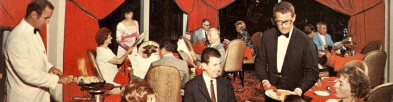
After decades of viewing photos of brightly colored food arranged artistically in attractive settings, the American public, possibly women in particular, expected food to look as good as it tasted. With the increase in restaurant patronage in the 1960s and 1970s, restaurants began to realize they needed to focus more on the appearance of what they served.
 Bruce Axler, building on considerable experience in the hospitality industry, set out to assist restaurateurs in dealing with vexing problems such as too much whiteness or brownness, shapeless blobs and piles, flat sandwiches, and the empty-plate look. Perhaps most important, he addressed the issue of commonplace food that didn’t look worth its high price considering how much cheaper it was at the place down the street.
Given patrons’ high expectations regarding visuals, Axler set out a depressingly cynical scenario on page 1: “If it [restaurant food] is any less luscious looking, it suffers by comparison to such photos; especially when the guest has had three ice-cold martinis and cannot really taste the difference between a prickly pear and a mashed rutabaga.” He seemed to suggest that restaurateurs couldn’t even count on taste and texture working for them anymore.
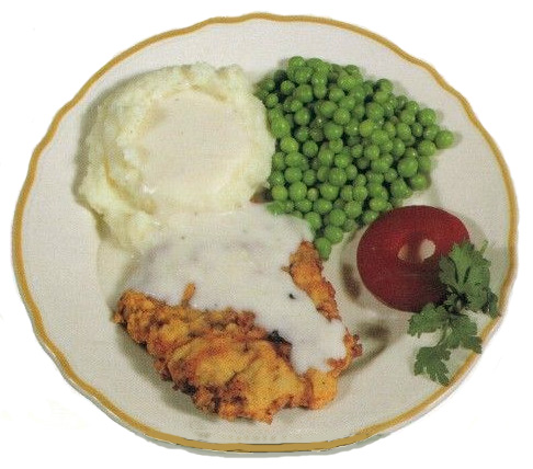
He also observed that some of the old-time fixes could no longer be relied upon. Broken potato chips couldn’t fill a void, he noted. Nor could food displays be enlivened by the old standbys parsley and paprika. “Buffets are loaded with mystery meats and salads similarly garnished with parsley and rouged with paprika like so many ancient chorines.”

He should have counseled against overuse of lettuce garnishes and potato borders too.
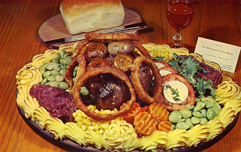
Axler’s suggestions included ladling soup from a tureen and serving sandwiches opened up, both to fill the plate and to display their innards. He advised that “Mounds are better than blobs, rolls better than slices, shingled layers better than piles,” and that vegetables should be portioned in odd numbers. To give the impression of increased worth, he recommended anchovy or grated cheese toppings.
At times his suggestions bordered on the desperate, such as “planting sparklers in food items” and floating small lit candles on soup croutons. I, for one, am not among the many customers he believed “would enjoy the visual appeal of a bright red tulip stuffed with chicken salad.”
Nonetheless, there is no doubt that restaurants were eager to adopt ideas such as his. Many have become standard practice, yet by now it has become clear that chefs have many more tricks up their sleeves, especially when it comes to making a dish look deserving of a high price. Some seem to go against the wisdom of the past. Who in the 1970s could have foreseen how powerfully miniature food artfully arranged on a king-size plate could signify a $$$$ restaurant?
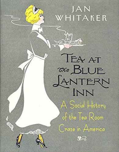
© Jan Whitaker, 2019
 It's great to hear from readers and I take time to answer queries. I can't always find what you are looking for, but I do appreciate getting thank yous no matter what the outcome.