Tag Archives: California coffee shops

The art of menu covers

Ask someone to name a designer of menu covers and it’s likely you will get a blank look. Although many stylish and eye-catching menus have been produced over time, their designers and illustrators mostly worked in anonymity.

In the early 20th century many of the menu cover artists were probably women. In 1900 the Kalo Shop in Chicago, for instance, employed six women graduates of the Art Institute who were trained in the esthetics of the arts-and-crafts movement. They created menu and magazine covers and other items. It’s likely that most of their menu work was for private banquets, while their biggest clients would have been steamships and railroads.

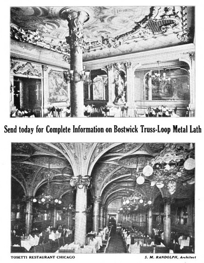
Individually produced menus such those from the Kalo Shop were rapidly being made obsolete by chromo-lithographers who could achieve quality effects at a lower cost. Unsurprisingly, the next chapter of menu production was taken over by printing companies with designers on their staffs. Some of the printing companies, such as Denver’s Standard Menu Co., were specialists in menu production as early as 1920. Like the women artists of earlier times, the names of designers in printers’ art departments are unknown. In more recent years, menu covers for well-capitalized restaurants have been designed by independent design firms. They created striking logos to be used on signs and menus and in advertising, giving individual restaurants and chains a thoroughly integrated visual signature.

In his book on menu design, “May I take Your Order?,” Jim Heimann says that well known illustrators such as Maxfield Parrish and Norman Rockwell rarely, or never, designed menus or created art specifically for menu covers. That is mostly true, with a few exceptions, such as Al Hirschfeld, who contributed caricatures to New York’s Stage Deli menu and Charles Bragg, who painted a crowd of Hollywood celebrities for Chasen’s in Los Angeles [shown at top].

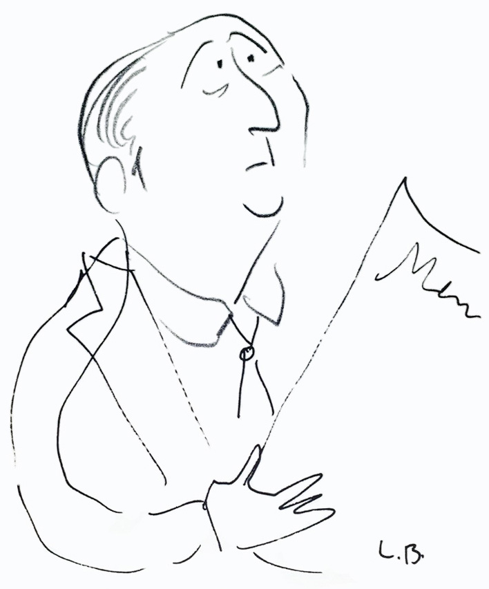
Chicago’s Blackhawk Restaurant used 8 drawings by Ludwig Bemelmans in the 1960s. They were not originally created for the restaurant, though owner Don Roth bought the originals, obtained Bemelmans’ permission to use them on menus, and gave them to customers as souvenirs.

Here are a few menus with designs that I particularly like.

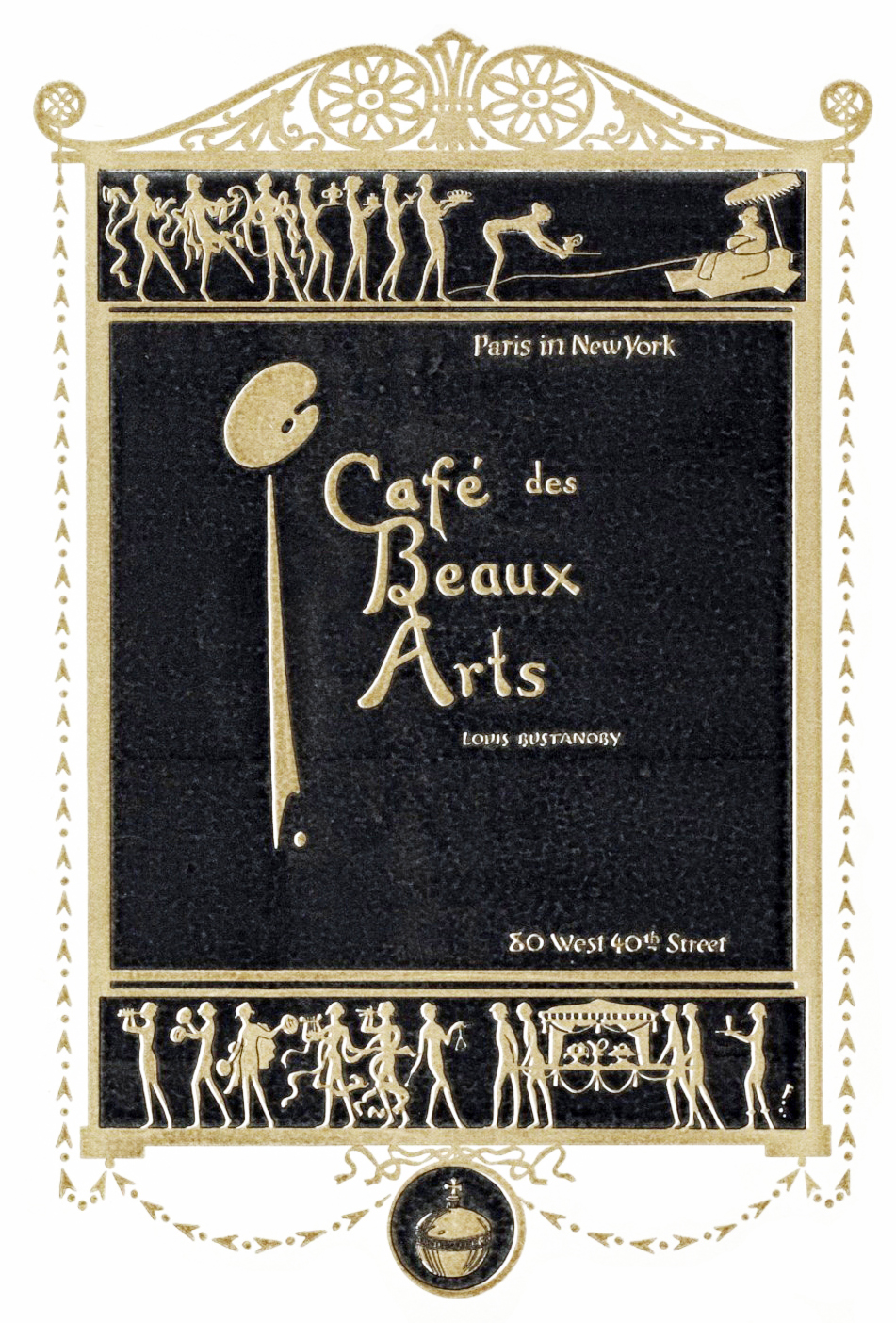
Café des Beaux Arts, New York City, ca. 1910
A fashionable café of the early 20th century created by brothers Louis Andre and Jacques Bustanoby. Said to be a hangout of the artistic crowd, on Sunday nights it was so crowded no one could enter. Unlike other so-called “lobster palaces,” it reputedly served good food. It closed in 1920, a victim of Prohibition.

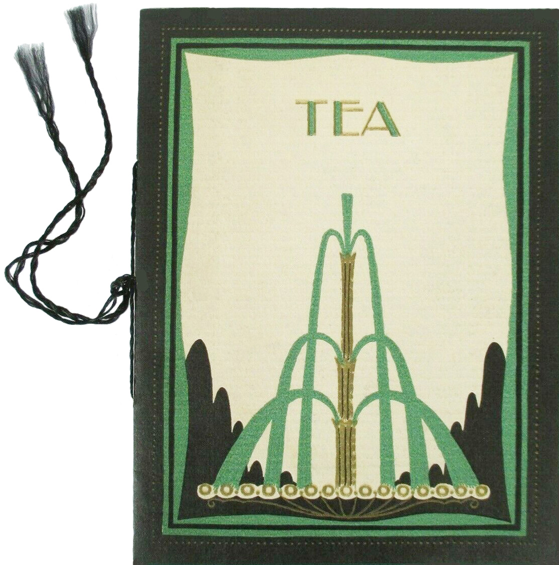
Carson Pirie Scott Tea Room, Chicago, early 20th century
In 1904 the old dry goods store named Carson Pirie Scott bought a building on Chicago’s State Street built by famed architect Louis Sullivan. The 8th-floor tea room soon became a city-wide attraction. This menu of uncertain date has the subdued but assured look of a pedigreed eating place meant to appeal to “ladies” who seek to be correct as well as stylish.

Café Society, New York City, 1938, 1940
In this case a known artist, Anton Refregier, not only contributed his artwork but did so in a full cover design when Barney Josephson, owner of New York’s Café Society music club restaurants, hired him to create menu covers for his two locations, first downtown at Sheridan Square in 1938, and then uptown at East 58th street in 1940. [Both covers are probably on beige-ish, not white, paper]

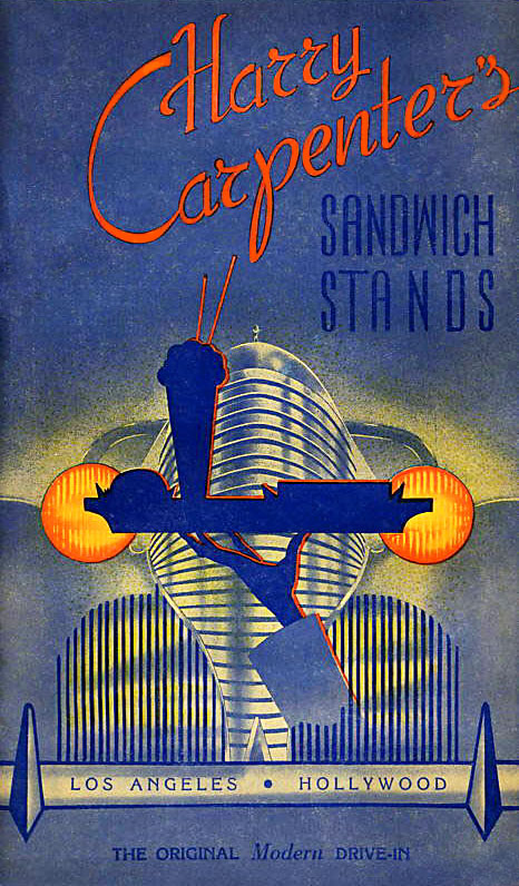
Harry Carpenter’s drive-in, Los Angeles, early 1940s
Harry Carpenter opened his first drive-in, an octagonal building, on the corner of Wilshire Blvd. and Western Ave. It was so popular he soon opened two more. In addition to hamburgers and hot dogs, Carpenter’s served corned beef on rye and chicken a la king on toast. This menu, though somehow foreboding, is dramatic.

The Hungry I, San Francisco, ca. 1955
The Hungry I, a comedy and music club, was founded around 1950, then sold and relocated to 599 Jackson street in 1954 where this menu was in use. Among those appearing there were Mort Sahl and The Kingston Trio. This menu offers entrees such as steak, lamb chops, chicken, and shish kabob. In ways that are hard to pinpoint, the cover design captures the spirit of the 1950s beatnik counterculture.

Huddle Restaurants, Southern California, 1956
The Huddle’s menu borrows the lettering of the chain’s exterior signage as well as the style of its architecture by Louis Armét and Eldon Davis. Probably their firm also handled the design of this menu, either in-house or by commission. Not all the restaurants in the chain featured futuristic “googie” design, but you can view images of many of those that did.

According to Heimann, the golden age of menu cover design in America ran from the 1920s through the 1950s. The 1960s in his judgement was mostly “a monotonous era” for menu design. Sadly, to me, in recent years printed menus with covers have almost completely vanished, along with postcards, matchbooks, and business cards. Digital photographs, if preserved, may become the sole visual record of most restaurants.

© Jan Whitaker, 2023

Note: Fans of menu cover art would enjoy Menu Design in America (2011) and May I Take Your Order (1998). Reproductions of menus suitable for framing are available from Cool Culinaria, which also provides links to samples from the collections of Lou Greenstein, Henry Voigt, and the Culinary Institute of America. Also, beginning April 25, over 200 menus from the 19th and 20th centuries selected from Henry Voigt’s collection will be on display at New York’s Grolier Club. More about that later.

14 Comments

Filed under menus, popular restaurants

Restaurant design and decoration

In the second half of 19th century restaurant decoration – in restaurants that had any — was mainly the work of painters who created baroque fantasies on walls and ceilings. Rooms reserved for female diners seemed to be more likely to be well decorated. An example was a ladies’ Refreshment Saloon on Broadway in New York in 1853 painted by someone simply referred to as Delamano. It’s likely he was the same Signor Delamano who painted scenery for a minstrel production with tableaux featuring Uncle Tom and Little Eva five years later.

Unfortunately I don’t know what the women’s decor of 1853 looked like. But for men, a standard decorative focal point was a painting over the bar of a reclining nude woman. Presumably men enjoyed these paintings, though one dissenter in 1884 declared barroom artwork a tasteless and degraded “decorative nightmare” aimed at “gamblers and the swell-mob.” To little effect – such paintings survived well into the 20th century, continuing to define spaces as male turf.

Along with friezes and murals, a full-service painting and decorating firm was likely to be able to handle plaster ceiling decorations and room moldings. In the case of the excessively ornate, carved and gilded Tosetti Restaurant opened in Chicago in 1895, decorators were aided by metal grillwork attached to the ceiling which was then covered with elaborate plaster work and lunettes painted to depict historic scenes.

Magnificence had become more attainable in the 1880s with the availability of Lincrusta-Walton, a thin version of linoleum that was embossed and paintable. It was waterproof and altogether superior to papier maché reliefs that had been used earlier. An era of exuberant gorgeousness was about to begin.

Theatrical decor reached a peak in the work of Henry Erkins, who designed the short-lived, Babylonian-styled Café de l’Opera and the opulently ridiculous Murray’s Roman Gardens in New York, shown here in 1908.

Decorative materials such as Lincrusta [shown here] were especially popular in the decades when restaurants were designed as empty boxes, ready for a decorator. As explained in Interiors Book of Restaurants (1960), architects from earlier eras had “designed buildings from the outside in, often giving no more thought to the appearance of the interior than the use of appropriately designed moldings, paneling, stairways, and other architectural details which would relate the style of the interior to that of the exterior.” The rest was left to a decorator who would finish the interior in the period style selected.

Later, particularly around the mid-20th century, the process was reversed, with architects working from the inside out, often in collaboration with an integrated design team that might include lighting and kitchen consultants along with interior designers. The integrated inside-out process was manifested in the California coffee shop of the late 1940s and 1950s.

Of course hiring a professional design team presumes a well-capitalized restaurant. Many restaurants, of course, had no architect, designer, or decorator unless it was the owner or an associate, and this remains the case today. In stark contrast to restaurants designed by prominent designers and decorators such as Raymond Loewy Associates or Dorothy Draper [see top, coffee shop at The Greenbrier], were the everyday 20th-century cafes and lunchrooms that had no decor whatsoever other than advertising calendars and soft drink posters.

For a long time, only luxury restaurants enjoyed the services of professionals, but that had begun to change with the emergence of chain lunchrooms in the late 19th and early 20th centuries. They adopted functional designs meant to make the most of a storefront location from a business standpoint. Rather than beauty or faux-luxury, they built their reputations on cleanliness, efficiency, and brisk, moderately priced food service.

Although there have been some well-known restaurant designers, they tend to remain behind the scenes, largely unknown to the dining public. Certainly the designers of lunchroom and cafeteria chains were not celebrated. It’s likely that some of them were employees of restaurant supply companies, such as Vulcan Equipment and Supply Co. of Birmingham AL, which claimed in the 1950s to be “One of the South’s Finest Restaurant Designers,” specializing in “beautiful and serviceable” restaurants.

After World War II restaurant design came into its own, with firms that specialized in just that, handling not only dining room decor, but kitchen layouts, lighting, furnishings, and even the design of distinctive uniforms, tableware, and menus. In the case of restaurants owned by New York’s Restaurant Associates – such as the Forum of the Twelve Caesars, Leone’s, the Four Seasons [see below], La Fonda del Sol, and others, each restaurant had its own logo appearing on menus, matchbooks, ashtrays, and in advertisements.

Although New York City had many restaurants by top designers, California proved a strong rival in the 1960s when restaurant patronage soared there. A new restaurant type had evolved, the “California coffee shop,” combining elements of drive-ins, coffee shops, cocktail lounges, and dinner houses. They occupied specially designed structures that used novel angles and signage, with modern interiors that were said to reduce labor costs and speed up service. Among the leading designers were IRS, Inc., responsible for designing and developing more than 2,200 California coffee shops by the mid-1960s, and Armet & Davis, hailed by Alan Hess (Googie, Googie Redux) as responsible for making “Coffee Shop Modern . . . a major popular modern style.” Hess identifies a specialized architectural vocabulary applicable to these styles, one that includes terms such as boomerangs, dingbats, folded eaves and plates, and hyperbolic paraboloids. [Biffs, Los Angeles, Dougles Honnold architect]

The Four Seasons, opened in 1959 in NY’s Seagram Building, represented the height of luxury restaurant design, not only because it employed a top flight of designers but also because everything in it was custom designed to the tune of $5.5 million. The decor changed with the seasons, from the interior trees and plants right down to the color of waiter uniforms and matchbooks. The recreated Four Seasons, about to open at a new address, reportedly cost $30 million, which works out to $6.2 million less than the present-day value of the 1959 project [measuringworth.com].

In the 1970s and 1980s, the growing popularity of theme restaurants brought about new kinds of decorating services, as well as a growing industry of collectors who amassed warehouses full of objects of all sorts, ranging from antiques to wagon wheels and dentists’ chairs. One such business, originating in the late 1950s, was Oceanic Arts in suburban Los Angeles which grew to be a major supplier and manufacturer of Tiki decor.

By the later 20th century anyone opening a first-class restaurant faced a host of requirements beyond heightened customer expectations of decor. They ranged from managing utility demands, fire and health regulations, accessibility issues, and, in California, earthquake proofing. By 1990 costs began in the hundreds of thousands, easily escalating into the millions, even when dealing with a location in pre-existing building.

Restaurant design has come a long way from Lincrusta and potted palms.

© Jan Whitaker, 2018

8 Comments

Filed under chain restaurants, elite restaurants, lunch rooms, restaurant decor, uniforms & costumes