
It is always gratifying to find a piece of ephemera that marks a transition. The postcard above is blank on the back, probably to allow McDonald’s franchises to imprint it with their locations as they completed the changeover from the old building style to the new in the 1970s.
The old-style McDonald’s was based on the original design of California architect Stanley Meston who had once worked for Wayne McAllister, noted designer of modernistic 1930s drive-ins. The design was made for the McDonald brothers who in the 1950s had begun to franchise their California drive-in.
When Ray Kroc obtained a franchise from the brothers and spread McDonald’s outside the West and across the nation, he made modifications to Meston’s design, simplifying the arches and adding a glass-enclosed vestibule to the front as shown on the postcard at the top.
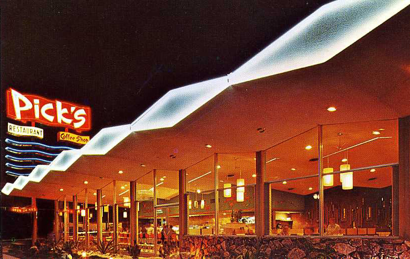 The original Meston design was of an exuberant style known as “Googie” that featured eye-catching elements such as swooping roofs, extensive plate glass, neon, and the use of shiny industrial building materials (but sometimes also lava stone as shown in Pick’s). I recommend the books Googie and Googie Redux by Alan Hess, which I have drawn upon for this post, along with Orange Roofs, Golden Arches by Philip Langdon.
 In the 1960s Kroc’s McDonald’s (he had bought out the McDonald brothers in 1961) began to run up against resistance from local zoning boards that wanted something more restrained than the “franchise schlock” look of the golden arches model. In 1968 the corporation went to work on a new design for a brick-faced building with a dark mansard-style roof and indoor seating. “We have taken off the gaudy materials and eliminated the circusy atmosphere,” said a McDonald’s executive in charge of design. The arches, on their way to become an ever-smaller letter M logo, were relegated to the sign. The first mansardized McDonald’s opened in the Chicago suburb of Matteson in 1969.
The little red, white, and yellow stands began to disappear. In 1972 most – about 75% — had been remodeled or replaced, leaving only about 250. By 1980, fewer than 50 remained, out of a total of 5,082 McDonald’s in the U.S. Preservationists in Oregon and Virginia tried to have old-style McDonald’s placed on historic preservation lists on the grounds they were symbols of America; they were turned down. By 1990 only five remained. A McDonald’s in Downey CA which opened in 1953 has been preserved, and this is probably the only example of the original design remaining other than the corporation’s recreation of Kroc’s first unit in Des Plaines IL.
 The cultural climate that brought McDonald’s and other fast food restaurants into contention with critics who sought to keep Googie buildings out of their towns and neighborhoods was in stark contrast to the optimistic futurism exhibited at the 1964-65 New York World’s Fair. Philip Langdon has used the term “the browning of America” for the turn away from buildings that were shiny, colorful, and blatantly commercial to ones that were low-slung, dark, and of natural looking materials. He suggested this shift signified a downcast attitude toward America. “The demand for a less garish roadside strip, when combined with other currents in the culture – a growing awareness of the nation’s faults and a fading away of the once-euphoric attitude toward futuristic technology – fostered a more subdued esthetic,” he wrote.
But another interpretation begs to explain the change as a progressive corrective to the post-WWII abandonment of nature, as evidenced in commercial roadside strips, napalm warfare, chem-lab convenience foods, and the widespread despoliation of the environment.
© Jan Whitaker, 2014
 It's great to hear from readers and I take time to answer queries. I can't always find what you are looking for, but I do appreciate getting thank yous no matter what the outcome.

Pingback: California coffee shops | Restaurant-ing through history
The photo in this article of the new mansard style is our Aberdeen, NJ McDonald’s restaurant. Built in 1983. I’m assuming the author took it from one of our Be Our Guest cards. My father took that picture in 1983. I have it hanging in my office. It was our first restaurant.
Thanks, nice to know.
You can’t make everyone happy. When the McDonald’s franchises sprang up, seemingly everywhere, the very design was a form of corporate branding. Also, by the franchisee leasing the facility from Kroc’s real estate company, he had greater control over them, plus his primary income source. As one of his men is credited as advising him, he was really in the REAL ESTATE business; it was his franchisees that were in the business of running a hamburger stand.
While it might be true that the long-running “Mansard Roof”, with its Earth tones, was intended to please local zoning authorities, and blend in with the trend in the 1970s to build corner “mini malls”, it was also a way to renew the “brand”. By then, garish neon and lots of chrome and glass were outdated, and also hard to keep clean and fresh! That’s another advantage of “Earth tones”, they hide dirt, so your facility has a cleaner appearance. There was yet another reason as well: the “walk-up” style, where folks lined up in front of a window to place their order, and either got back in their cars and drove off, or simply ate in the parking lot, or even WALKED away, was seen as low-class. Also, Kroc, from the very moment he opened up his first McDonald’s in Des Plaines, IL, wanted to keep it from being a hangout for the ‘rough crowd’, and attract families, seeing the then-Baby Boom demographic. He couldn’t have timed it better. The restaurant design change simply reflected what was felt suited the tastes of when those same “Boomers” were grown up and starting their own families.
Pingback: The Urban Planning Behind America’s Weirdest McDonald’s
Pingback: The Urban Planning Behind America’s Weirdest McDonald’s
Pingback: The Urban Planning Behind America’s Weirdest McDonald’s • Just Conservative Views
Pingback: Pine Stream, West Hempstead – Hidden Waters blog
Pingback: MCDONALD’S ARRIVAL IN SCHAUMBURG TOWNSHIP | Local History
Pingback: Learning activity 01 – Idea development | Tina Konradsen
The architectural change at McDonald’s echoed a worldwide trend that did indeed signify a shift away from a (often unquestioned) belief in technological innovation and progress. The embrace of modernism after World War II came as too much too soon for many people and there consequently arose a pushback of sorts as people returned to a desire for more traditional elements of design and thinking.
The New York World’s Fair was probably a symbolic last hurrah of unfettered postwar modernism. I wrote about this back in January (mostly from an automotive standpoint) and included the McDonald’s example.
McDonald’s actually established a trend with their mansard roof design; it was widely copied in the 1970s not only on a number of commercial buildings but for capping stand-alone signage as well.
Thanks for your comment. I really never thought about how car design and decor mirrors other trends.
Brilliant post, always look forward to your columns, Thanks!
I remember frequently going to the one in Phoenix at Indian School and Central. Was surprised to see it go. It held on forever.
Has anyone been to the still operating unit in Downey, Ca.? It’s really a wayback experience when the arches, Speedy and neon light up in the evening!
Our local brown version has just been razed. Signs indicate that locals should be looking forward to a new and improved McDonalds in the near future. It will be interesting to see a 21st century version.
It’s true that the brown version is not the latest. I’ve noticed quite a few of lighter brick, no neon whatsoever, and reduced signage. What does it mean?
Love the article! Coincidentally, drove by a “vintage” Burger King the other day, and turned back to take a picture of it. Really wacky looking, almost a German Expressionist interpretation of McDonald’s “Golden Arches” – I’d be happy to forward the photo… I found it pretty funny.
I’d love to see it.
Very interesting, and excellent social history as always. I’d guess Meston may have been influenced also by Lego designs, which were first released at the end of the 1940’s in Denmark. If you look at the depiction particularly under the Pick’s one, it seems similar to the classic interlocking colourful Lego bricks and other forms. Whether this was so or not, the Meston design was surely intended to attract the youthful, those with no excess change in their pockets and for whom 15 cents for a hamburger was affordable. And parents with a gaggle of kids in the backseat would in turn get the yen for the fast food offerings, but Meston or possibly the McDonald brothers may well have intended the stores to have a toy-like look to attract a young audience. The look since the 1070’s is quite different and an example of how big business can navigate changes in the culture, creating a “subdued ethic” is the perfect way to describe it, Langdon was exactly right. But certainly elements remained from before, not just the famous arches now fashioned to look like the letter m, but those bars on the roof, which are deconstructed from the original arches reaching up from street level. All brilliant stuff and a testament to the creativity of American business.
Gary
Interesting idea about the Legos, Gary.
Another awesome read, thank you!
Fascinating. McDonald’s has always struck me as a good indicator of so many economic and social issues – and now architectural/social/economic as well!
The early ones would make a good collage.
Date: Sun, 13 Jul 2014 18:02:01 +0000 To: meredithbritt@msn.com
How true.