Tag Archives: red decor

Fear of restaurants?

In a talk he gave at the National Restaurant Association convention in 1965, restaurant designer Richard Kramer observed that “Eating and drinking are anxiety-evoking situations that reduce man’s independence and make him regress to a child-like dependency.” Going into a restaurant made him feel “angry because he is hungry and also dependent on someone else to feed him.”

I find it so interesting how he linked anxiety and anger, not to mention restaurants and anger.

He applied this mostly to men. By contrast, I would think most women then would have felt grateful and relaxed when going to a restaurant because someone else would be doing the cooking and clean up.

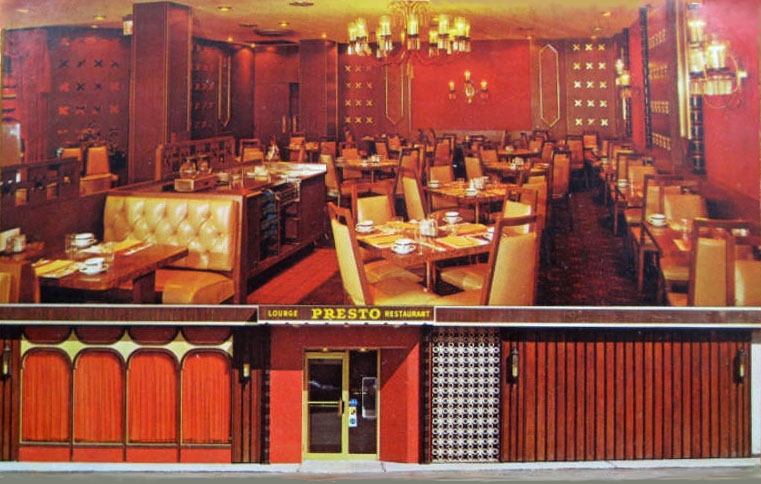
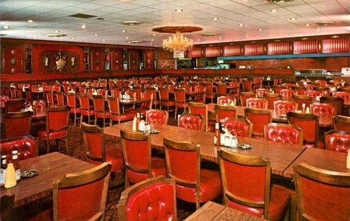
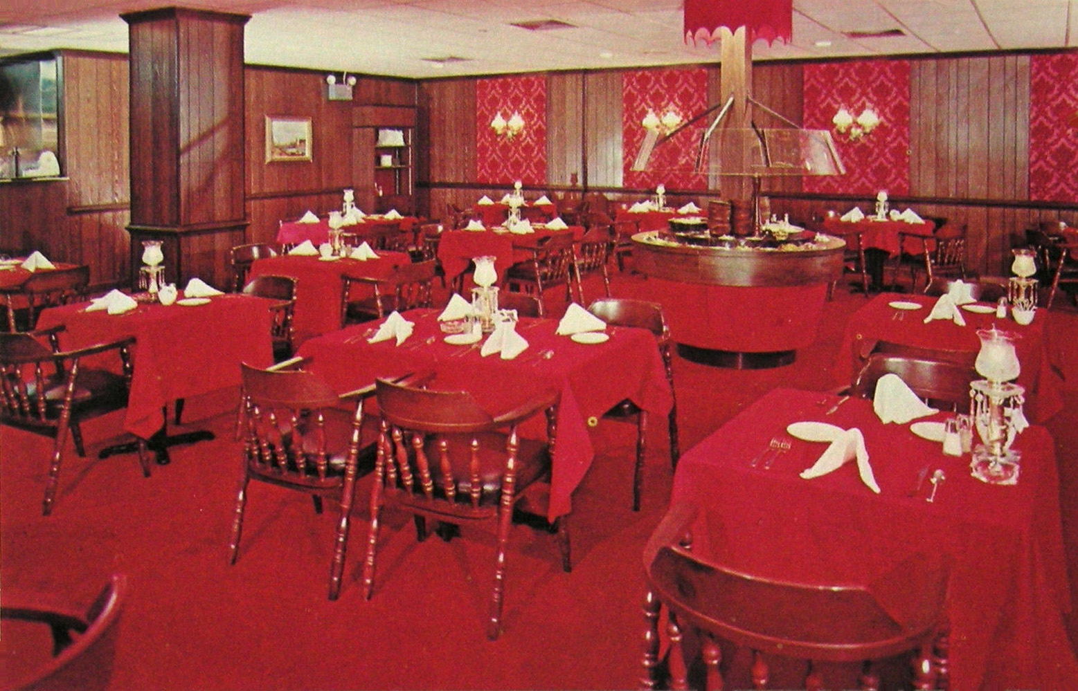
Kramer, who said he had studied psychology and psychotherapy, had a very successful career as a restaurant designer and founder of Integrated Design Associates in Los Angeles in the 1960s. The company continued in business long after he retired in the 1980s. IDA won 6 of 19 awards given by a national magazine in 1964, two of them for the restaurant El Gaucho in Beverly Hills’ Wilshire House [shown above].

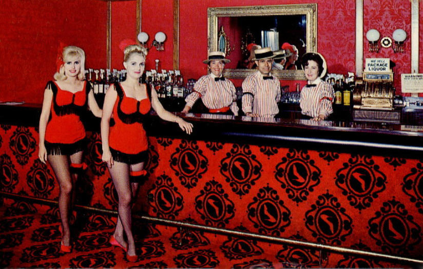
In addition to El Gaucho, IDA’s clients included Hyatt Hotels, a couple of Playboy Clubs, the Balboa Bay Club, Chez Voltaire in the Beverly Hills Rodeo Hotel, the Little Corporal in Chicago, Quivira Inn in San Diego, Dobbs Houses at the Dallas/Fort Worth Airport, eating facilities in the Air Resort Hotel in Fresno and the Friendship International Airport in Baltimore, The Lodge of the Four Seasons in Missouri’s Ozarks, and a number of western Sirloin Pits.

After reading Kramer’s approach to design I could only wonder what his interiors looked like. Although I could find very few images of restaurants he designed, I noticed that he seemed to like to use the color red, a color that has been linked strongly to mid-century restaurants especially attractive to male diners. I was surprised when I saw the red interiors, mainly because I don’t see redness as soothing. But perhaps the role of red in restaurant decor was to suggest luxury more than to soothe an anxious, angry diner. [above: Chez Voltaire]

His observations were that people eating in restaurants “want to be taken care of in a basic psychological sense.” They choose restaurants that make them “feel secure.” But he was also aware that a restaurant had to present a sense of luxury if guests were to “enhance their status and bolster their egos.” He wrote that “The designers’ task was to find a balance between extravagant formality and boring familiarity.” Otherwise their interiors might fail to “activate a buying mood.” Another hazard was that the diner might decide that a restaurant served bad food, according to Kramer, who declared, “To any angry, anxious person, the best food can have no taste except bad.”

Who knew that the stakes in restaurant design were so high?

© Jan Whitaker, 2025

9 Comments

Filed under atmosphere

Image gallery: Redness!

The author of the book A Perfect Red identifies it as “the color of desire” and “the color of blood and fire.” She also notes that the color has often been associated with masculinity because it signifies power, prestige, and “heat and vitality.”

So it makes perfect sense that at one time it was popular as steak house decor. [above, Presto, Chicago, ca. 1970]

But it took a while to catch on. In the early 20th century the color red was strongly rejected by many Americans as inappropriate for clothing. Those who dared to wear red – or other strong, bright colors – were seen as low class and with questionable morals. The judgment was particularly harsh if the wearer was Black or an immigrant.

The use of red in home decor was also severely criticized. An elite Chicago woman’s club firmly rejected a trend toward Oriental-styled dens with red walls, piled-up cushions, and low lighting. One of the club’s members noted in 1903 that during a visit to a house with so-called “cozy corners” full of soft pillows she began to doubt that “the mistress of that home was a moral woman.”

Needless to say, though early women’s tea rooms sometimes adopted playful decorating themes, red was decidedly not a popular color scheme in them.

Despite its association with immorality (or maybe because of it?) red made a strong showing after World War II, especially in the mid-1950s through the early 1970s. It was often used in restaurant decor, especially for places that appealed primarily to men.

Red tended to be employed lavishly. It was variously used for carpets, painted wall and ceiling surfaces, columns, wallpaper, light fixtures, draperies, tablecloths and napkins, glassware, menus, upholstery for chairs and banquettes, and waiters’ uniforms. [above: That Steak Place, VA]

Sometimes an old-time theme was adopted, usually signaled by red-flocked wallpaper meant to conjure a bygone time of jollity that might suggest anything from the “gay ‘90s” to the “roaring ‘20s” to a brothel.

A 1955 book of decorating advice suggested that, in contrast to cool colors and bright lights, restaurants with warm colors and dim lights suggested luxury. The latter decor encouraged patrons to relax and was believed “to increase the size of his check.” Likewise, a bar decorated in red might encourage drink orders.

Of course red is more than warm, it’s hot! It can be difficult to imagine relaxing in some of the eating places that enveloped diners in redness. Such as, in particular, NYC’s Cattle Baron [shown above], which opened in 1967 in the Hotel Edison. If the red decor weren’t appealing enough, the restaurant’s owner seemed willing to revive an association with questionable respectability when he ran an advertisement picturing a nude female model marked with black lines indicating cuts of meat.

Whatever poshness and sense of luxury a red interior suggested, it began to wear off in the 1960s, and even more in the 1970s. In 1961, when a version of the NYC club known as Danny Segal’s Living Room opened in Chicago, a reviewer criticized the “engine red decor” with red light bulbs as “excessive” and amounting to “a satire on night club decor.” Also in the 1960s, an Oregon restaurant reviewer sneered at “that ubiquitous black and red decor which has almost become a stereotype of the snobbier bistros.”

Restaurants began ditching their red decor in the 1970s. The Colony Square Hotel in Atlanta installed a new restaurant called Trellises, causing a reviewer to applaud the disappearance of the “steakhouse/bordello gold and red decor.” The western Straw Hat Pizza chain decided in 1975 that Gay 90-style restaurants with red-flocked wallpaper were out of fashion. The Homestead in Greenwich CT hired NYC designers to come in and rip out their red carpets and red-flocked wallpaper for a country look with hanging plants, wood floors, and brick walls. [above, Harry’s Plaza Cafe, Santa Barbara]

Of course, the U.S. is a big country, full of diverse tastes and fashions, so it’s not a big surprise that there were (and are) some restaurants that kept their red decor.

© Jan Whitaker, 2023

9 Comments

Filed under atmosphere, decor, restaurant decor, restaurant fads